Meyer-Näkel Rebrand
A 19th-century seal, distilled into a single mark: Meyer-Näkel‘s rebrand strips away over a century of ornament to reveal what was always at its core. Built for one of Germany‘s most respected VDP estates – sharper, more confident, still rooted in the Ahr.
Background
Meyer-Näkel is a leading Pinot Noir estate in Germany‘s Ahr region and a member of the VDP (Verband Deutscher Prädi-katsweingüter) – the country‘s elite winegrowers‘ association. Its identity had stayed largely unchanged for generations: a circular seal crowded with illustration, ornamental script and an address line.
Brief
Modernize both the wordmark and the brand mark, redesign the front and back labels, and establish a clear visual system for the VDP classification tiers (Gutswein, Ortswein, Erste Lage, Grosse Lage) – all without losing the heritage that gives the brand its credibility.
Solution
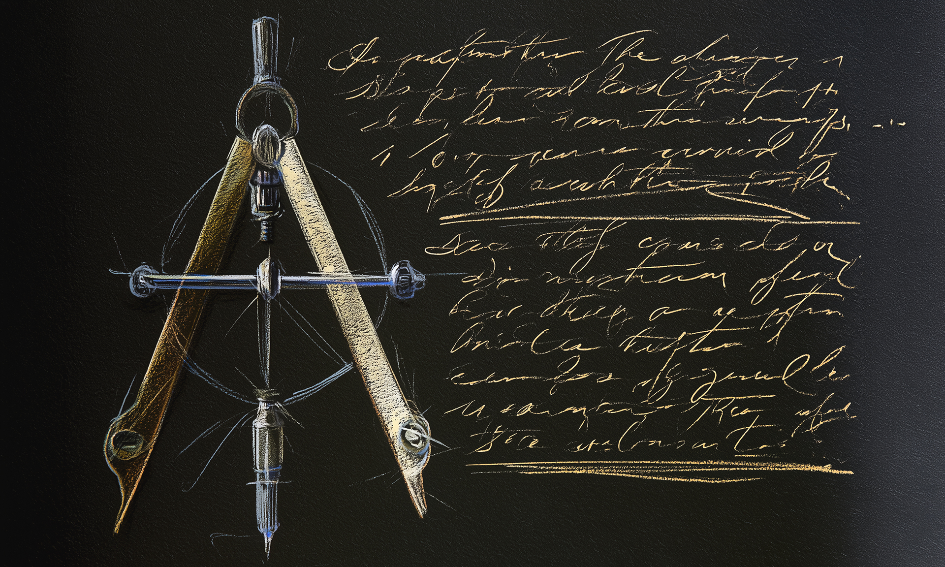
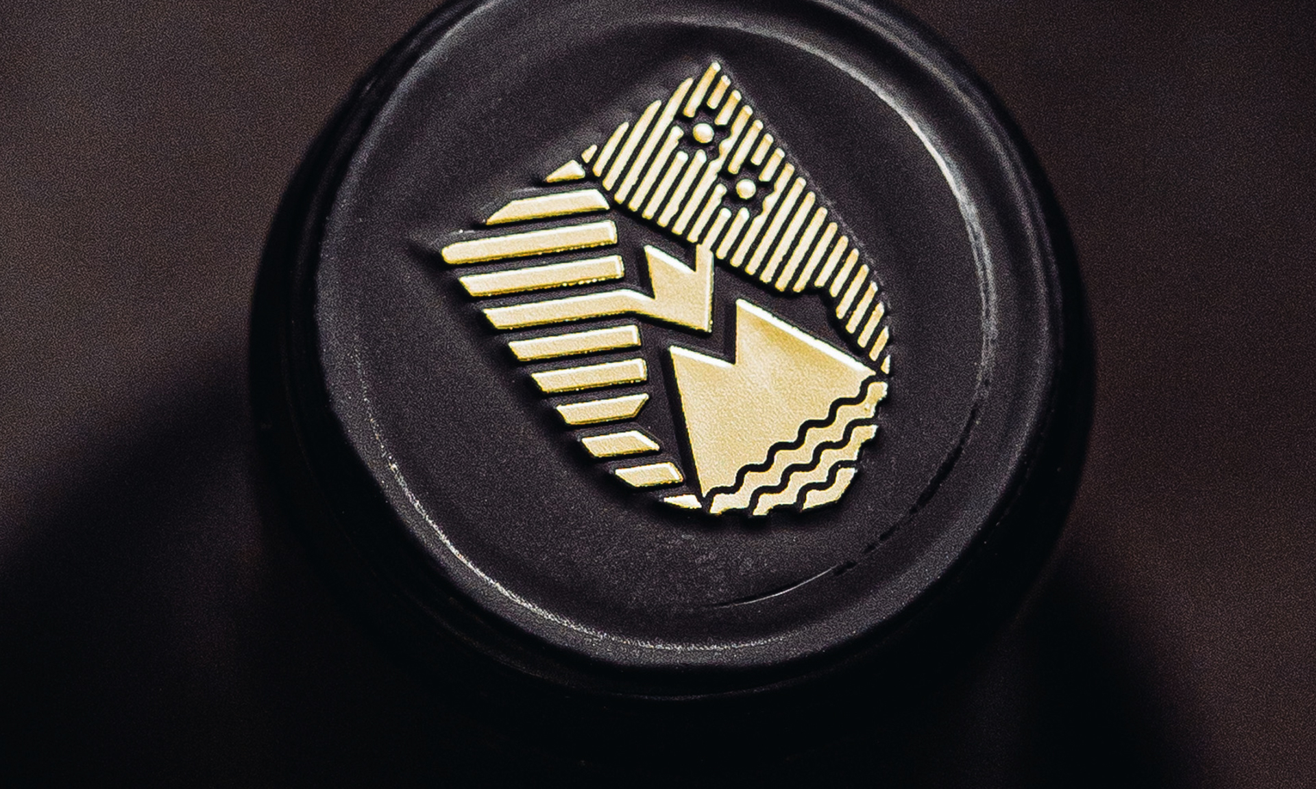
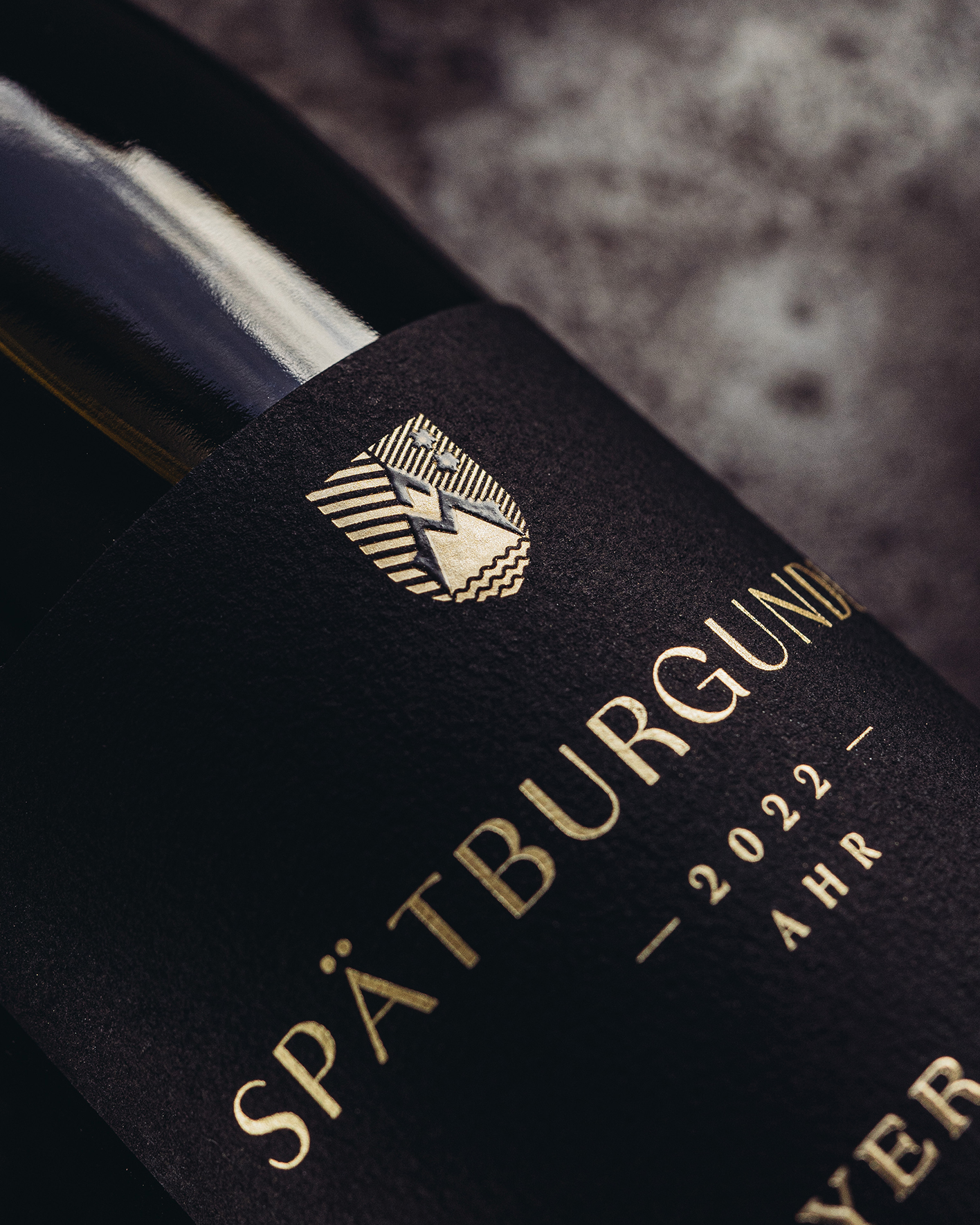
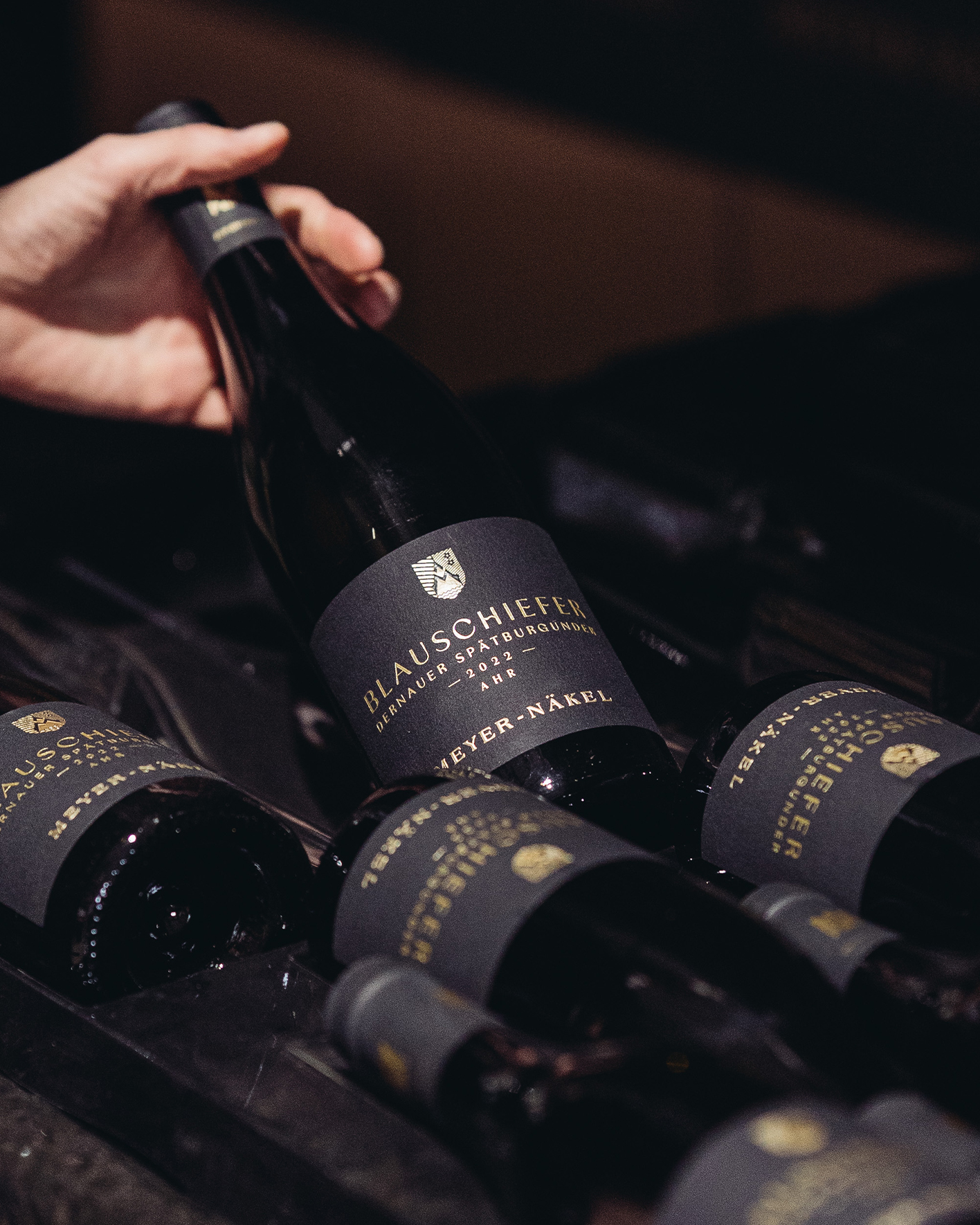
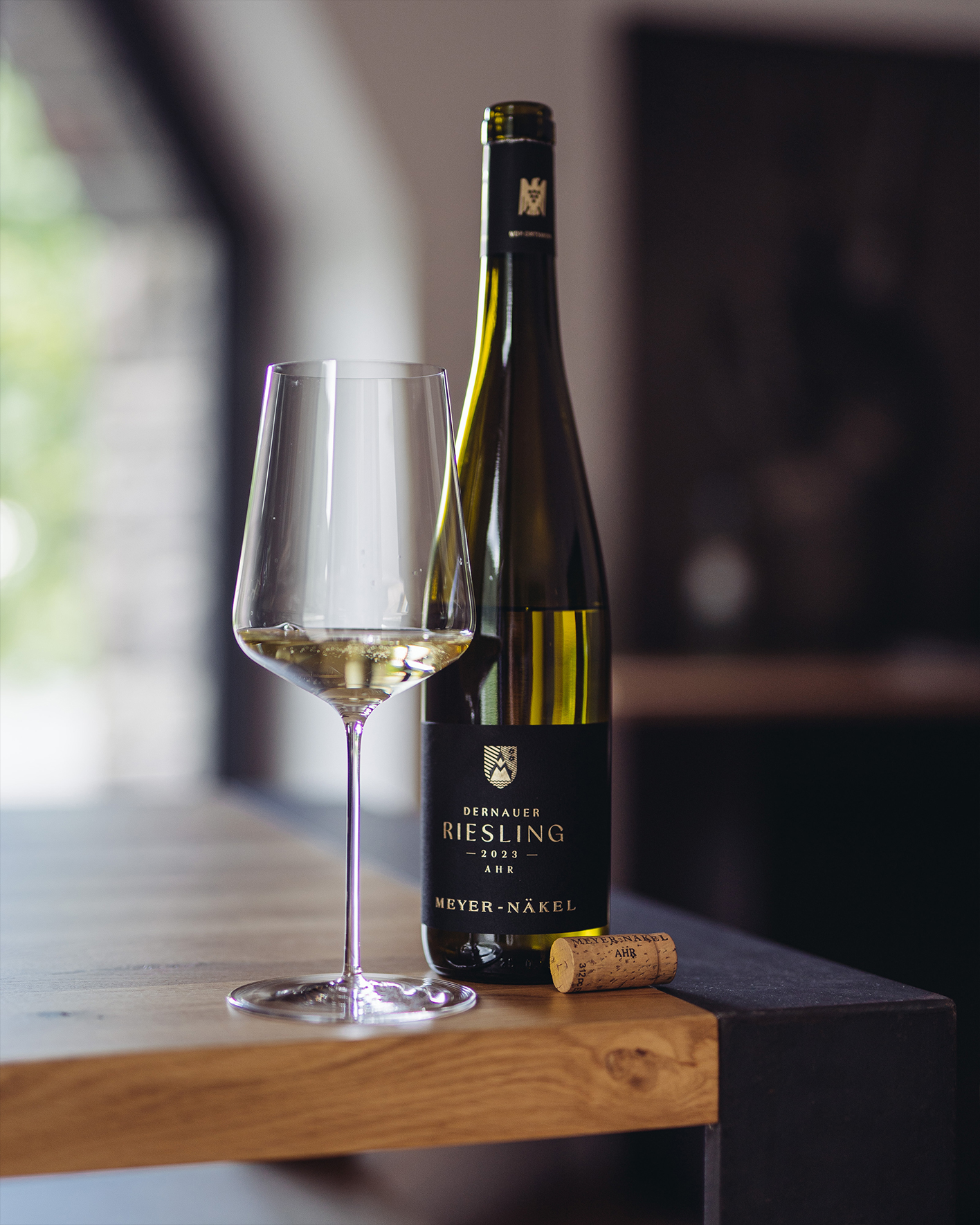
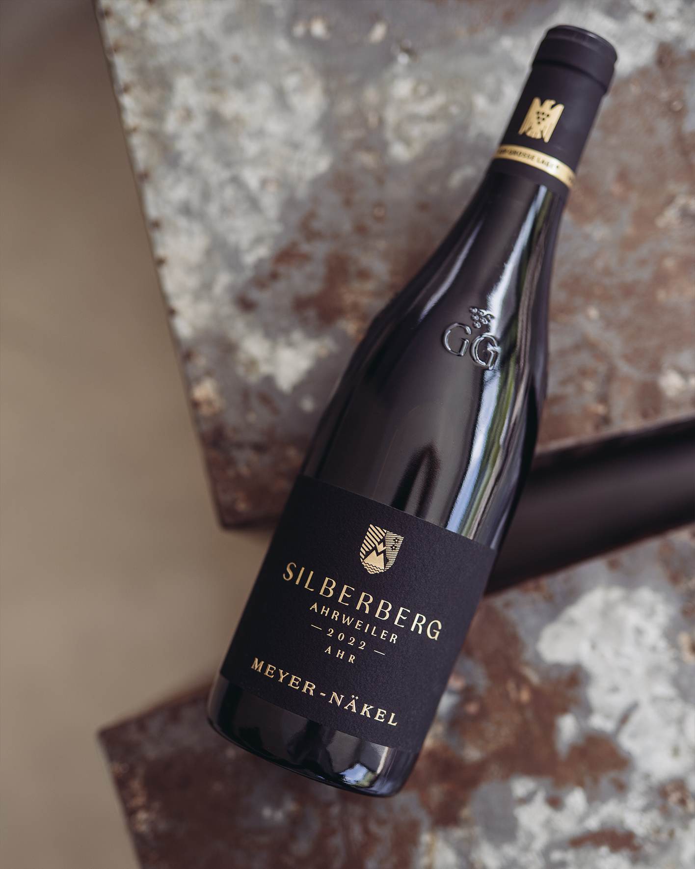
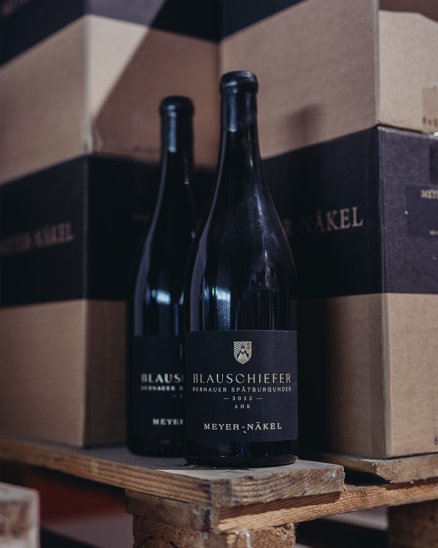
We found the brand‘s future inside its own past. Buried in the old seal was a small chevron shield — the only geometric element among the ornament. We rebuilt it around a stylized compass forming both an „A“ and an „M,“ its peaks tracing the Ahr‘s steep slopes and a flowing water motif nodding to the river that shapes – and once nearly devasta-ted – this landscape. Two small flowers honor the sisters who lead the estate today. The wordmark gained tighter spacing and confident weight; on the label, black, gold foil and clear hierarchy now speak instantly.


Long before it was a drafting tool, the compass symbolized infinity, community and an upright life. At the heart of the new mark is a stylized compass, forming an „A“ and „M“ at once.
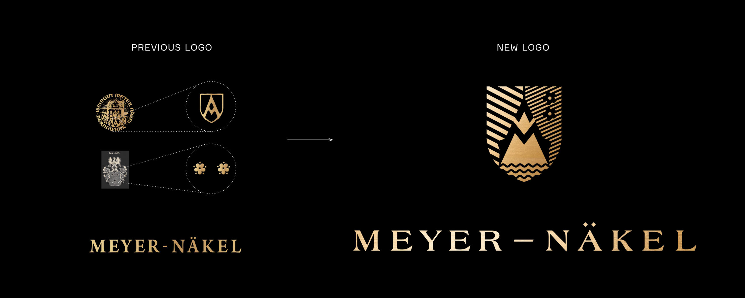

Layered on top: mountain peaks, water for the river that defines this region, and two small flowers for the sisters now steering the estate forward.


Giving the VDP Hierarchy
a Visual Language
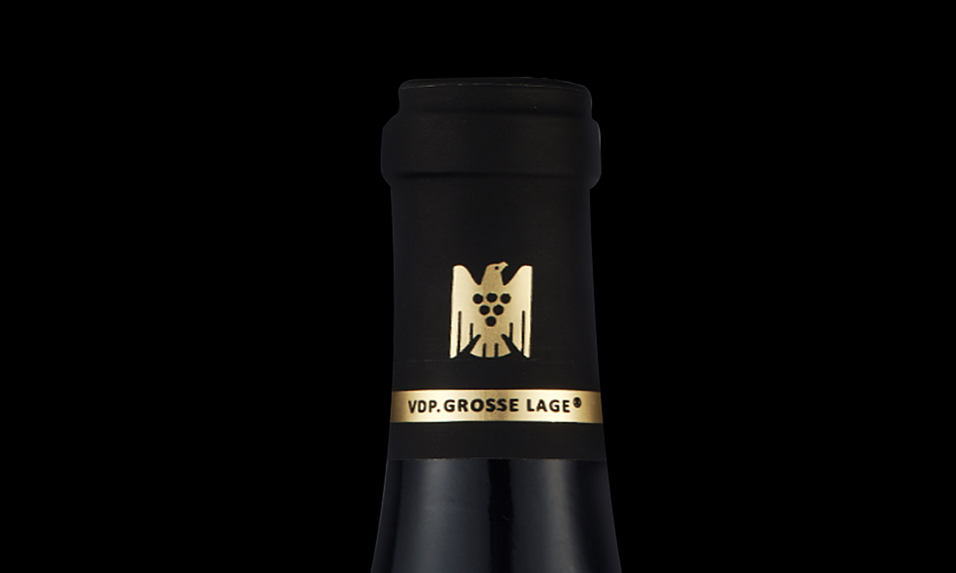
As a VDP estate, Meyer-Näkel‘s wines span four classification tiers – each with different expectations of provenance and price. We built a simple, scalable capsule system where gold intensity and finish rise with the wine‘s classification, so Grosse Lage announces itself before a single word is read, while the VDP eagle keeps its required place without competing with the estate‘s own mark.
Photos: Sandra Fehr (Heroes of Riesling)
Heritage isn‘t always lost in the archive. Sometimes it‘s just waiting to be seen.

“Our collaboration with Ruska Martin Associates is characterized above all by the expansion of our brand awareness and a breath of fresh creativity. Whether it’s a rebranding project or the creation of a completely new product identity – we take immense pleasure in working with this team to create something truly original through intensive collaboration!”
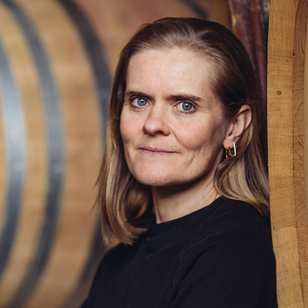

Meike und dörte Näkel
Gründer und Geschäftsführer von Meyer-Näkel

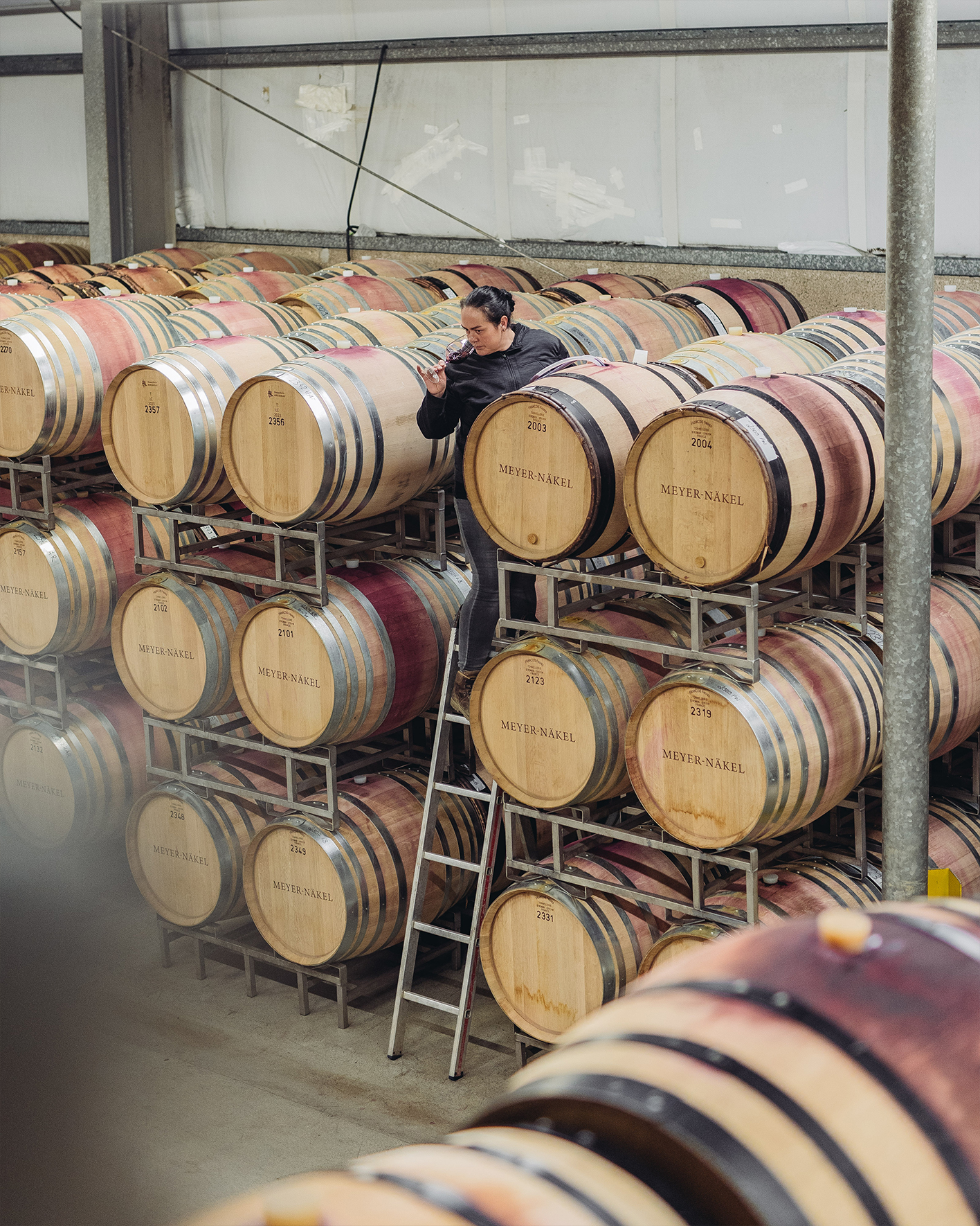

Photo below: David Weinmann
Hungry for more?
See related cases.