LIFT
Long before wellness had a hashtag, Presta has been quietly hydrating the health-conscious since the 1970s. Now as part of Coca-Cola Germany. Enter Lift Light: a bold, modern platform that carries Presta’s legacy like a watermark.
Background
Apollinaris faced a dual challenge: streamlining its brand architecture while injecting new energy into the premium segment. Presta, a pioneer of mindful consumption since the 1990s, still resonated with certain audiences – but had lost its visual relevance among younger consumers. The brand needed a new narrative. One that would preserve its DNA while shifting its cultural context.
Brief
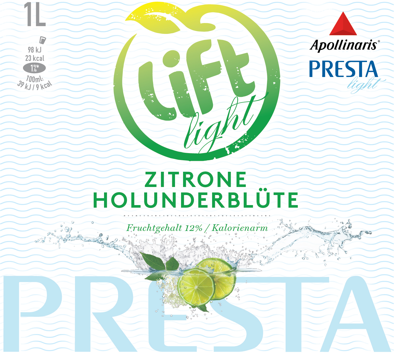
The task was to ensure Presta’s legacy of innovation didn’t disappear into the archives, but instead lived on – embedded within the Lift masterbrand. The packaging needed to be modern, visually confident and emotionally engaging, while subtly continuing the Presta line in the background. A quiet nod to its origins and health-forward promise.
Solution
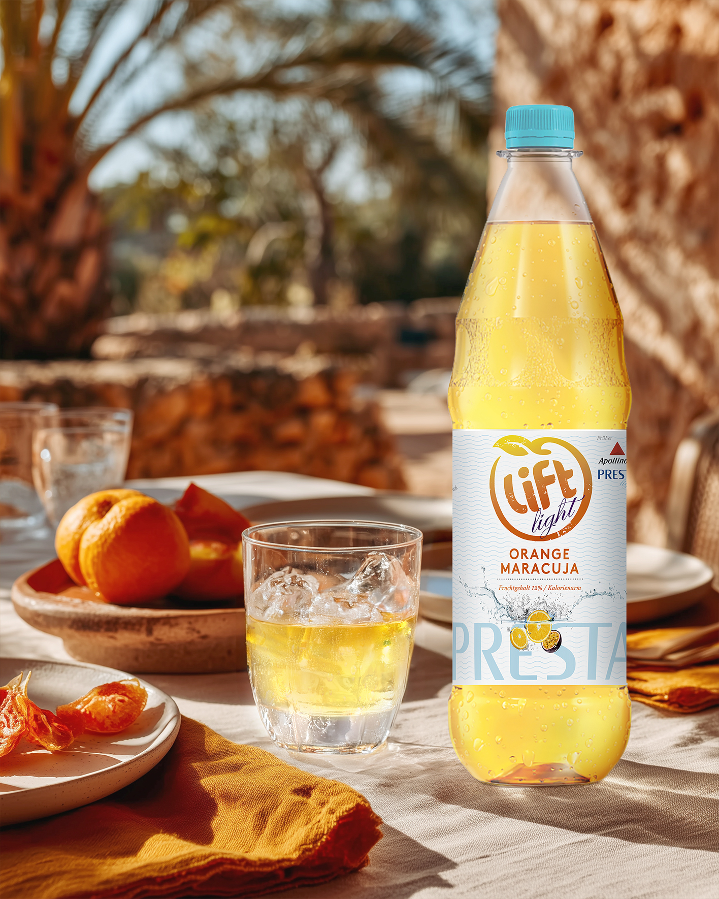
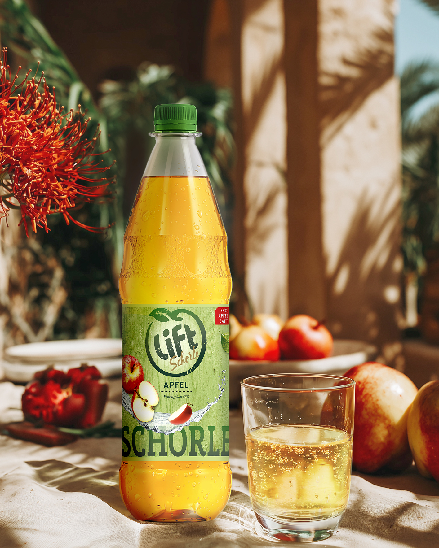
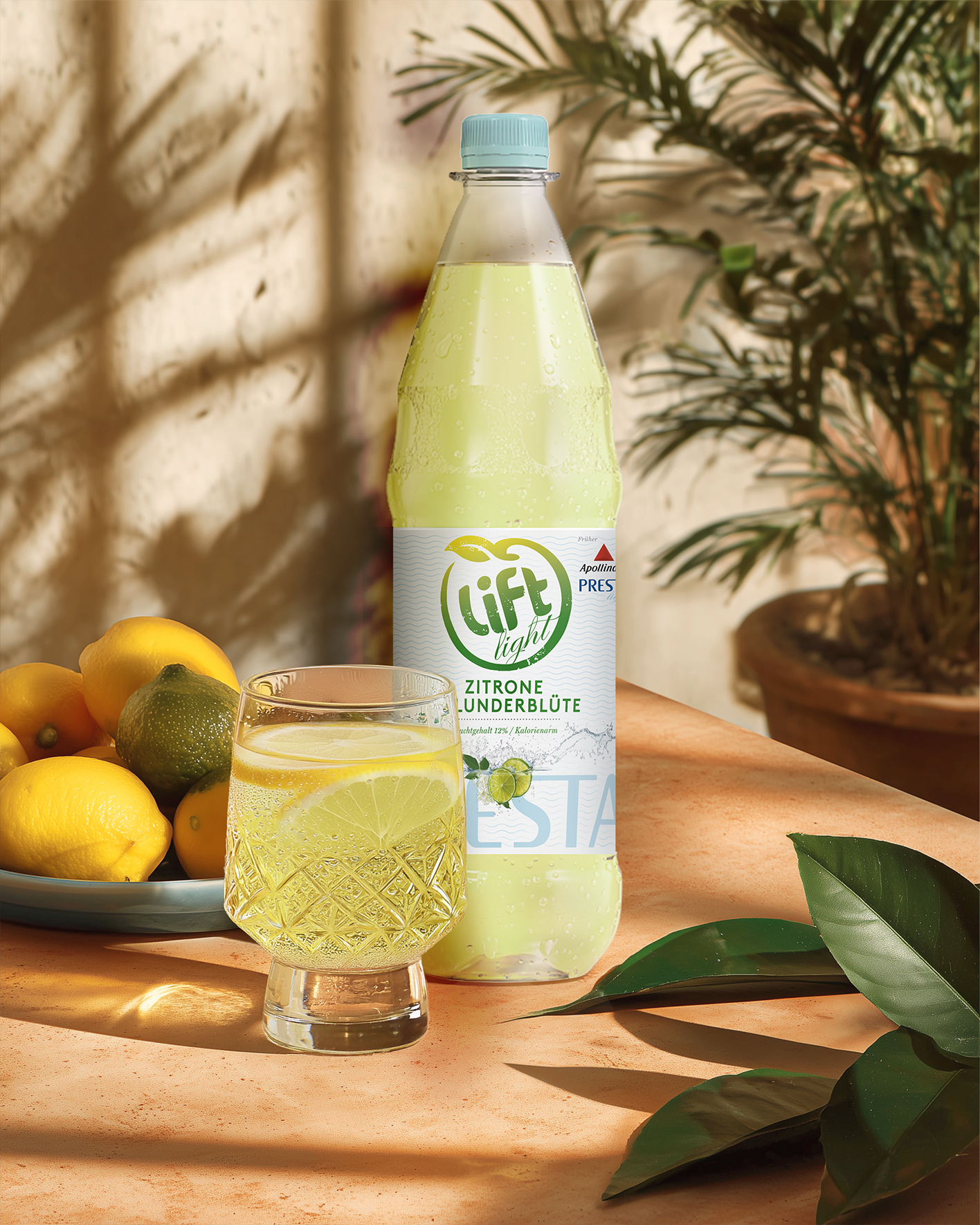
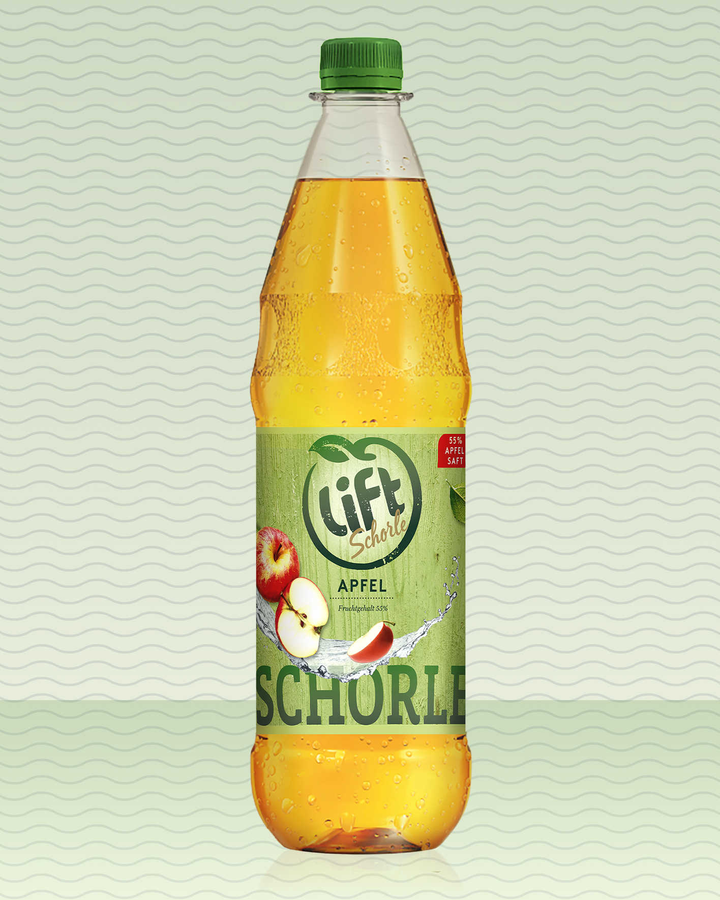
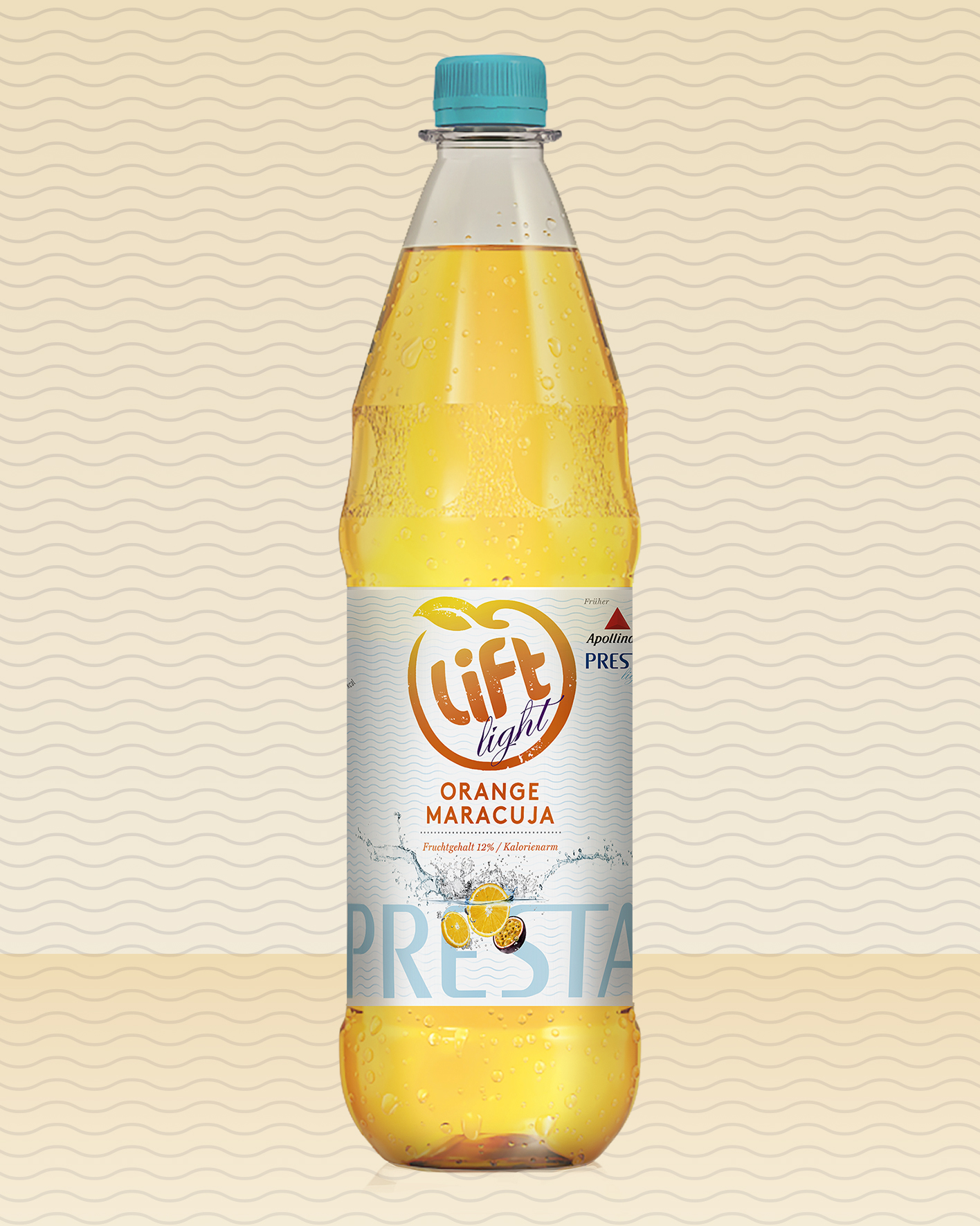
The visual solution was a balancing act: Lift took center stage, bold and clear, while the Presta name – gently modernized – remained visible as a secondary layer within the design system. The result was dual readability: a forward-facing, youthful brand with an embedded sense of trust and authenticity. Three SKUs – Lift Apple Spritz, Lift Orange Maracuja, and Lift Lemon Elderflower – brought the strategy to life: familiar in taste, yet unmistakably reimagined.
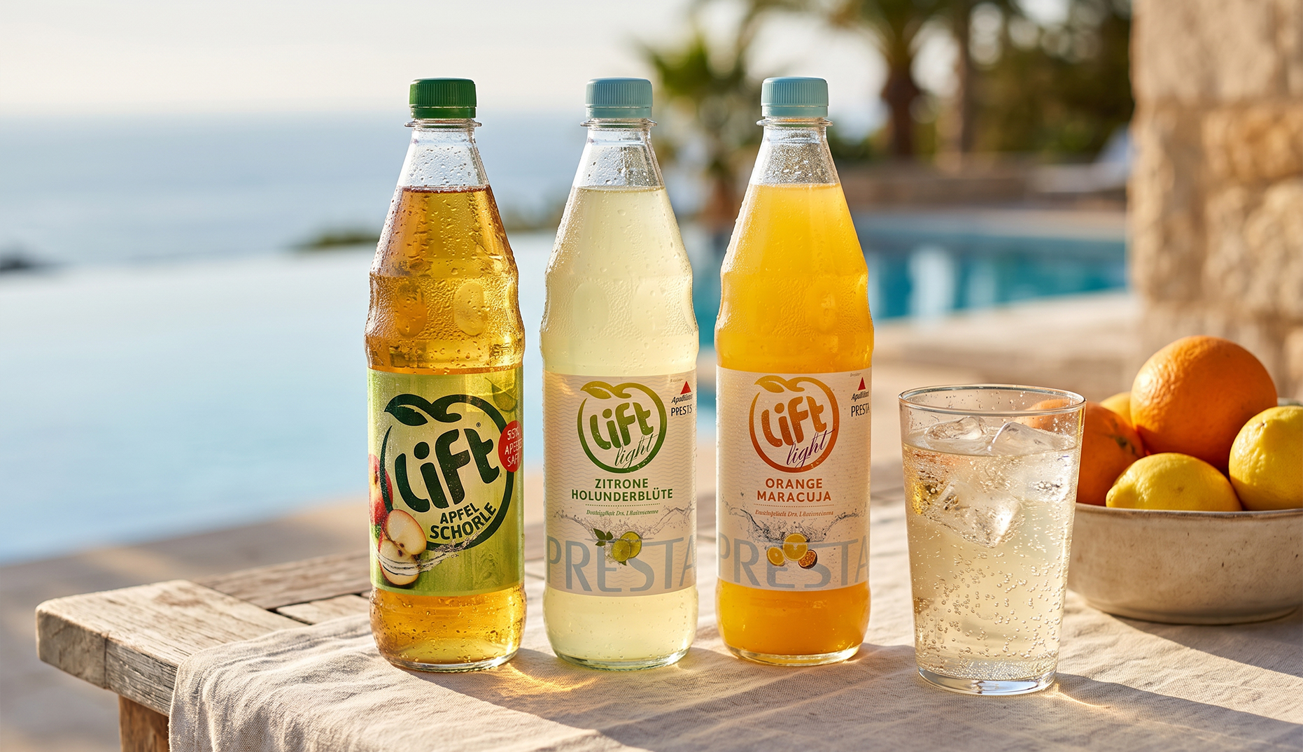

Some drinks are born trendy. Others have history in their veins.
Presta was never killed off. It was reimagined — not as a nostalgia badge, but as a quiet code for trust within the Lift brand. The result is a rare case of brand integration that deepens, rather than dilutes. Lift becomes the stage; Presta the subtext. It’s a structural move that says: we don’t need to shout legacy, we can embed it.




Cultural Relevance
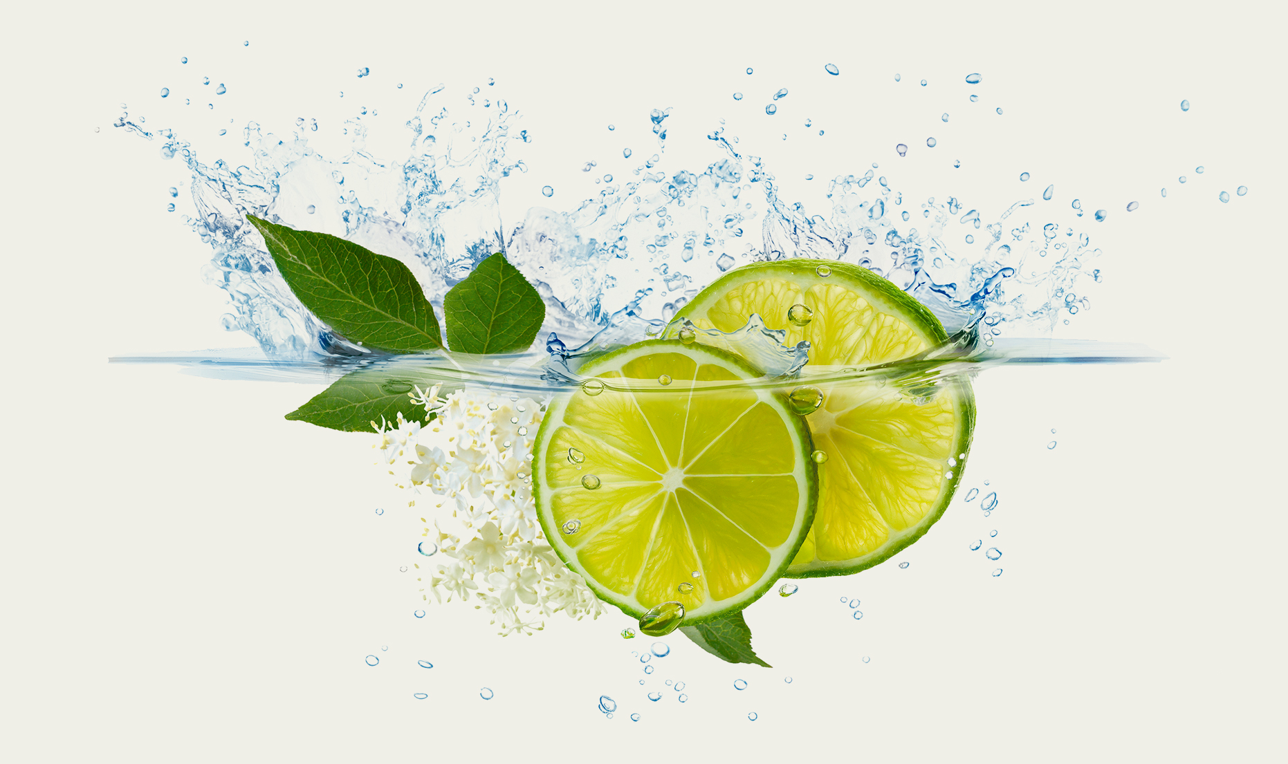
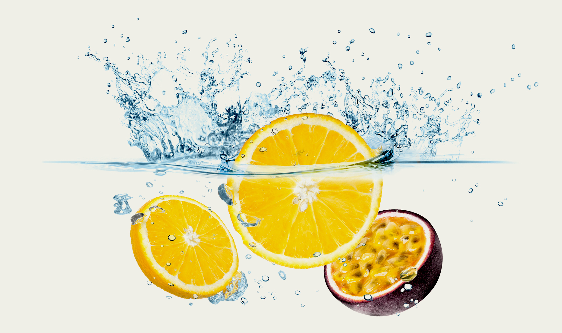
It’s not about less sugar. It’s about more meaning. Lift Light doesn’t sell you a lifestyle. It meets you where you already are. The visuals feel unfiltered — wet skin, bright fruit, light without effort. It’s not about yoga, detox or rituals. It’s about a product that feels right, looks right, and tastes like a day without noise. The branding doesn’t posture — it trusts the intelligence of the shelf, and the instinct of the consumer.

“Working with Ruska Martin was a truly inspiring experience. They deeply understood our brand—its heritage, values, and vision—and translated that into a fresh, modern design that felt both authentic and forward-thinking.
Their creative and thoughtful approach to expanding our brand into new product lines was impressive. The collaboration was smooth, energizing, and full of great ideas. A fantastic team delivering outstanding work”

Ulrike Henkes
Marketing Coca-Cola
Hungry for more?
See related cases.