Jakob Jung Relaunch
A trump card to triumph, but above all for drinking pleasure! Where a traditional winery becomes the playground – quite literally – of modern German wine design.
Background
A winery rooted in tradition but ready to play a different game: Jakob Jung has been family-owned since 1799, yet under Alexander Jung’s leadership it entered a new era. With a bold mindset and a strong product portfolio, the brand was looking for a fresh narrative – one that speaks to modern audiences while respecting its roots.
Brief
How do you stand out in one of the most traditional categories in the world? The task was to completely reimagine the brand’s presence – labels, website, and storytelling – while staying true to the winemaker’s origin and values. The creative direction had to combine clarity and character, and above all: be memorable.
Solution
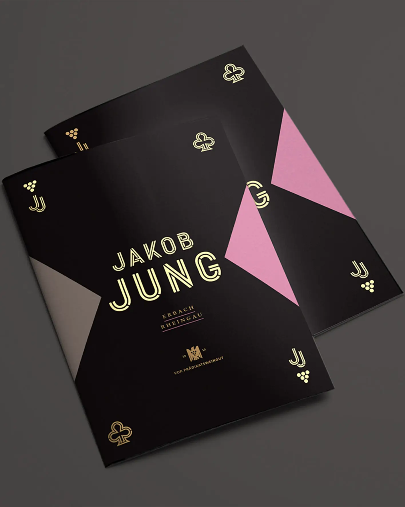
Inspired by the winery’s initials, “JJ”, we built the brand around a bold visual metaphor: the jack of cards. Four label tiers mirror the hierarchy of the VDP classification system, while suits and illustrations add a whimsical edge. The brand’s digital presence extends the metaphor into a rich, immersive world – turning every touchpoint into part of the story.



The awards? Four of them:
2x Red Dot, iF, DDC Gold.
The feedback? “There’s no better way to present wine,” said the jury.
The client? Happy across generations.
The sales? Let’s just say: the wine is selling faster than we can type this sentence.

Wine Relaunch
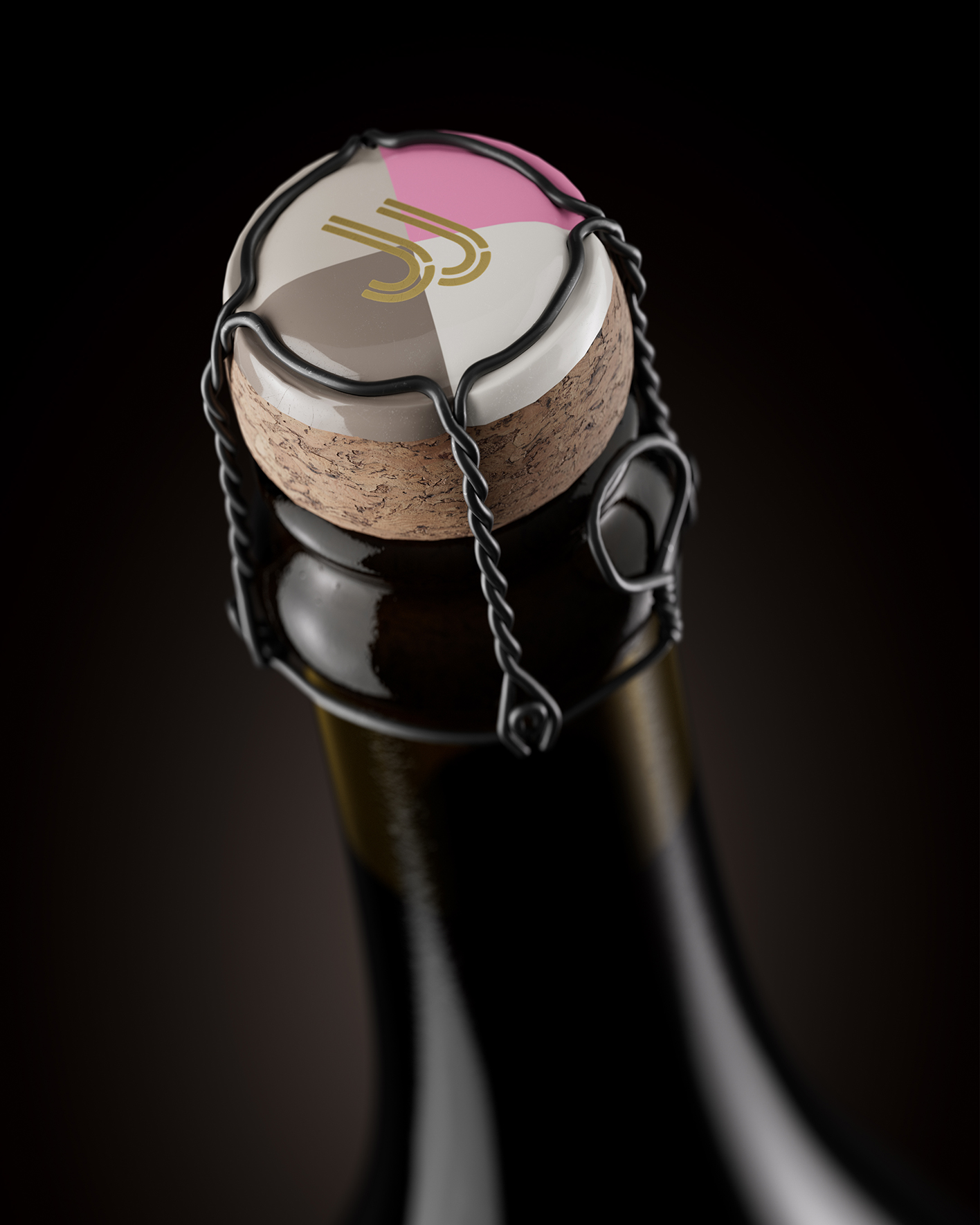
We turned the initials “JJ” into the face of the brand: a jack of wine, ready to shake up the table. Drawing from the visual language of playing cards, we created a system that is flexible, surprising, and instantly recognizable. The jack serves as a symbol for wit, elegance, and strategic play, exactly the traits Jakob Jung brings to the Rheingau wine scene. From logo to layout, everything communicates: this is a brand that knows the rules and how to bend them.
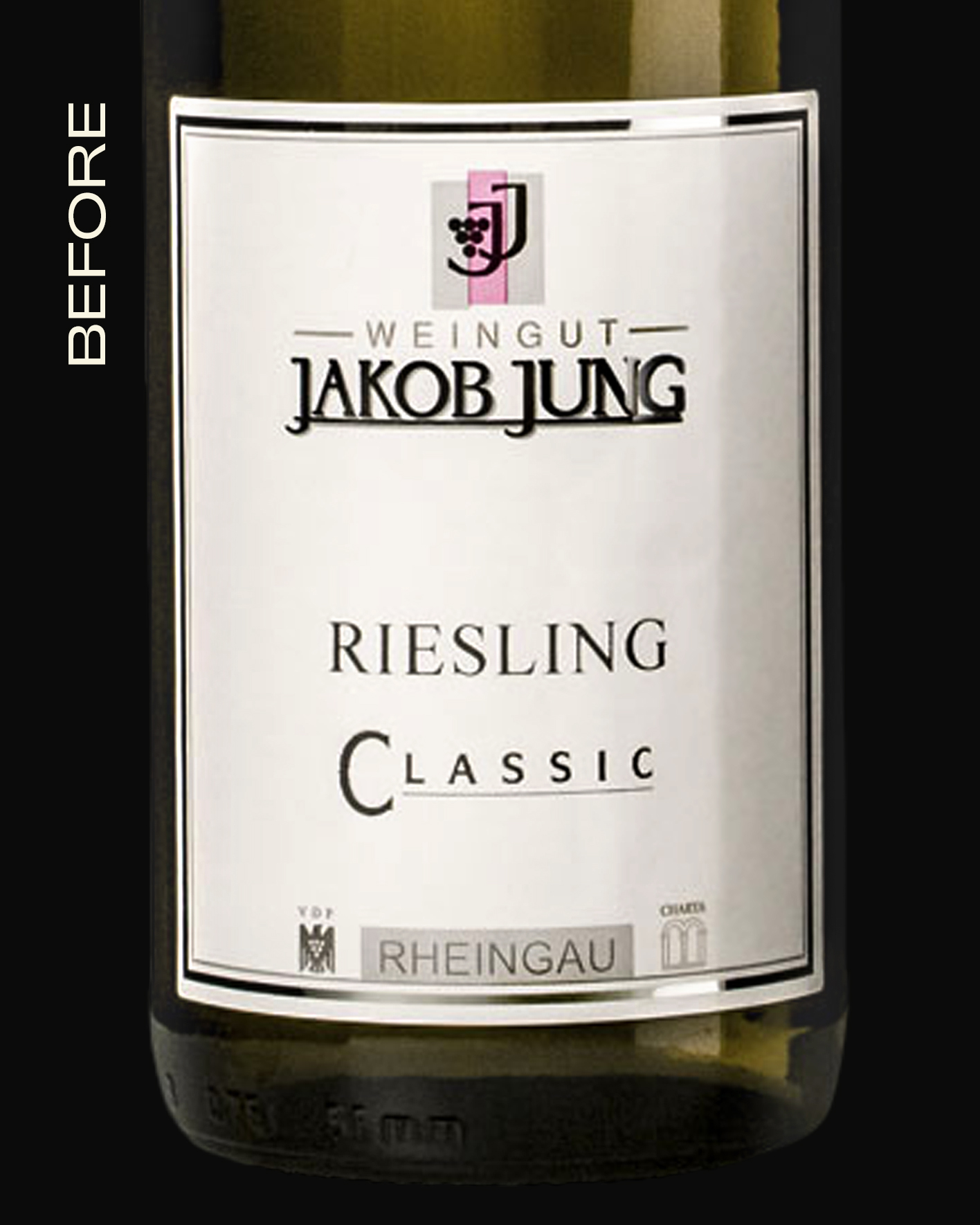
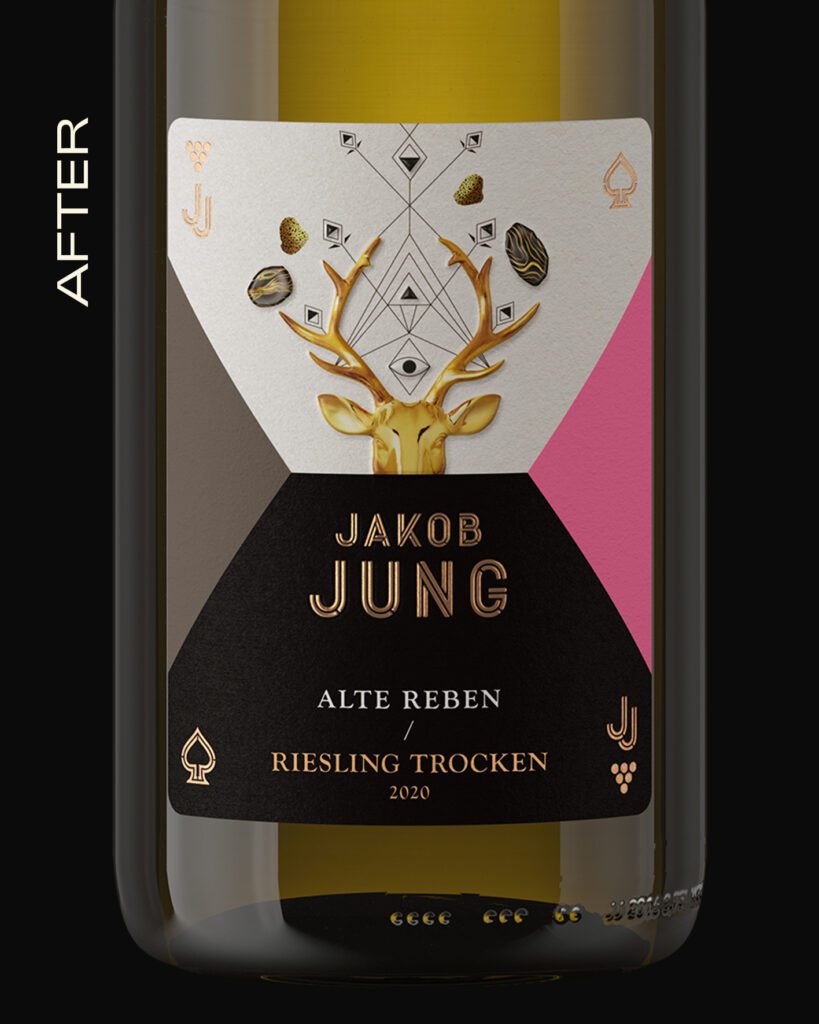
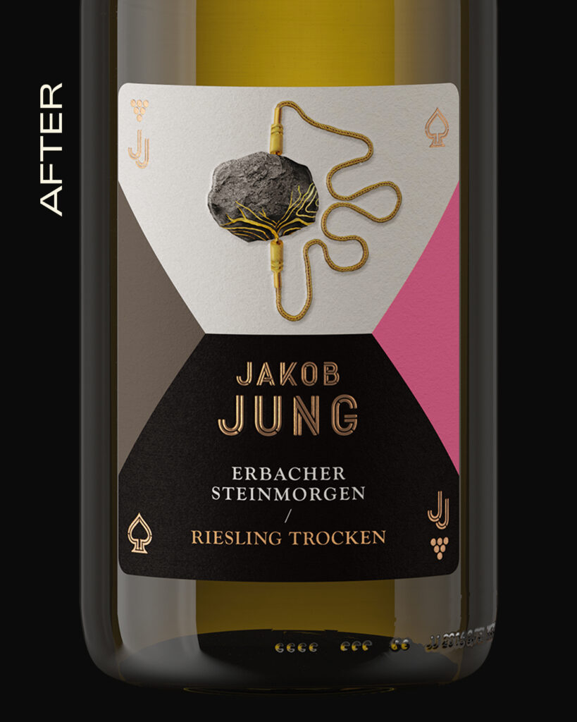
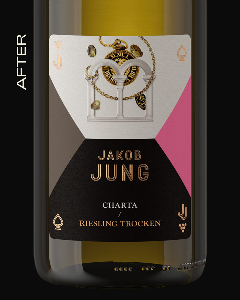
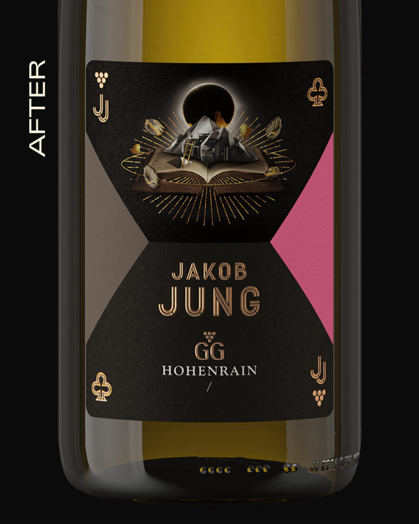
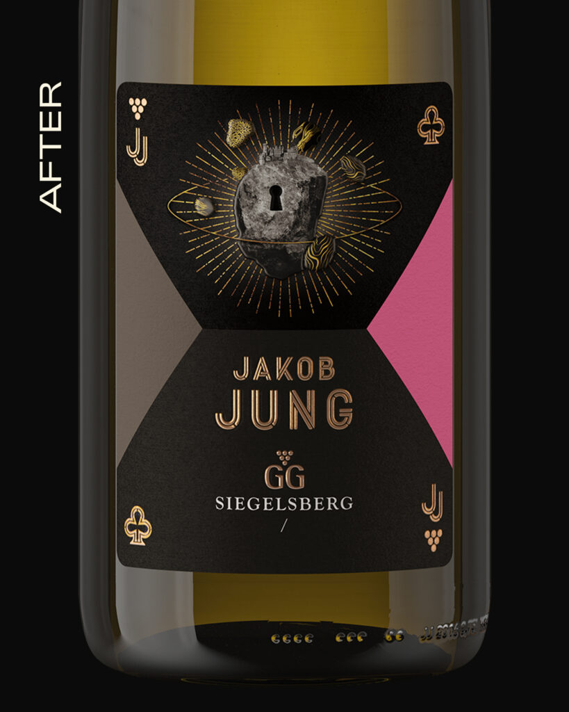
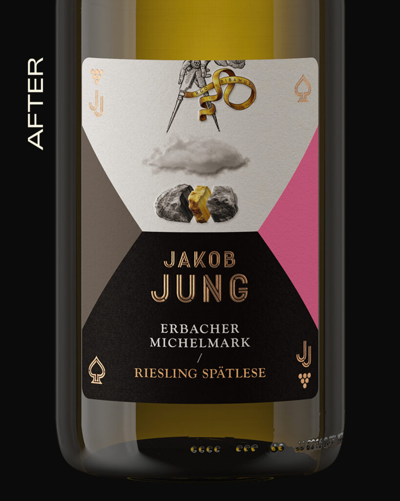
CARD DECK LANGUAGE
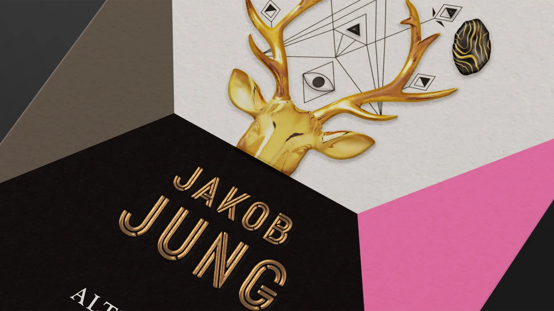
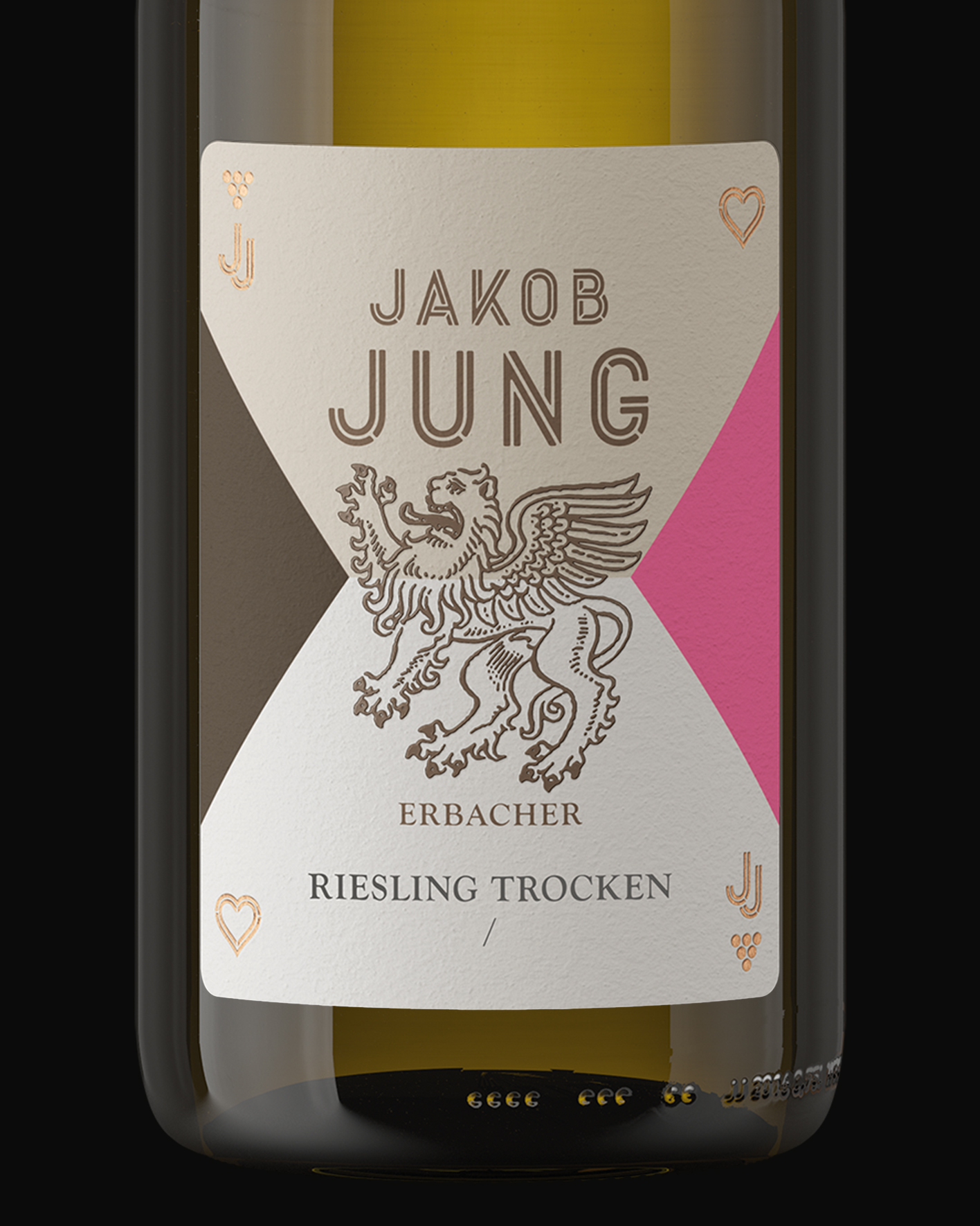
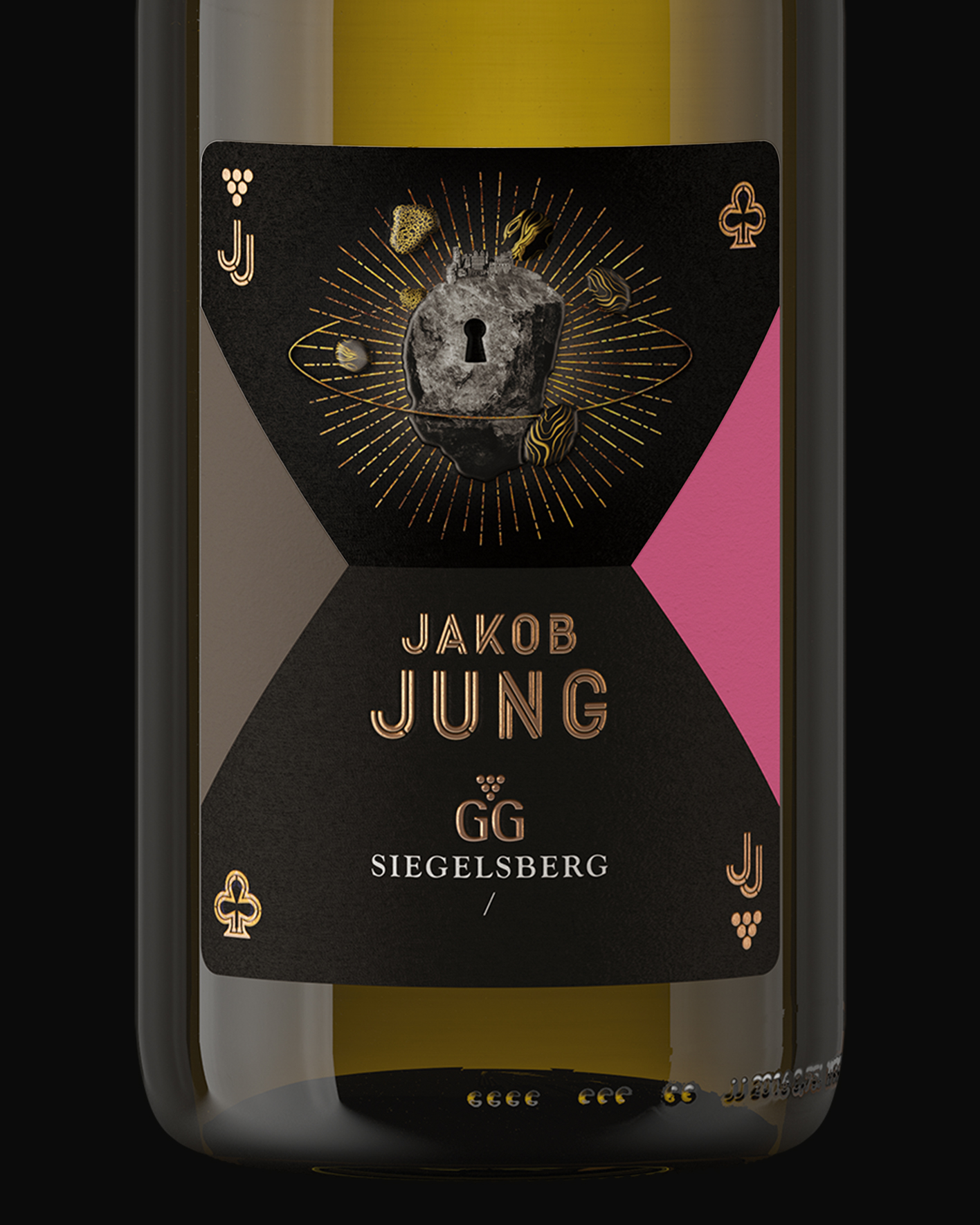
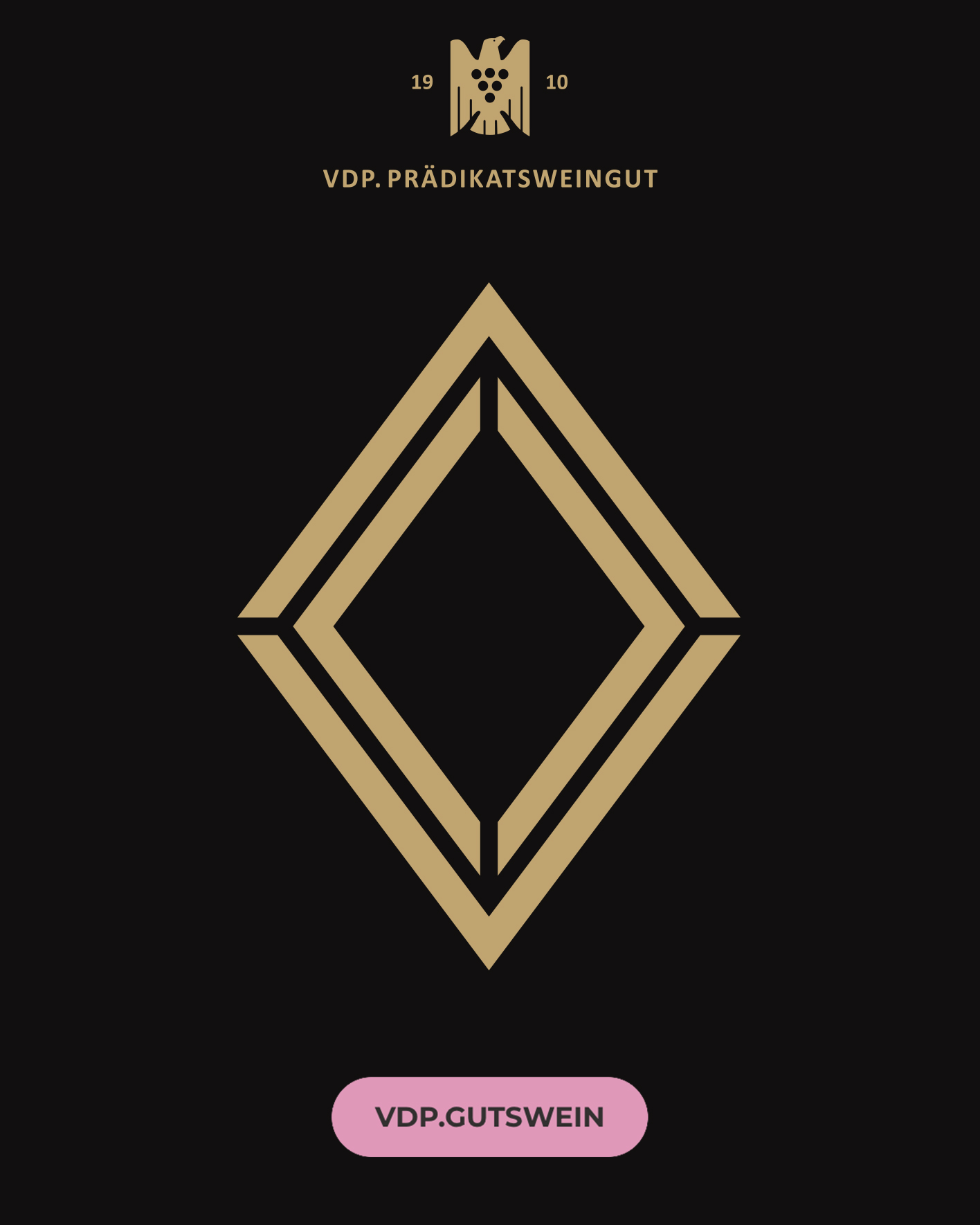
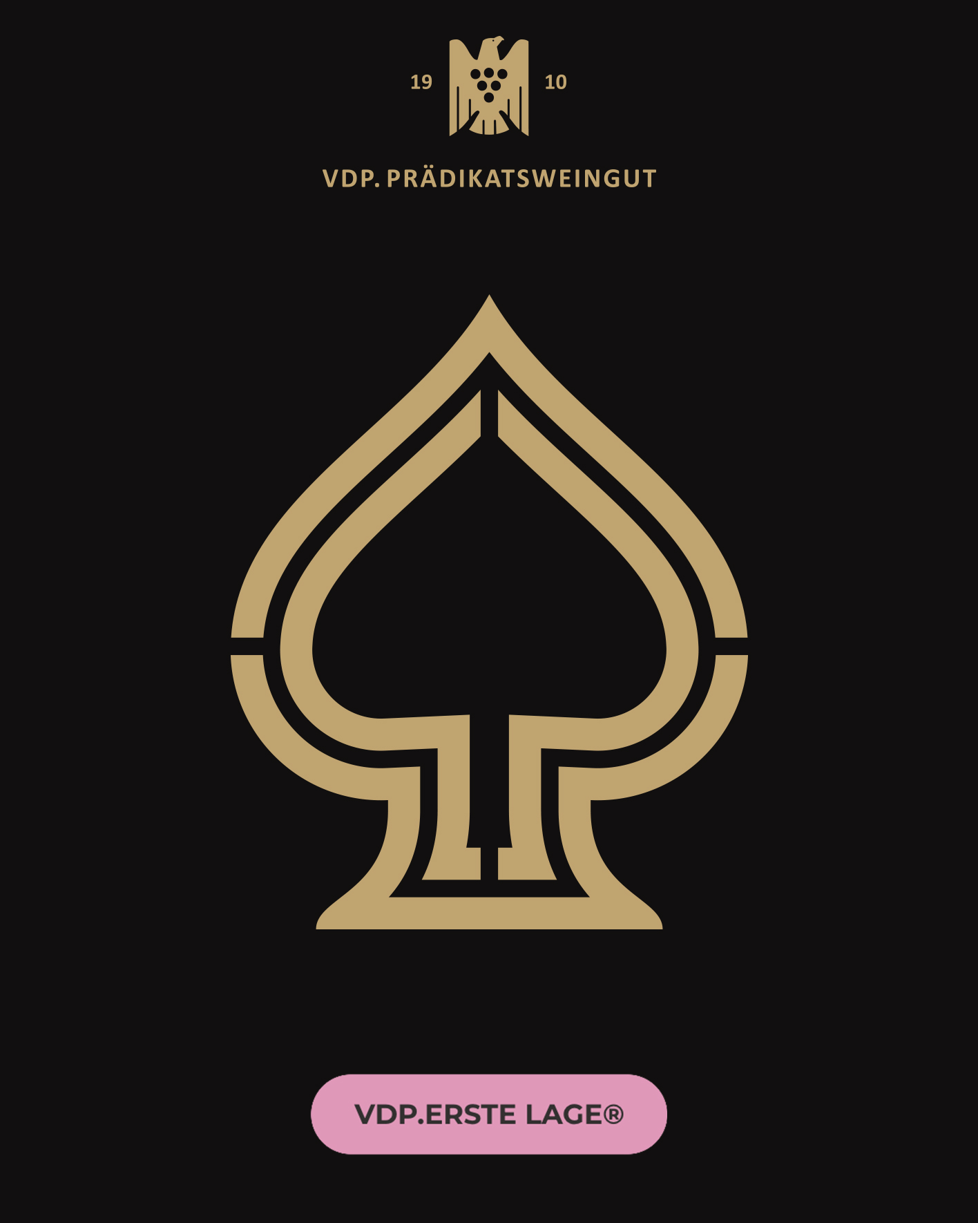
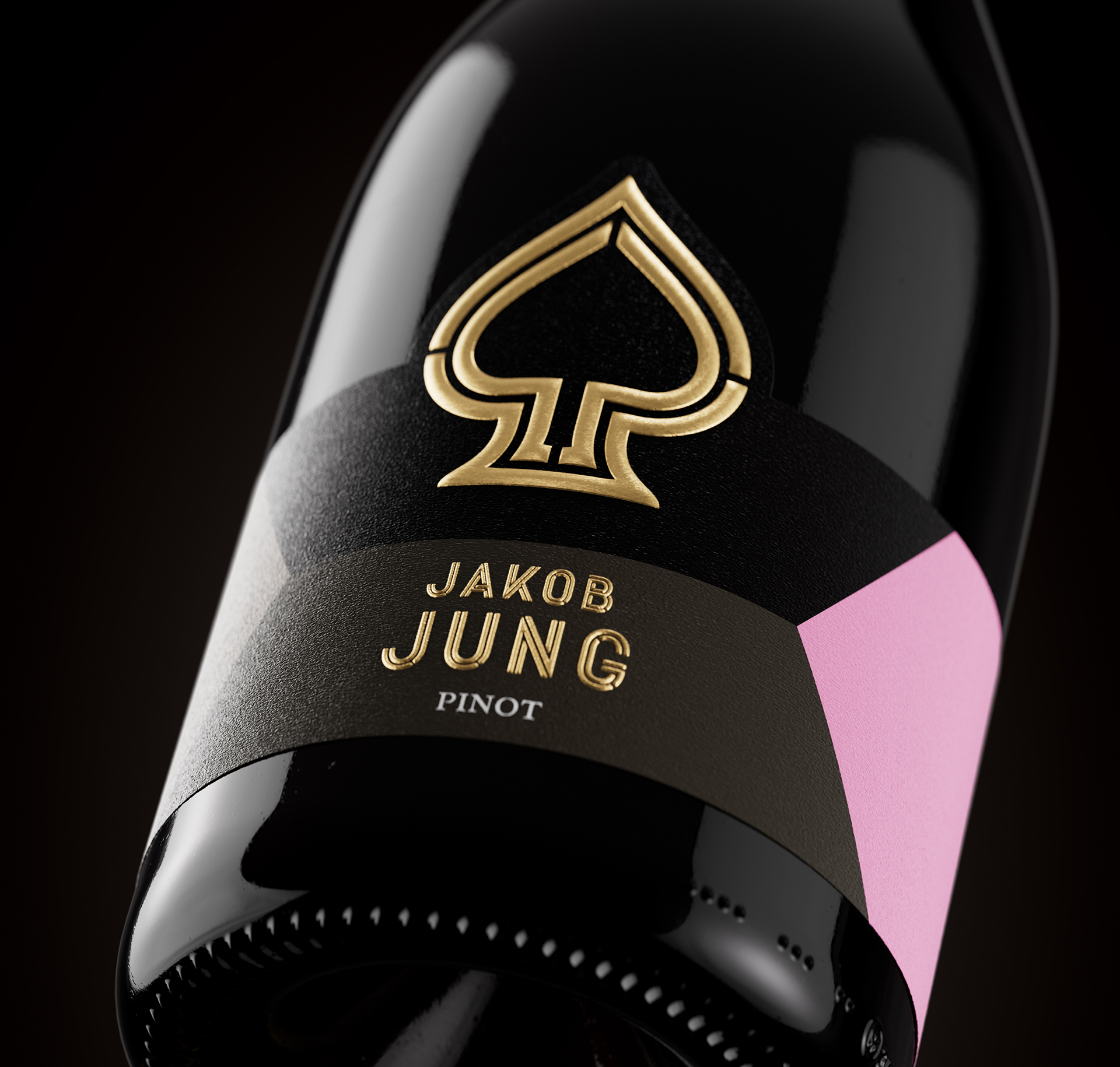
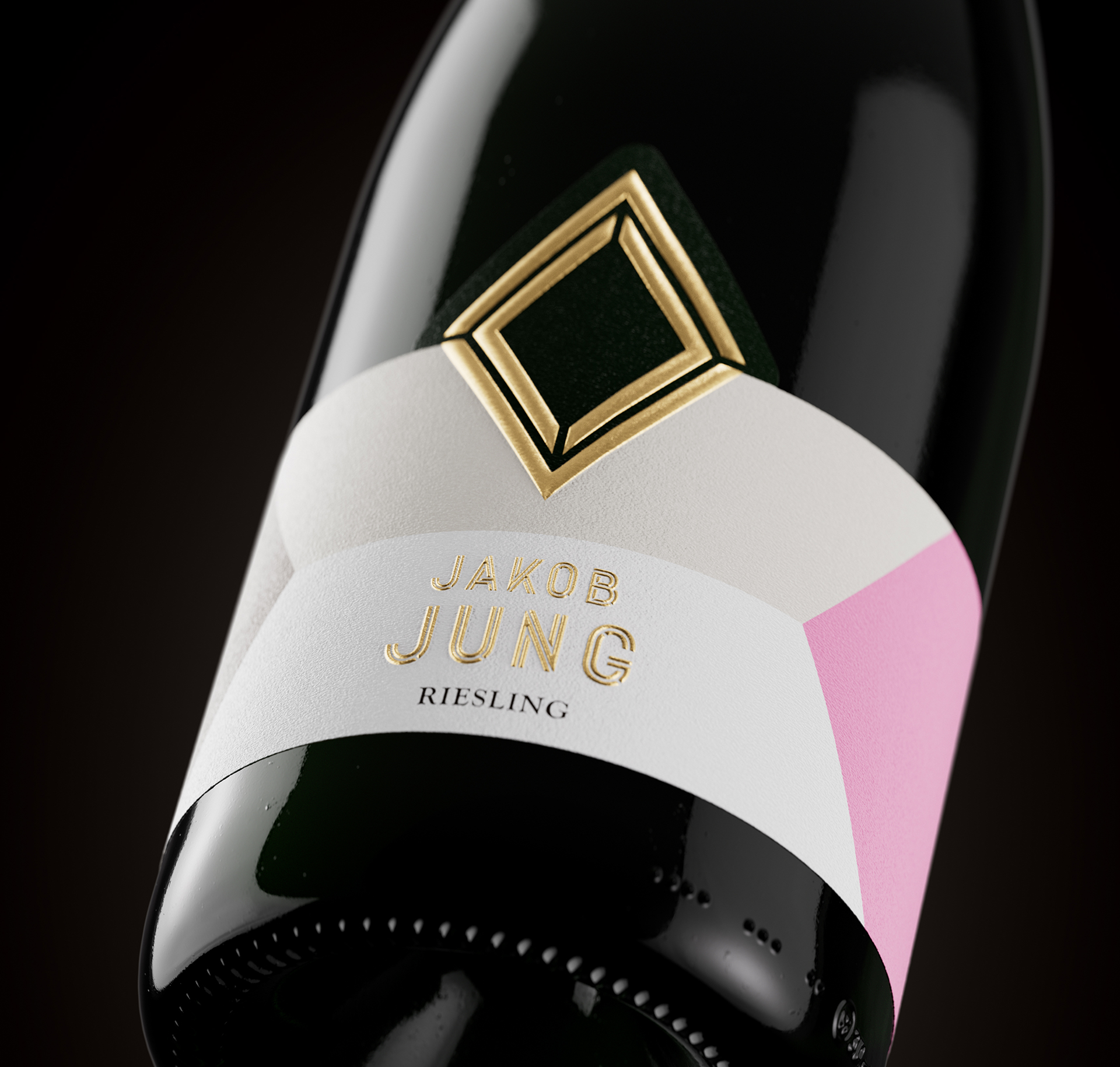
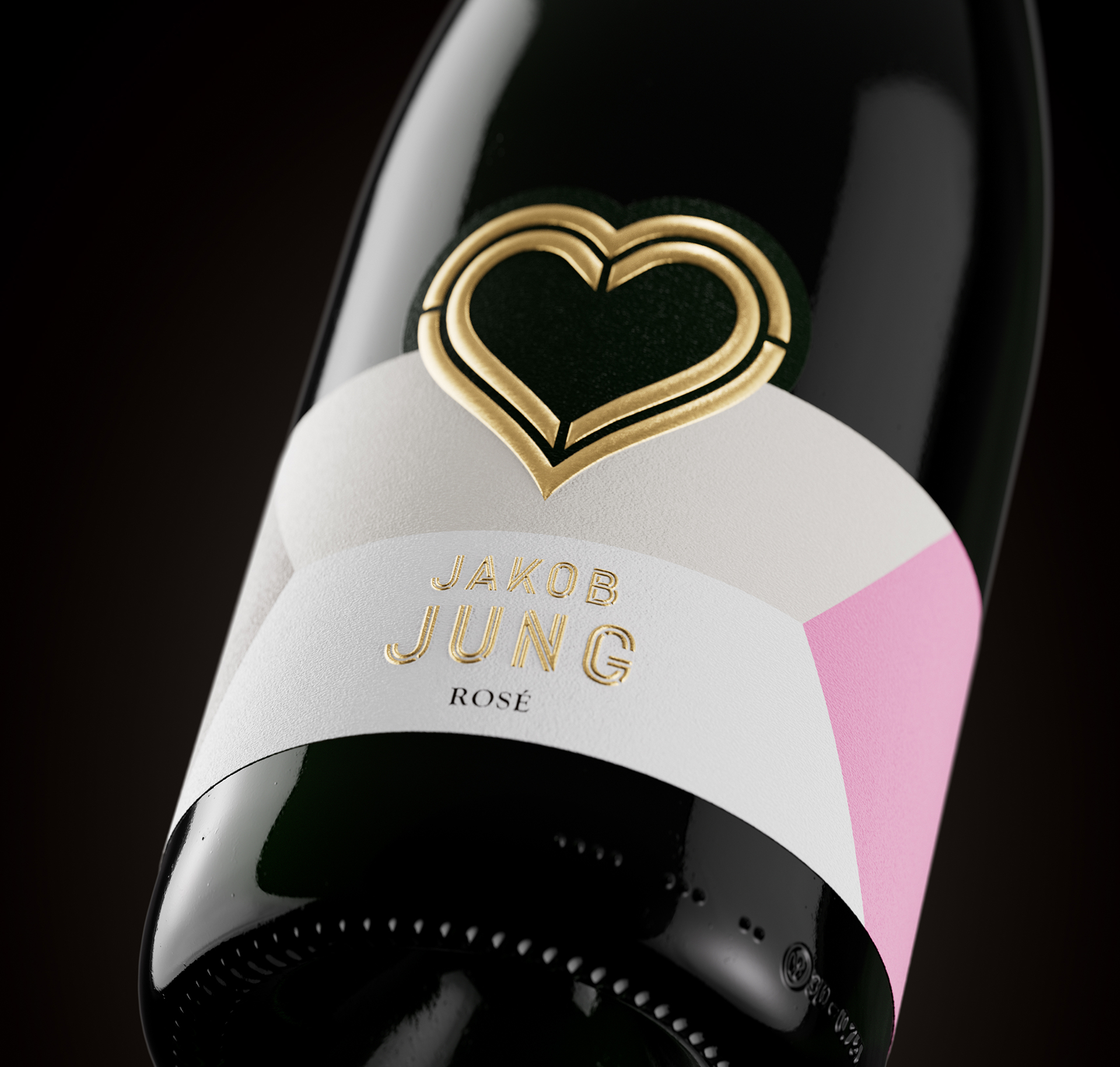
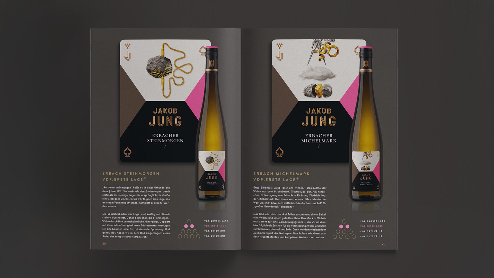
Jakob Jung’s four VDP quality levels are visually translated into the four French-suited card symbols: clubs, diamonds, hearts, and spades.
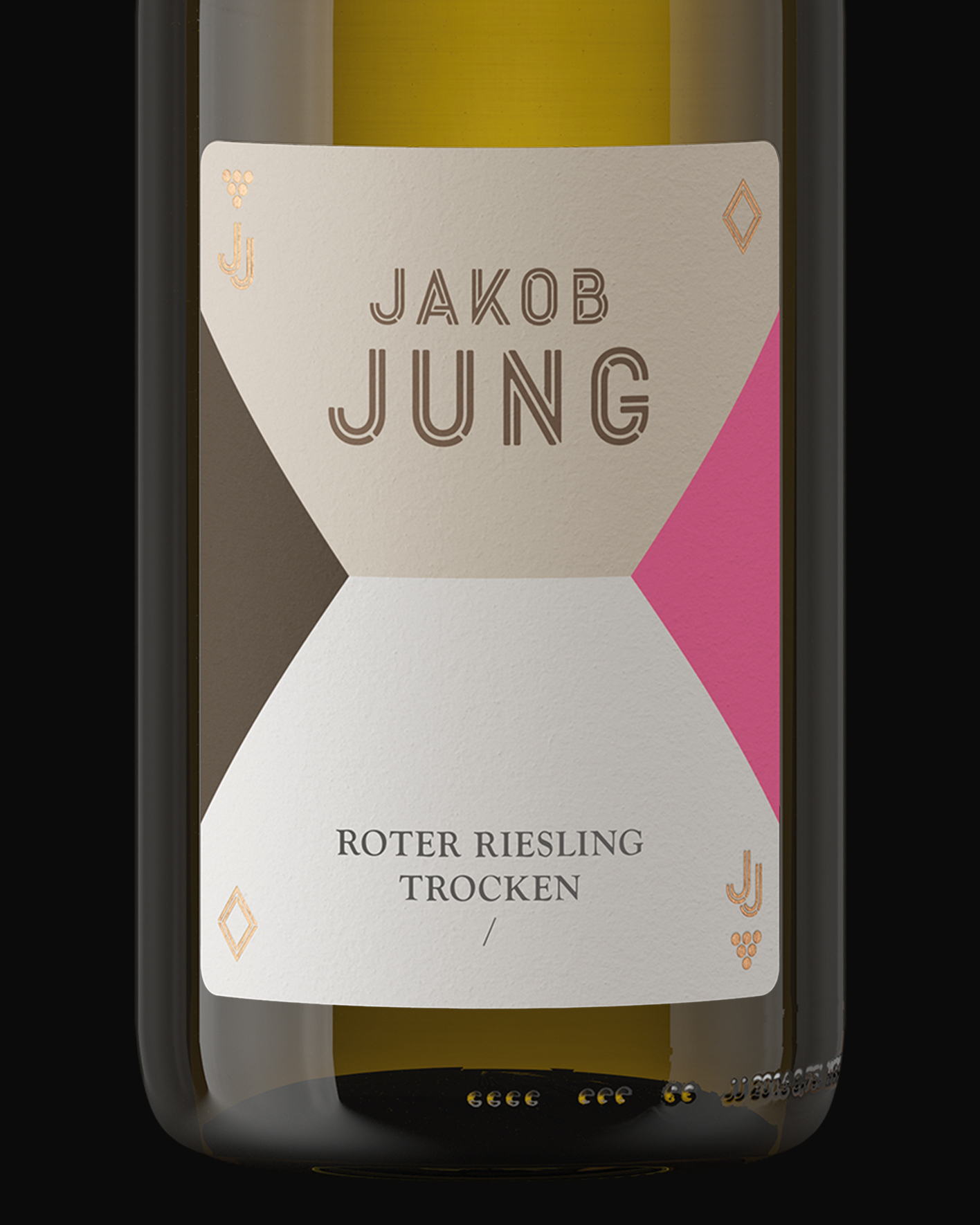




“I want to keep my pink!”
was Alex Jung’s only condition. Otherwise it was carte blanche.
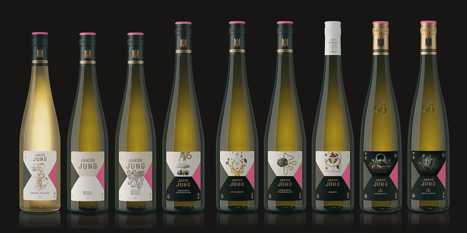
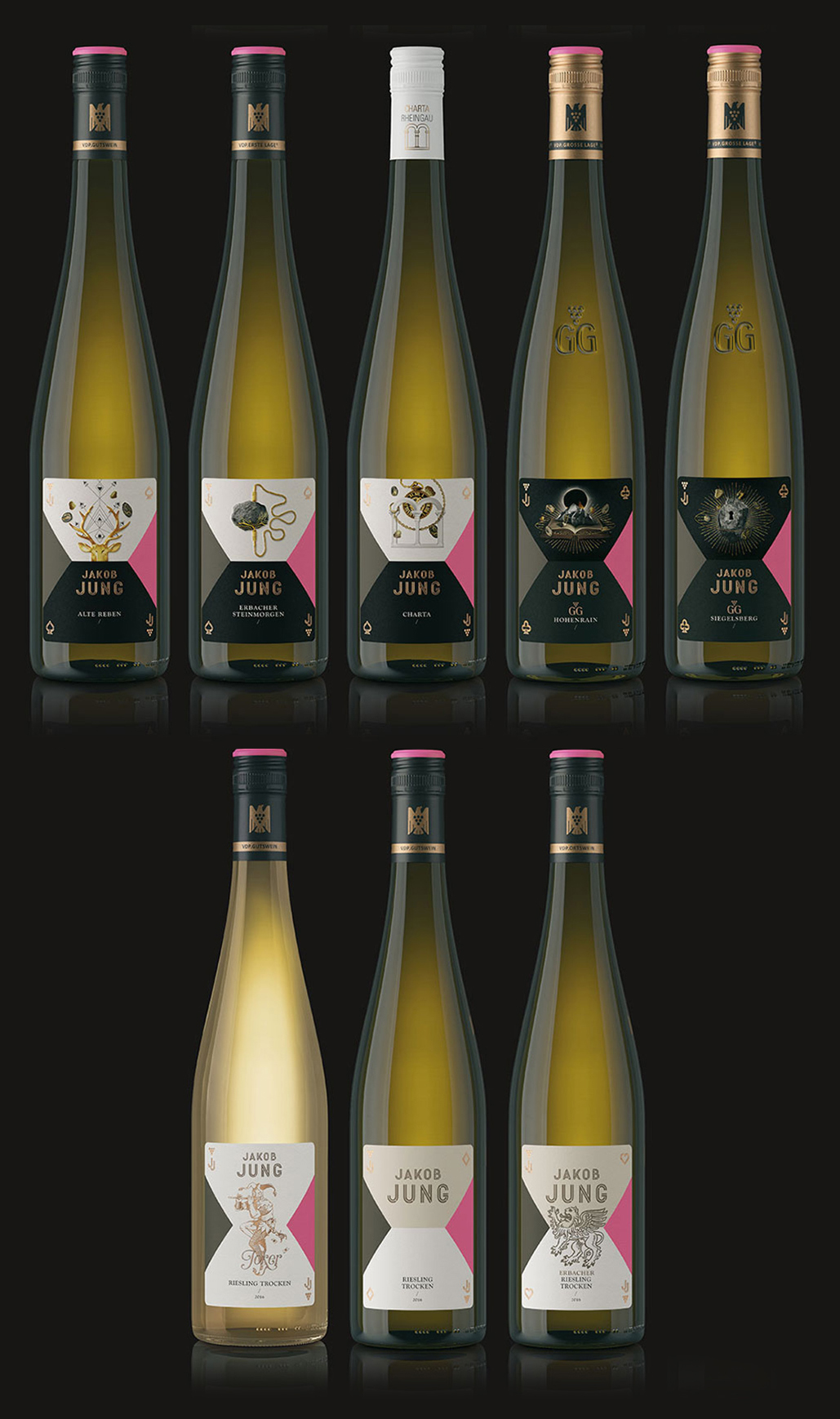
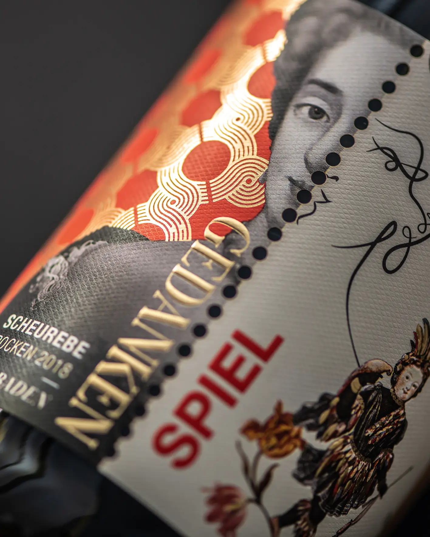
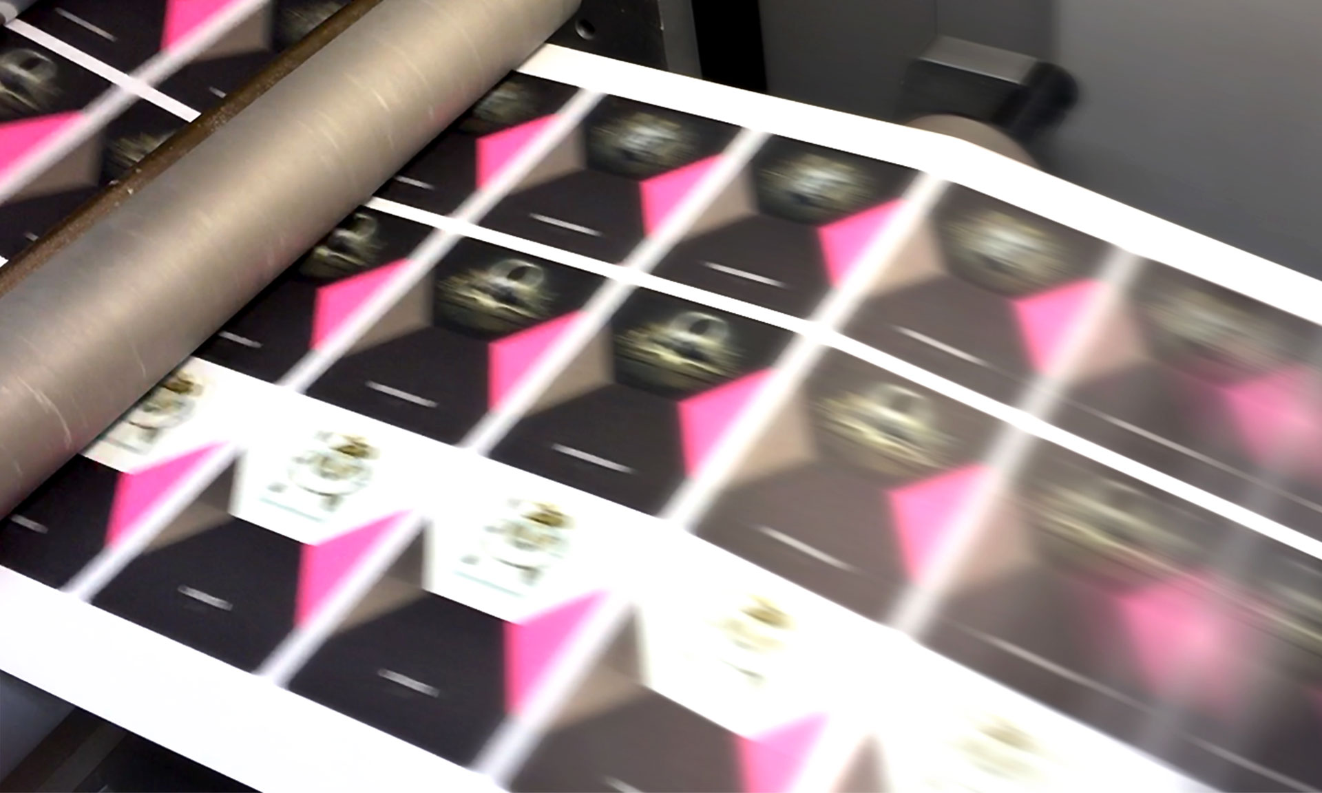
The labels aren’t just pretty; they’re a visual code. White for Gutswein, grey for Ortswein, black for Lagenwein, and richly illustrated for the Große Lage wines.
The Design System plays with light, shadow, and symbolism. Each label represents a card from the same deck, but with its own personality. The result? Maximum shelf impact and instant recognition for buyers and sommeliers alike.
Sekt
We extended the card suit system to the sparkling wine line, using the same principle with an adapted expression. Here, the symbols take center stage: clubs, diamonds, hearts, and spades act as clear visual markers of both quality and price range. A design that speaks to connoisseurs and collectors alike. A design that signals ambition without saying a word.
Print and CORPORATE IDENTITY
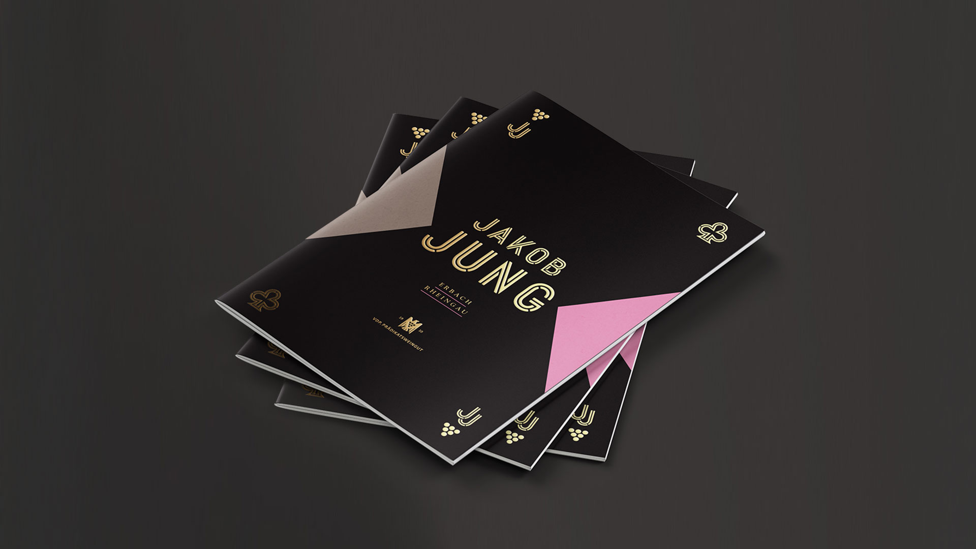
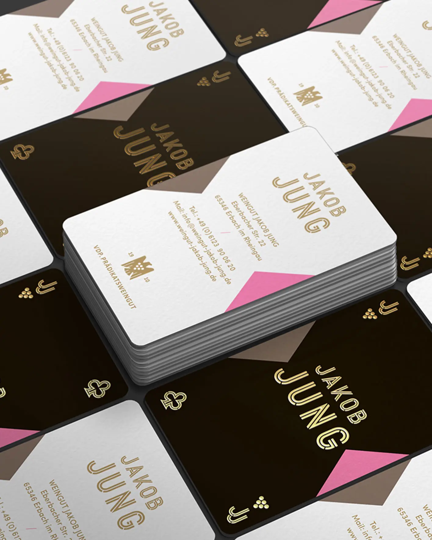
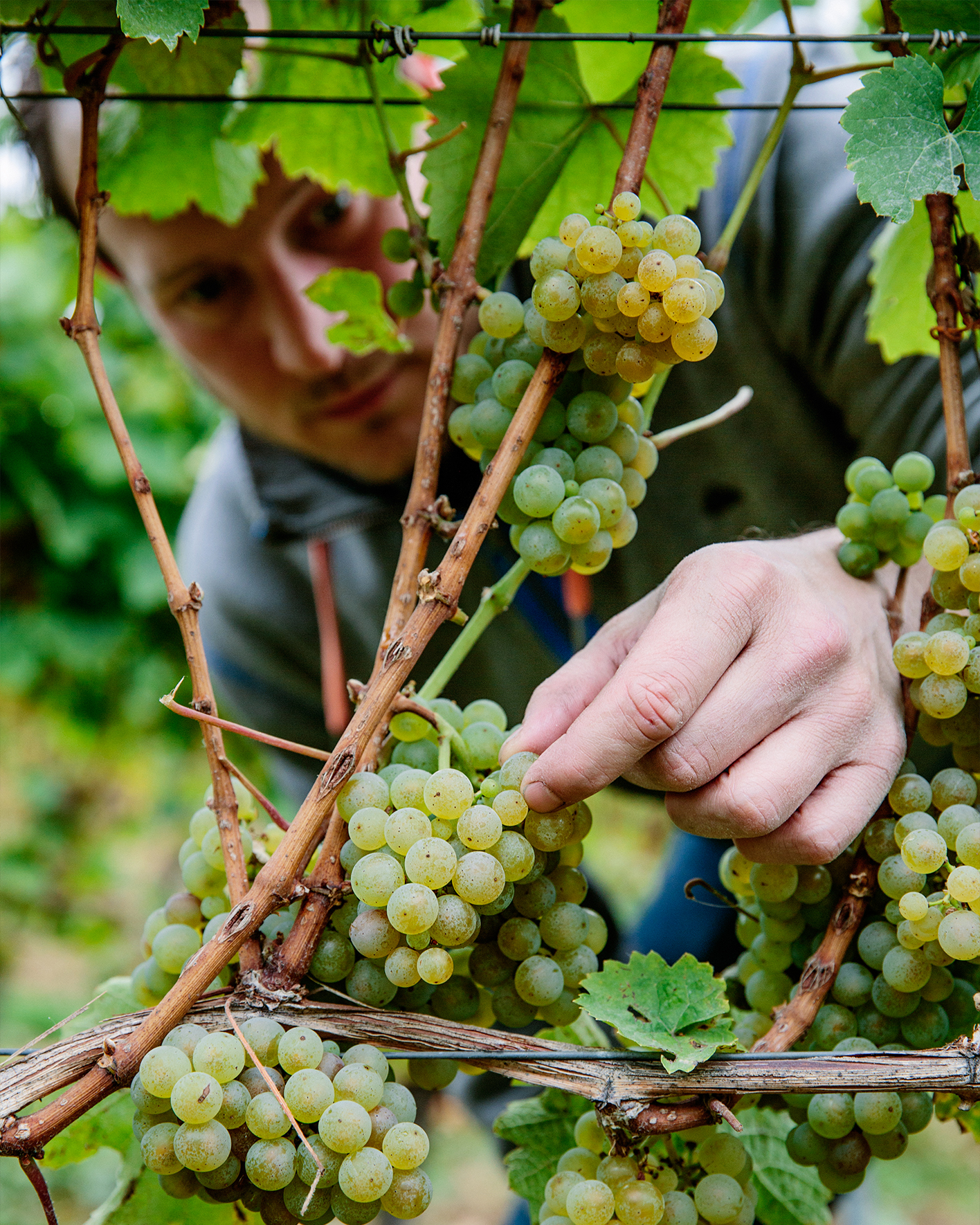
The iconic layout and suit-based brand system extend seamlessly into print: from business cards to letterheads and brochures, everything plays from the same deck. Paired with authentic photography and a tone of voice that’s as approachable as it is self-assured, the result is a brand presence that feels consistent, confident, and refreshingly un-corporate.

“Our partners always complained about the dull design, but now with your new design they have directly achieved a significant sales increase. Most importantly though, we were able to attract completely new dealers who became aware of us solely because of our labels!”

Alex Jung
Owner of the Jakob Jung Winery


web Design
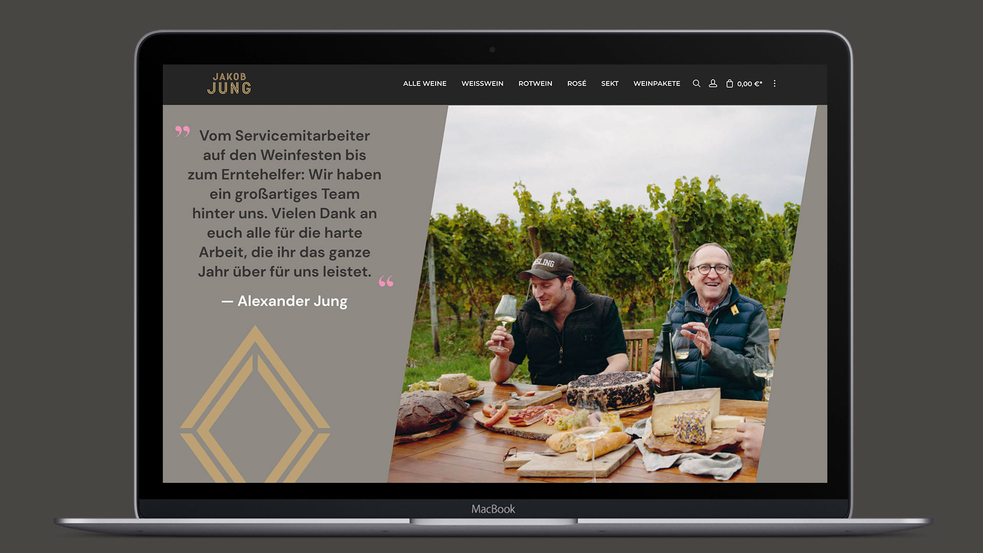
Forget dropdowns and templates: the Jakob Jung website is a journey. Designed as a horizontal scroll, users travel through dreamlike visual landscapes where wine, story, and brand values unfold. Built entirely without video or WebGL, the experience is fast, fluid, and rich in detail, proving that minimal tech can still feel magical. The site doesn’t just inform; it immerses. It’s no surprise it won Red Dot for digital experience.

Photos: Jakob Jung, Marta Greber, Ruska Martín | Renderings: Thomas Werle, Jakob Jung
Turns out…
… even a centuries-old winery can feel like a fresh hand in the game—when the design dares, the branding plays, and the wine speaks for itself. Cheers, Alex!
Hungry for more?
See related cases.