Saint Zur
Premium rosés are as common as sand on the Riviera. Beautiful, but interchangeable. HAWESKO wanted more: a design that states “this is not a drink, this is a way of life.”
Background
The client wanted a premium Provence rosé that doesn’t just taste good, but captures an entire coastline in a glass. Our task: to develop packaging and a story that make lifestyle, location and indulgence instantly visible and tangible.
Brief
The goal: a distinctive design that works both in the first digital encounter and physically at the POS. Packaging that stages the Côte d’Azur lifestyle with an iconic, fashion-driven twist.
Solution
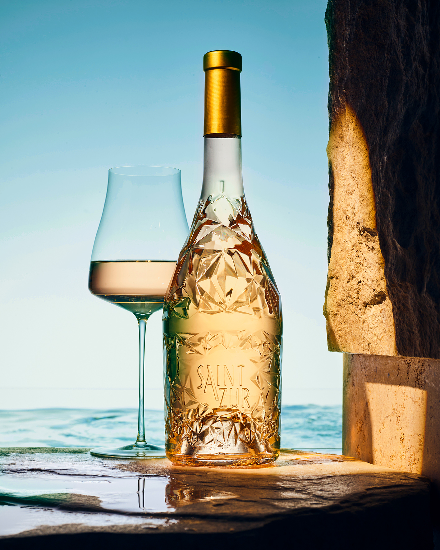
We developed the diamond-shaped bottle as a statement piece and combined it with an iconic wordmark – a subtle nod to the great fashion icons from Paris – as a self-assured signature. Inspired by the colours and light of the Côte d’Azur, the result is a design that sparkles – on screen and on shelf.
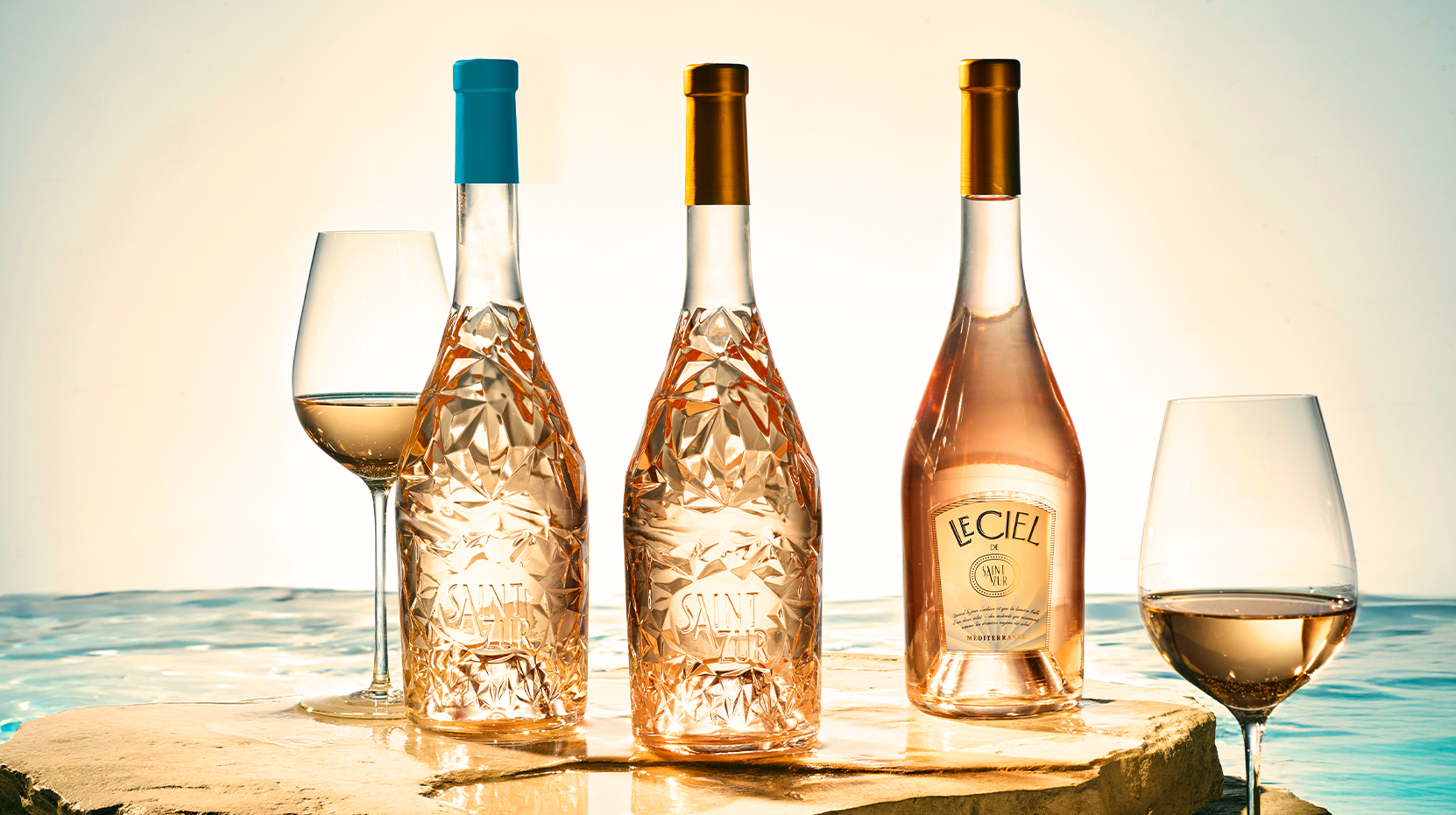

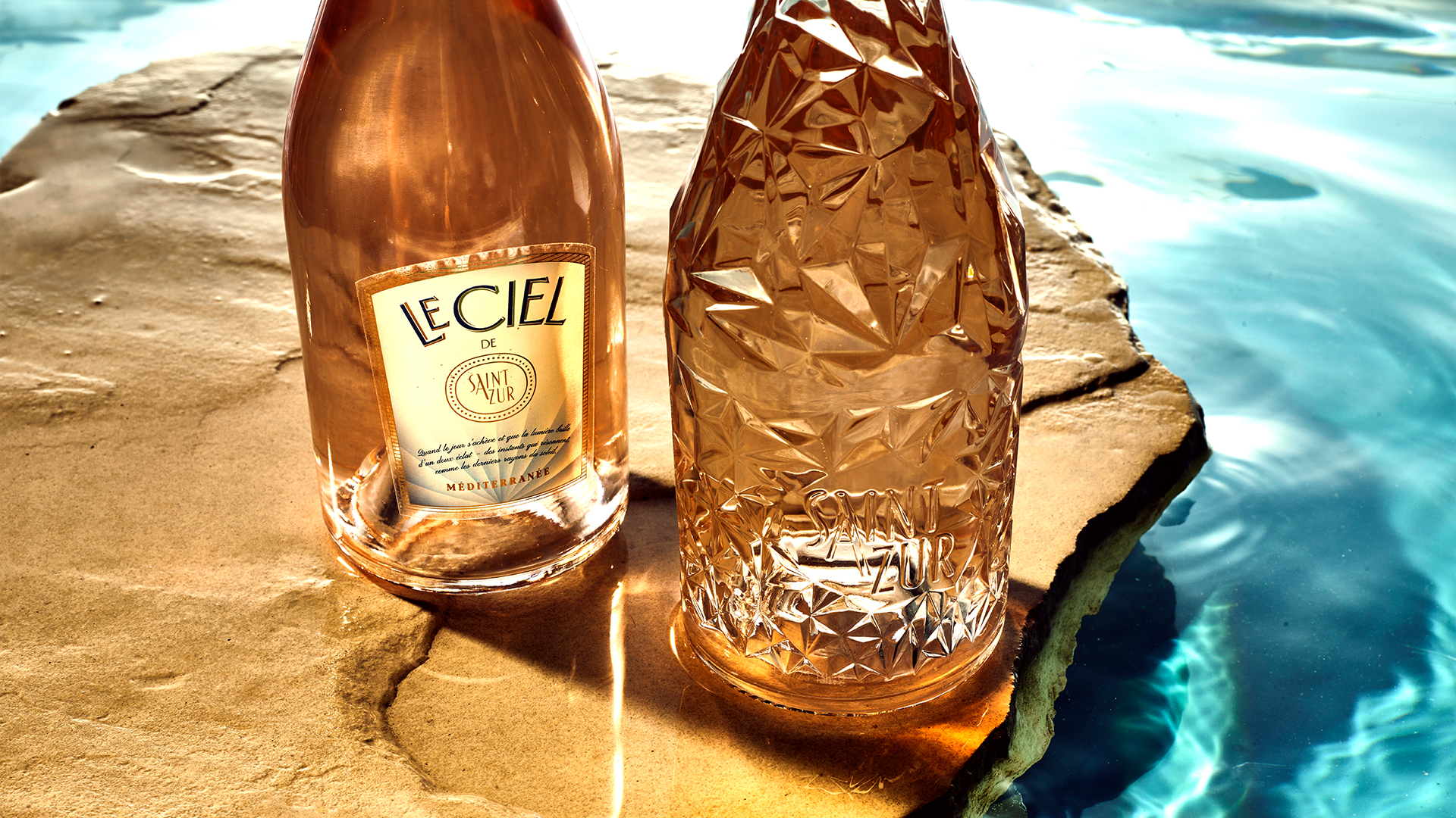
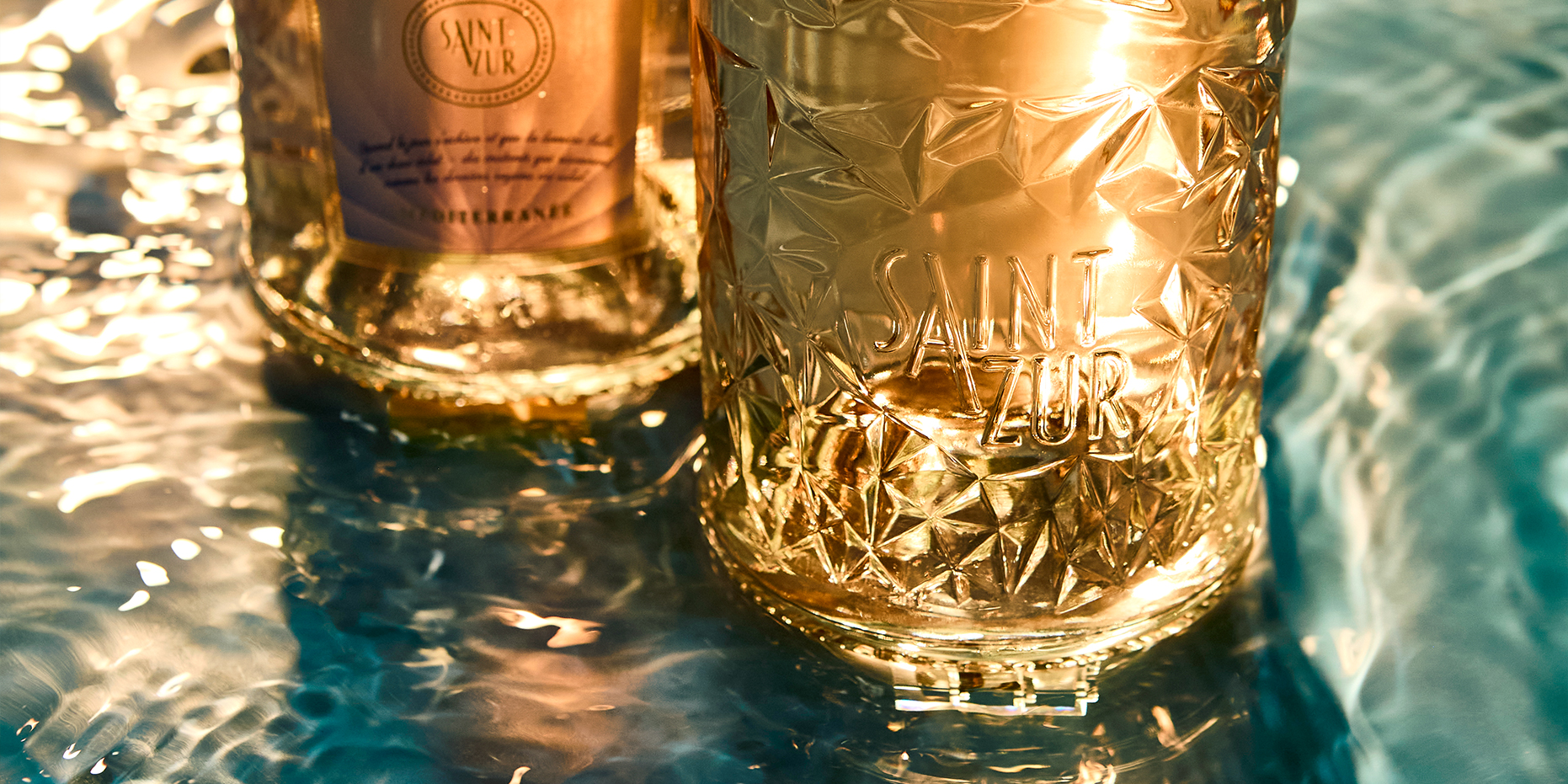
A bespoke diamond form that instantly commands presence. The facets catch the light and give the rosé a new stage. Alongside the iconic wordmark – a subtle nod to the great fashion icons from Paris – as a self-assured signature.
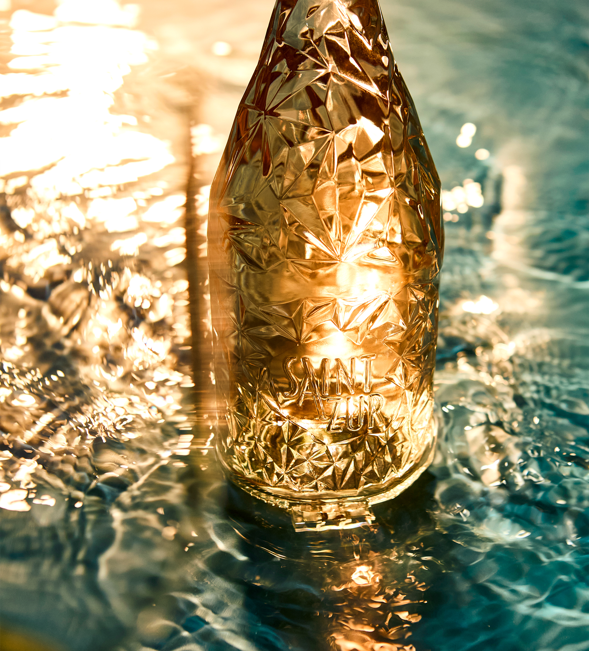
Photos: Oliver Schwarzwald
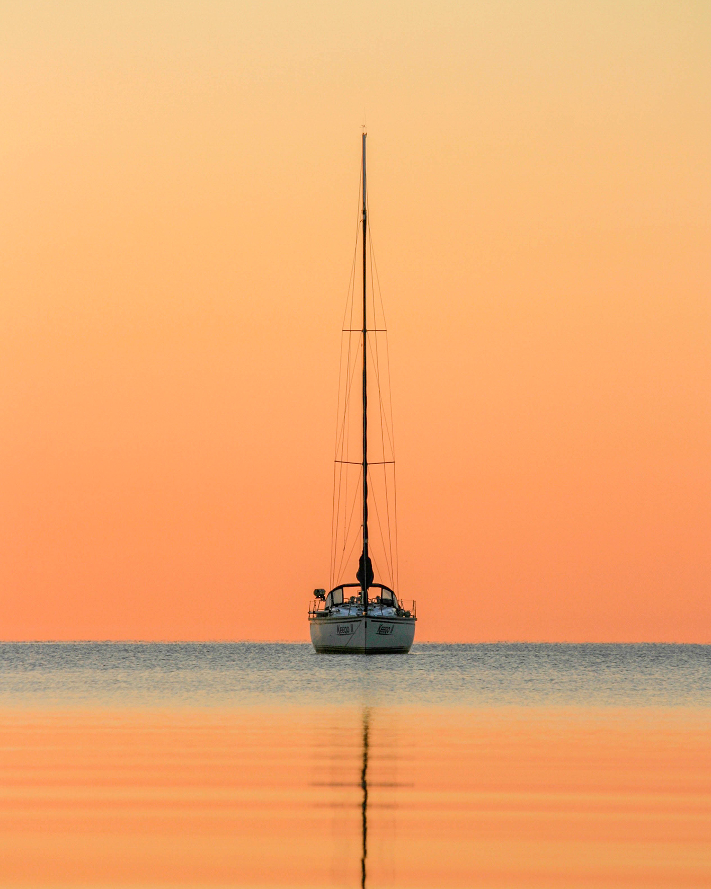
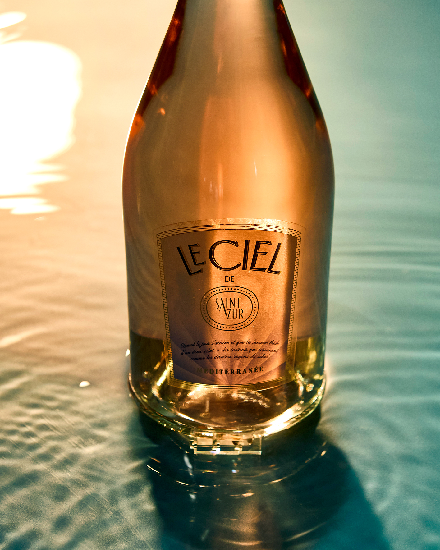
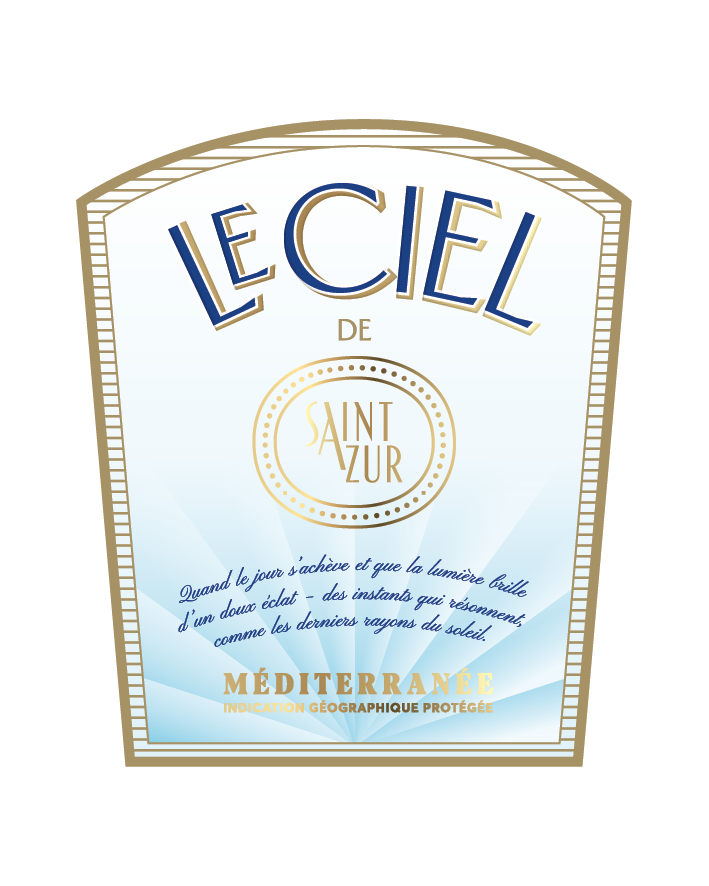
Le Ciel de Saint Zur
The younger brother with softer curves – for when the sun is low, the sea glitters, and the waiters on the beach move in slow motion. Less diamond, more daybed – but still 100% Côte d’Azur in a glass.
“For many years now, we have had the privilege of working with Ruska, Martin, Associates on numerous projects—several hundred to date. Time and again, we are impressed by their creative strength, high level of expertise, and professional approach. We greatly value this trusting collaboration and look forward to many more joint successes”

Felix Frommherz
Head of Corporate Brands – Hawesko Holding SE
Turns out…
… Saint Zur came, saw – and left HAWESKO’s warehouses faster than the sun sets in Cannes. The rest is just replenishment planning.
Hungry for more?
See related cases.