ST. Anthony Reserven
St. Antony. Rheinhessen. VDP. And Dirk Würtz, a winemaker who never plays to the lowest common denominator. Crafted together in a way that’s anything but predictable.
Background
The new Wine Series showcases rieslings of international renown, but by law, the famous vineyard names could not appear on the bottle. A paradoxical challenge: how do you communicate prestige when you’re not allowed to name the prestige?
Brief
Dirk: “I want connoisseurs to know exactly what they’re holding. But no one else.”
Us: “So, a label like a wink, for insiders, not the masses?”
Dirk: “Exactly. Minimalist, but with maximum impact.”
Solution
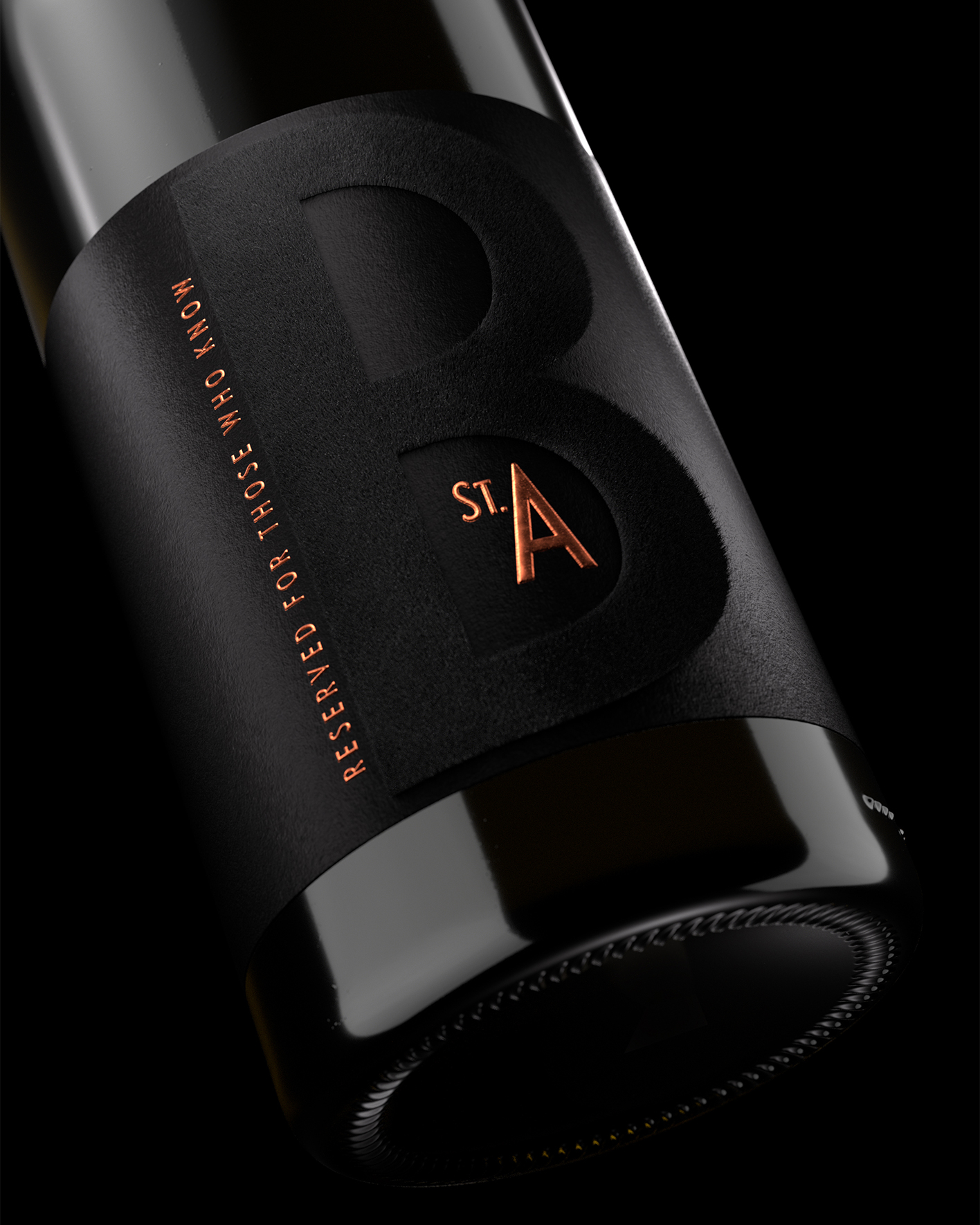
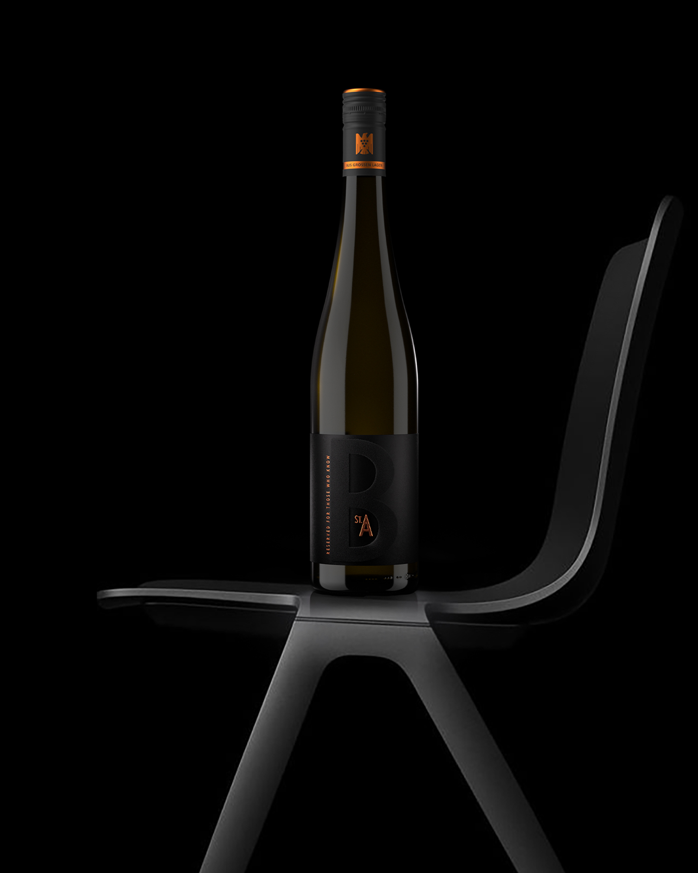
Our answer: reserved for those who know, a line that says everything without revealing anything. Instead of vineyard names, only the initial letter: an “O” for Orbel, a “B” for Brudersberg. Black velvet on deep black dyed paper, with the secret only revealed when the light hits. Cryptic, tactile, uncompromisingly reduced.
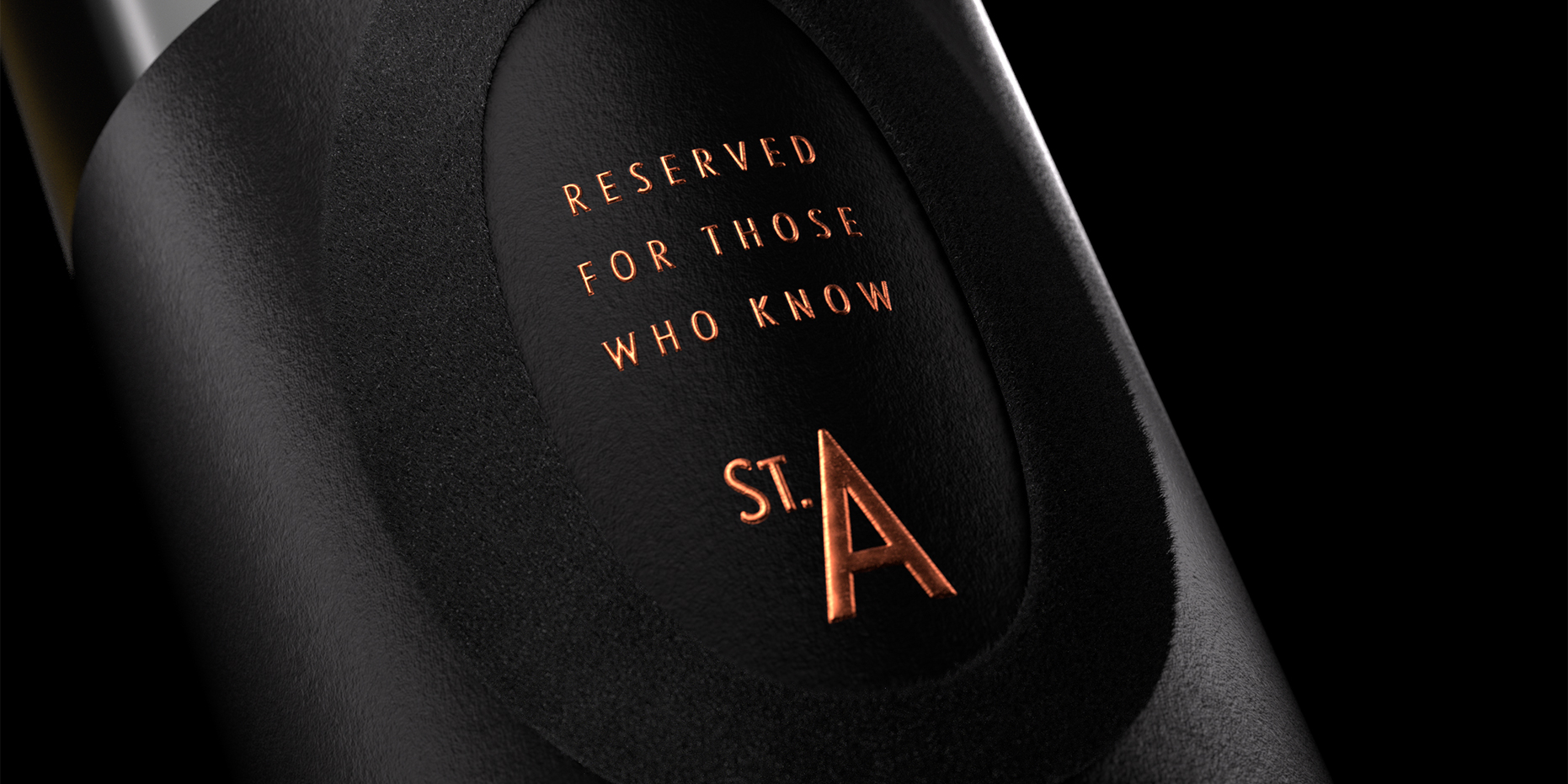


For those with a sense for style and substance: black velvet on deep black dyed paper, with the secret only revealed when the light hits. Cryptic, tactile, uncompromisingly reduced.

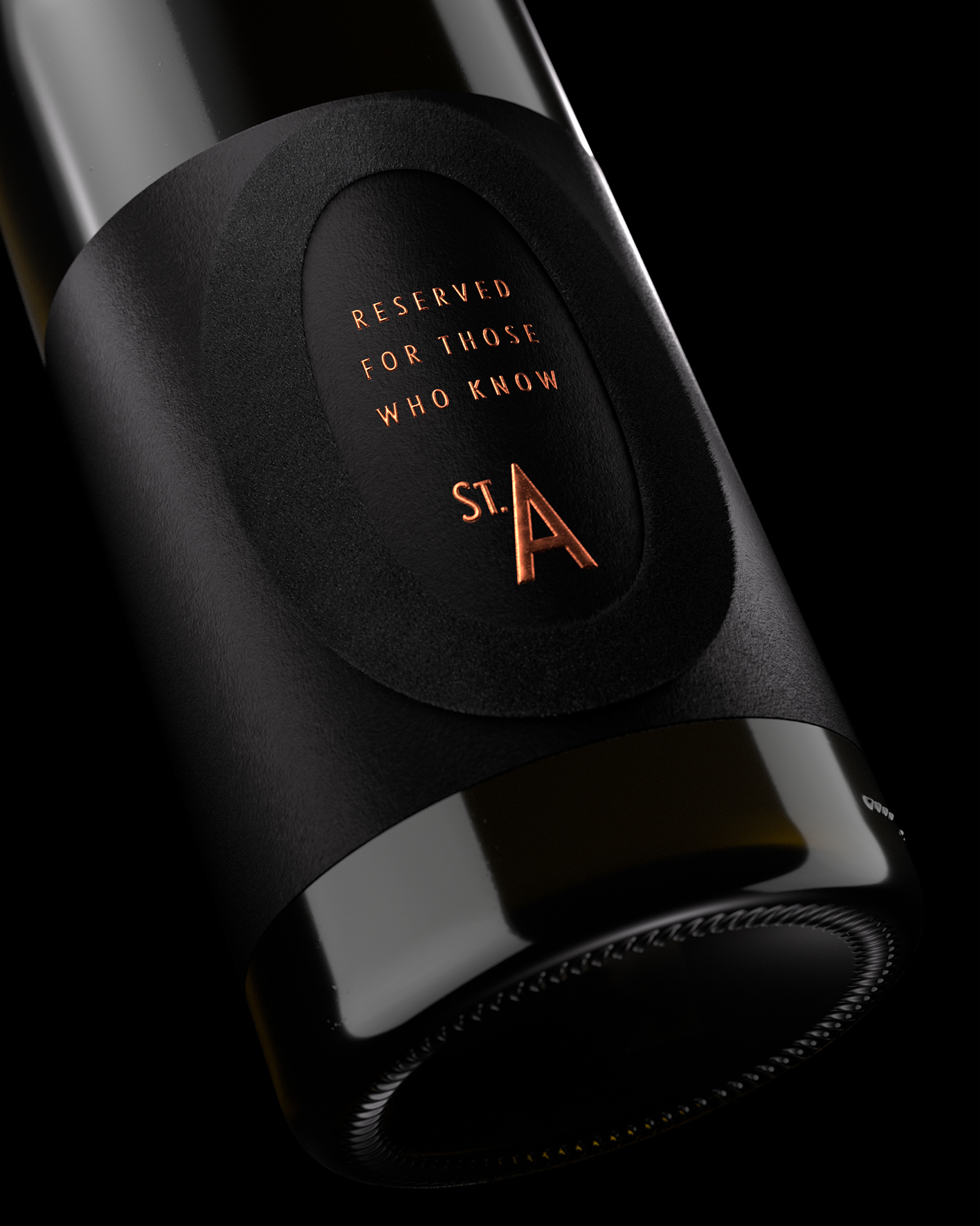
“We wanted a design that creates an instant connection but only with those who understand the code.
Black-on-black, a single letter, a line like a discreet handshake. That’s all it takes to turn a bottle into a legend.”
Turns out…
… sometimes, leaving things out is the loudest statement. The St. Antony Reserve line didn’t just get a label. It got a code. And in doing so, it became a design classic in its own right.
Renderings: Thomas Werle, Ruska Martín
Hungry for more?
See related cases.