Backhaus Schröer
Local ingredients, homemade sourdoughs and family craftsmanship since 1951. The only problem? Their brand looked like a chain store. Our concept: a relaunch that makes premium visible and irresistible – long before the scent hits the door.
Background
Since 1951, Backhaus Schröer has been baking breads, rolls and cakes by hand – using local ingredients and no premixes. Yet in the market, the brand was increasingly seen as a “chain bakery.” The blue-and-yellow colour scheme felt more discount than handcrafted.
Brief
Create a new visual identity that positions Schröer as a regional, family-run bakery with genuine craftsmanship. Deliver a new logo, interior design concepts, a unified POS look and a campaign that gets noticed.
Solution
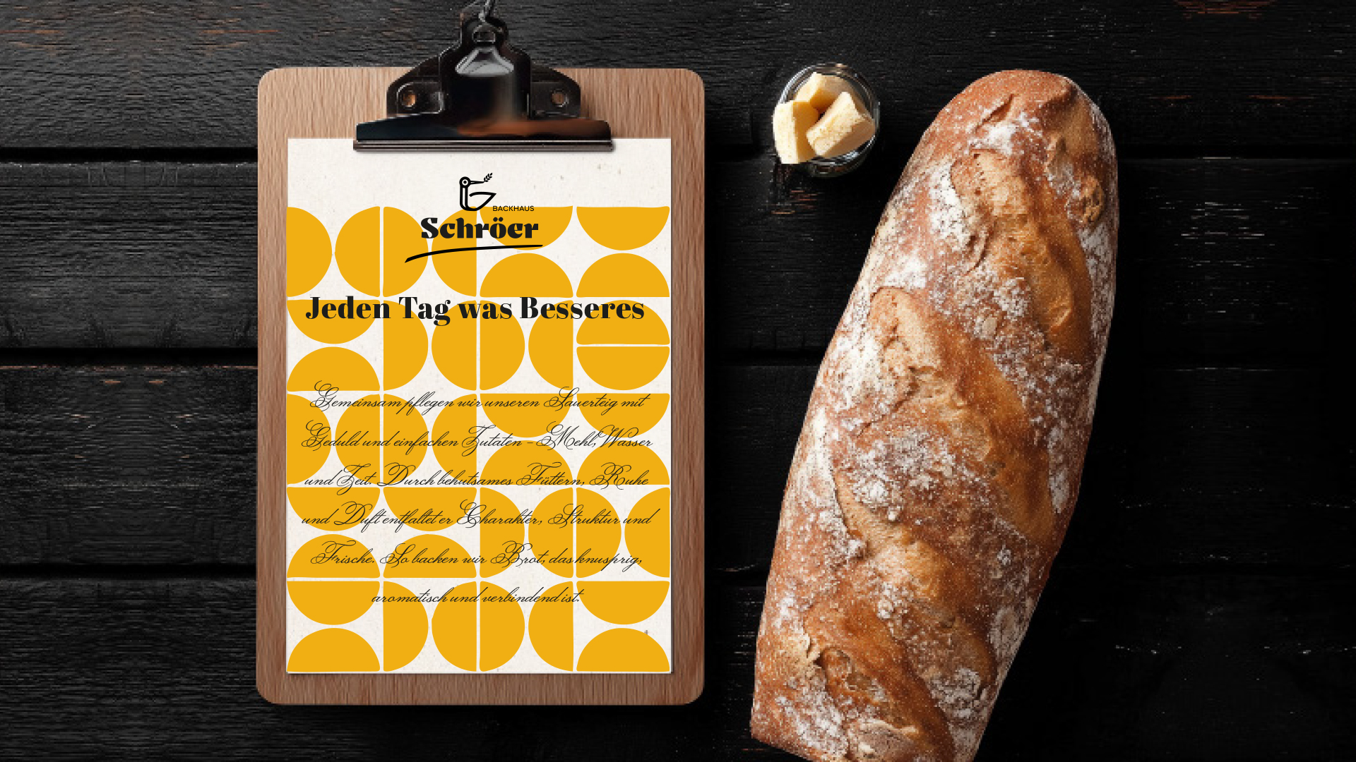
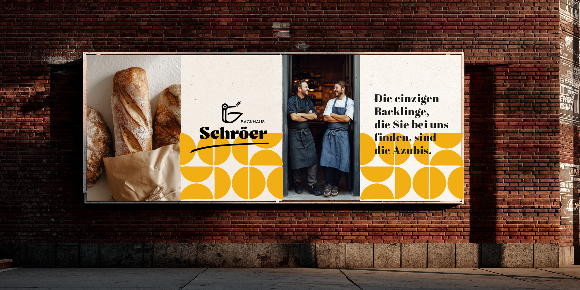
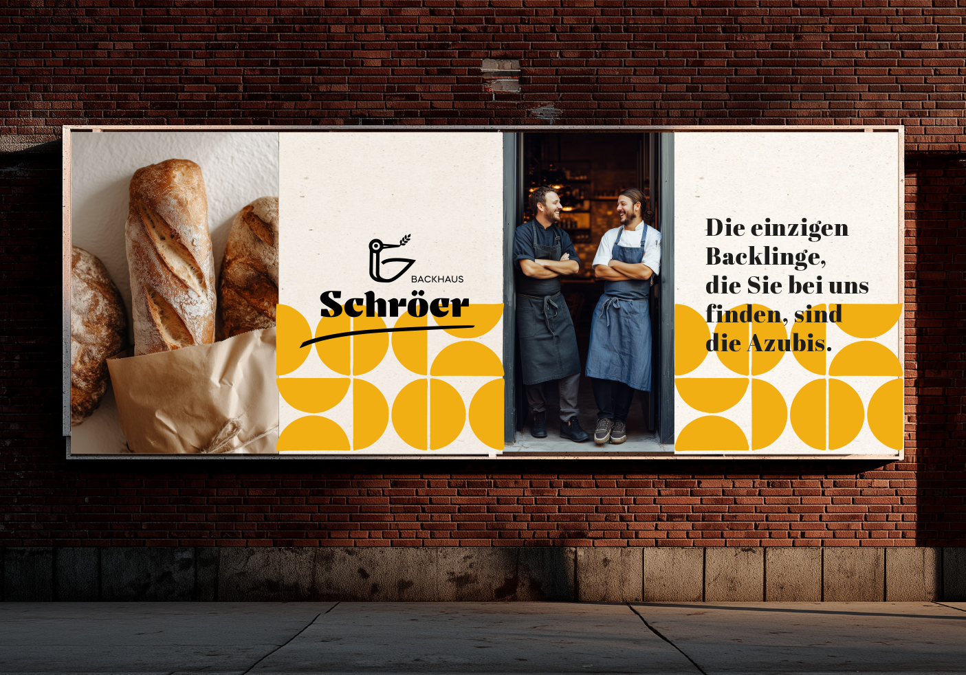
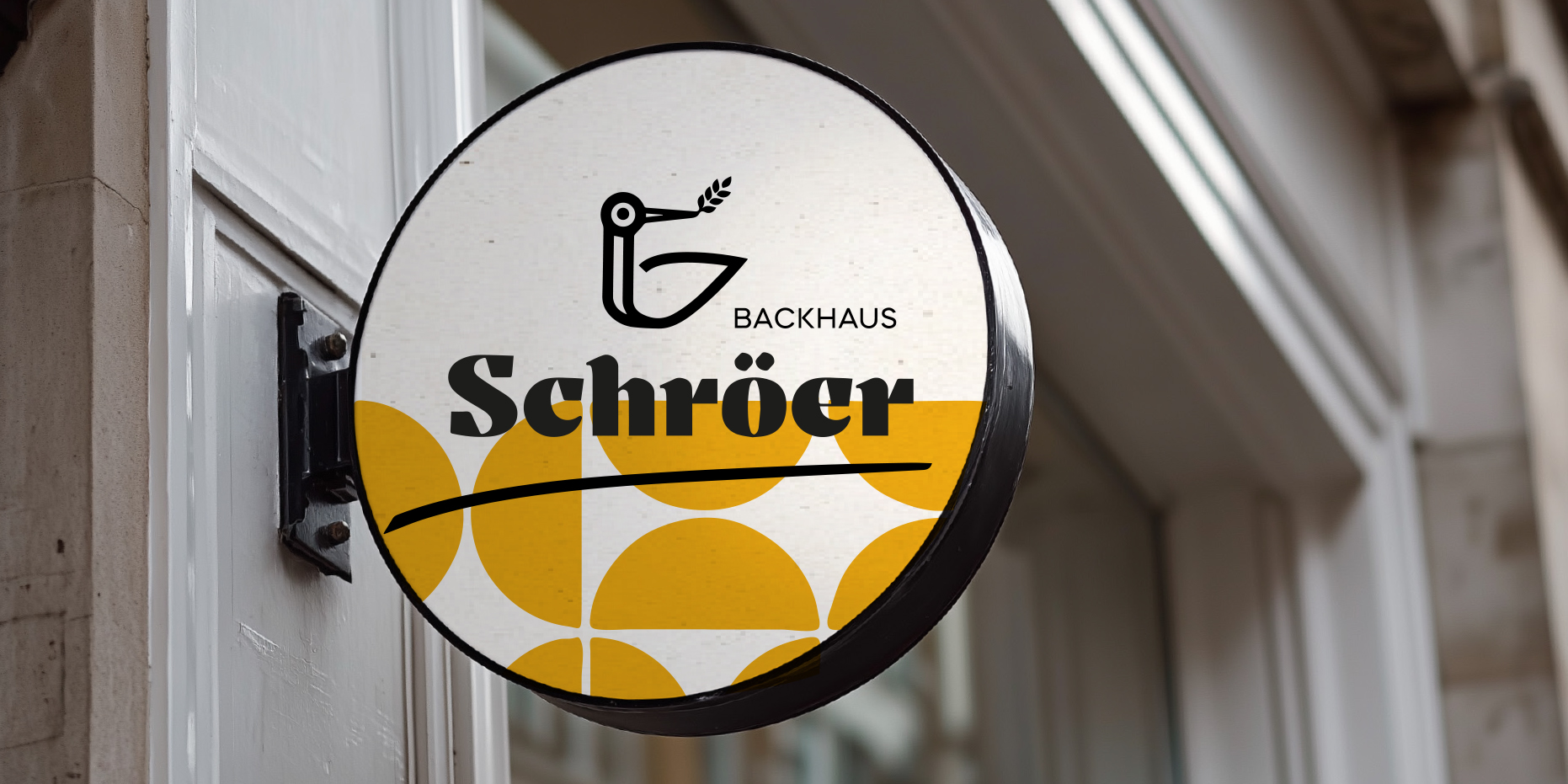
From logo evolution to full-on POS revolution. We created a modernised blackletter typeface, a flexible stork icon, a geometric bread-roll pattern, a sensually modern store concept – and a bold, humorous campaign that could hold its own on any city street.
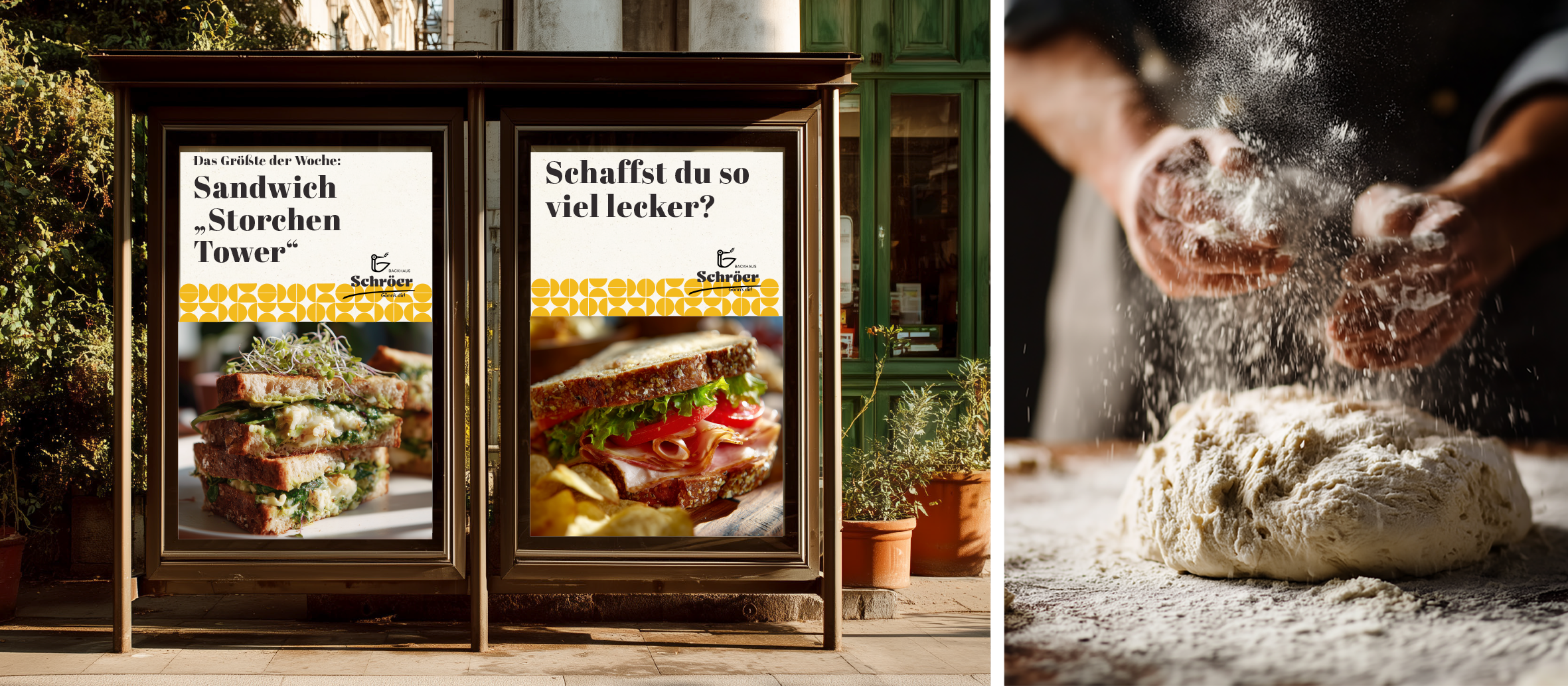
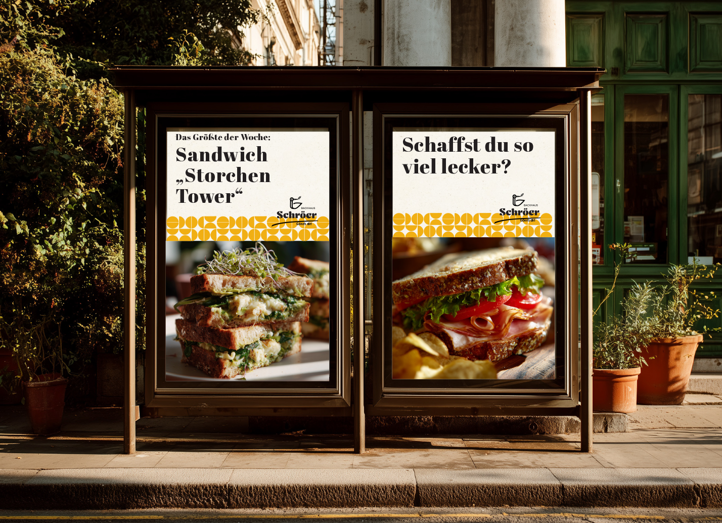

“A brand that smells like delicious bread and tastes like fresh-out-of-the-oven”

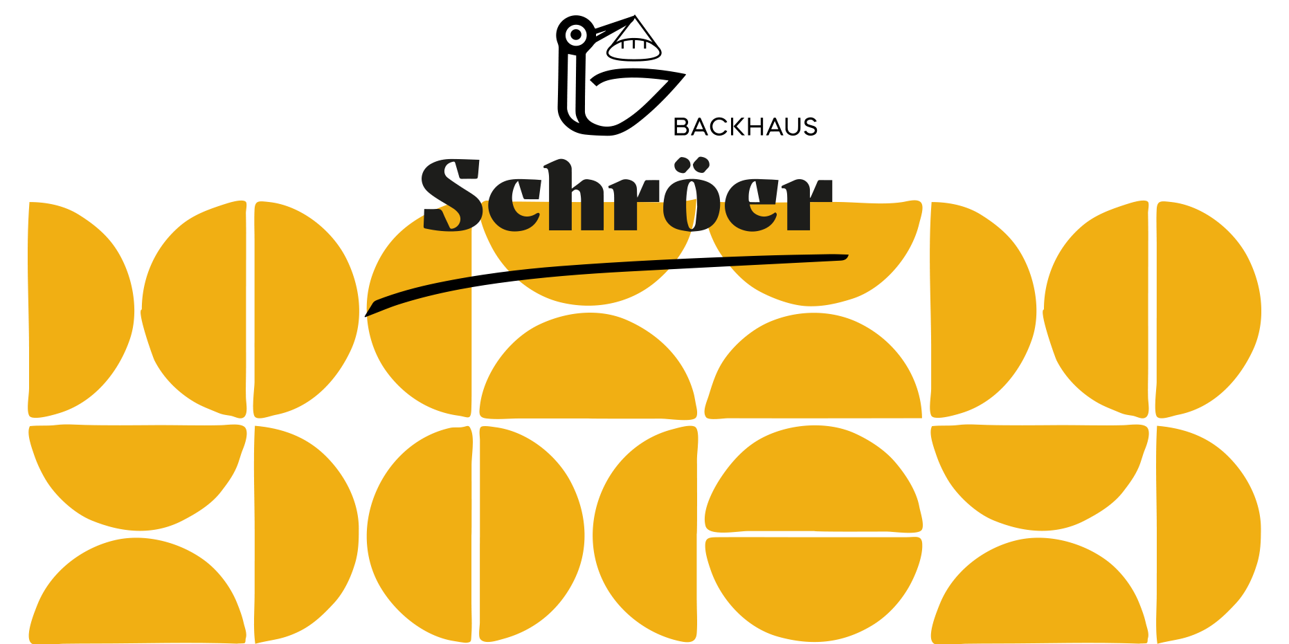

The Stork Delivers, in Black and White
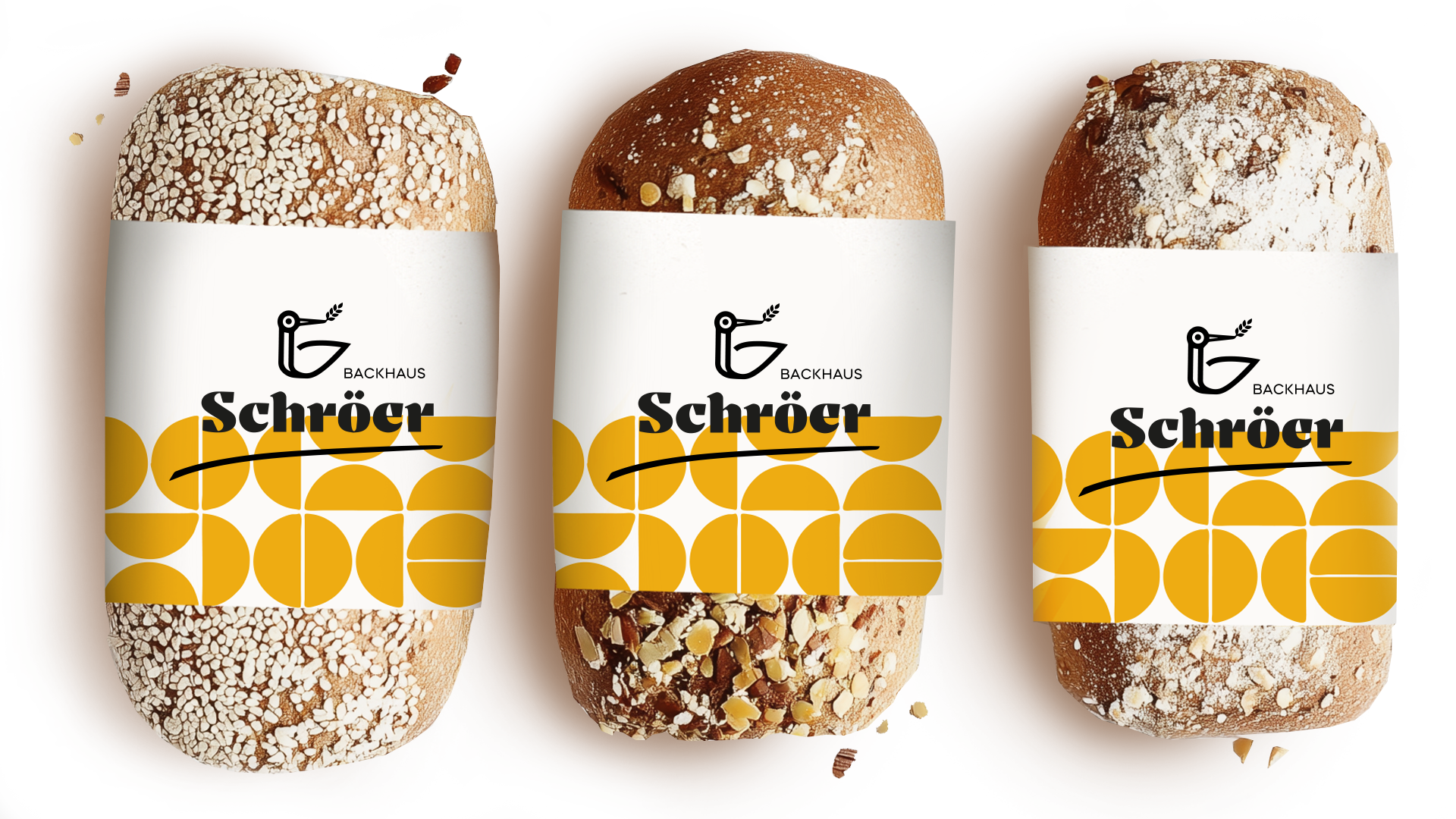
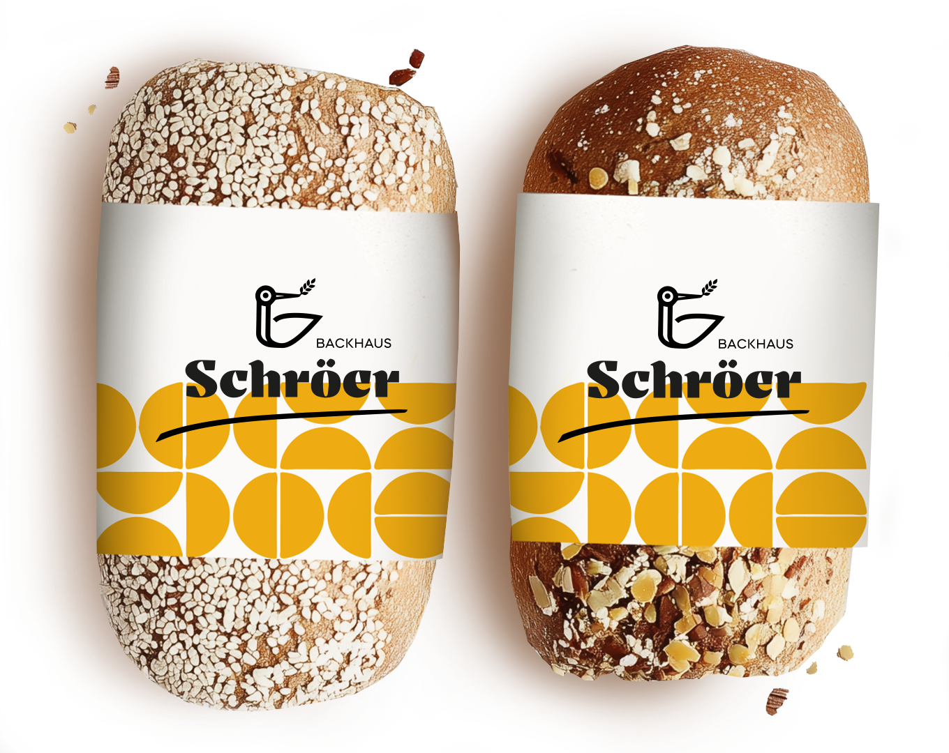
We ditched the discount-store blue and yellow, replacing yellow with a bold, geometric bread-roll pattern. The logo and stork now stood in elegant black on bright backgrounds.
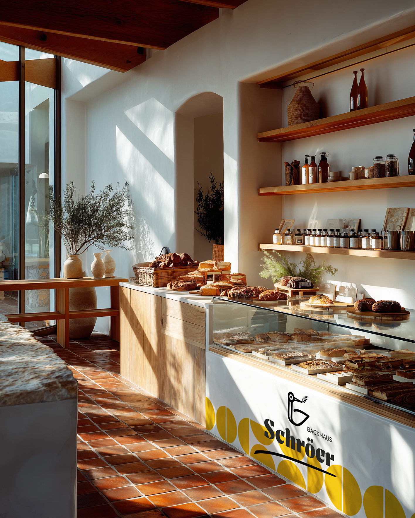
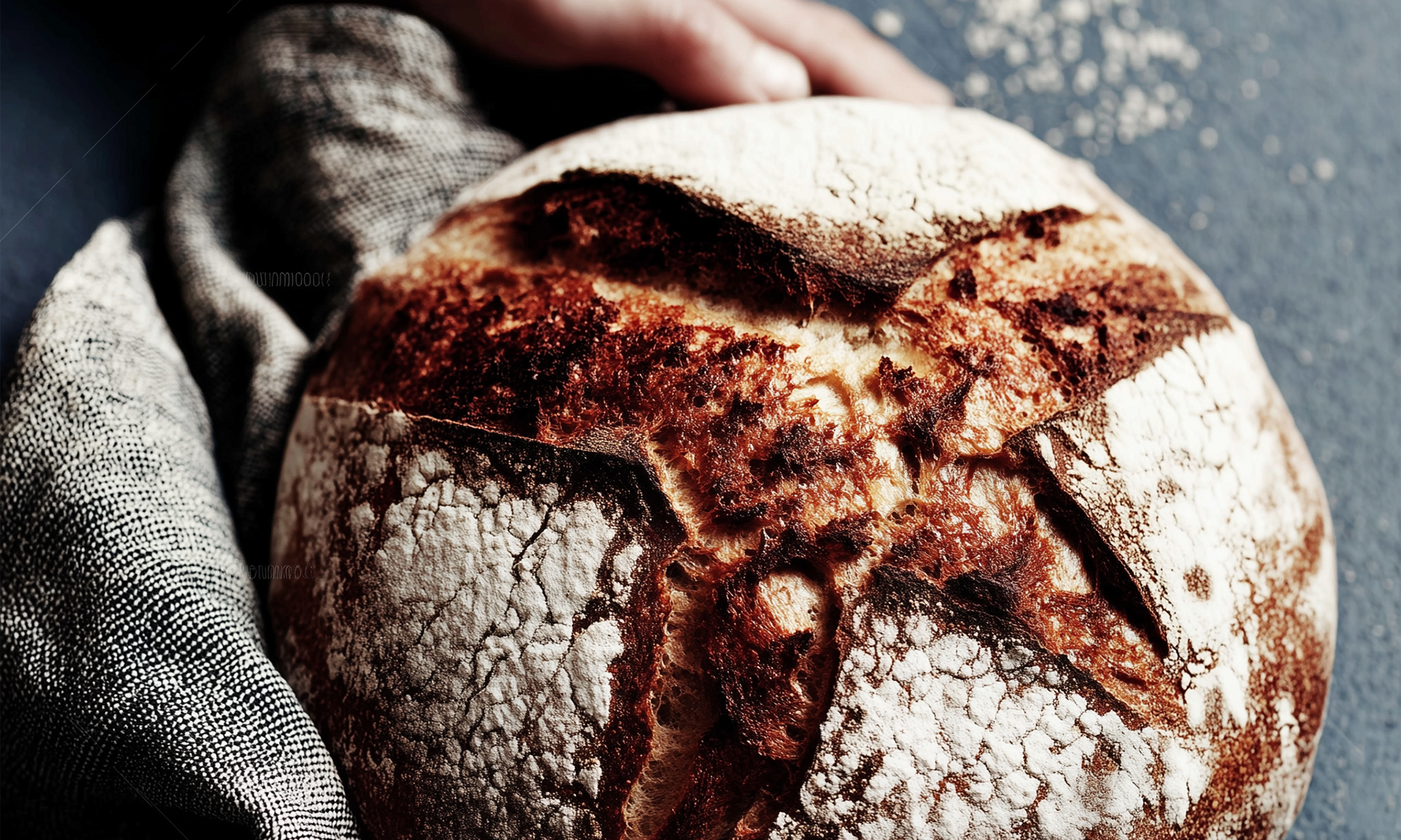
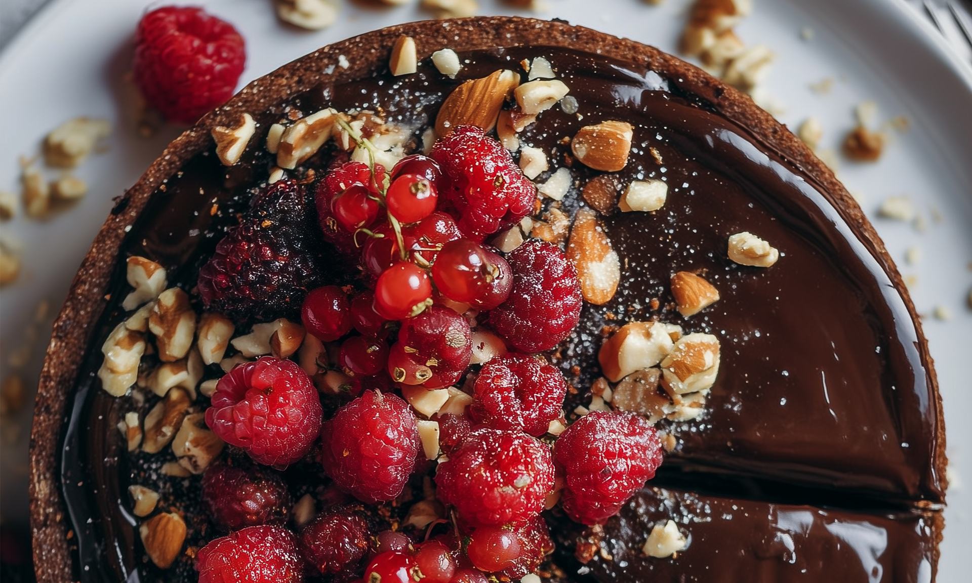
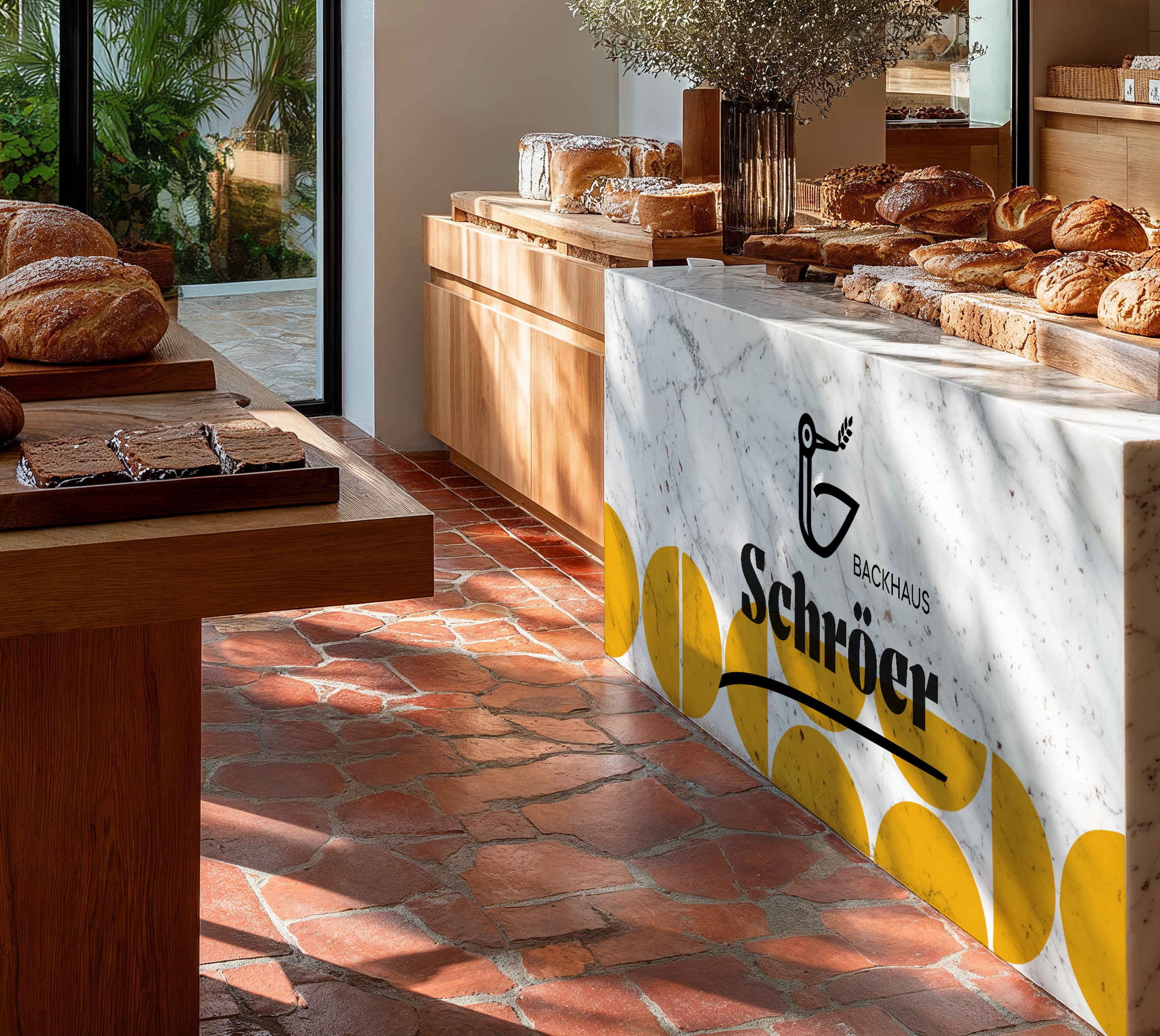
“The product displays should feel like galleries showcasing breads and cakes as one-of-a-kind pieces.”
Photos: Ruska Martín
Bread Displayed Like Jewellery
We combined clean, modern lines with tactile, earthy materials: warm woods, rustic stone, sand-coloured walls and black accents. The product displays felt like galleries, showcasing breads and cakes as one-of-a-kind pieces. The roll-out plan: start with flagship stores as brand beacons, then update the rest over time.
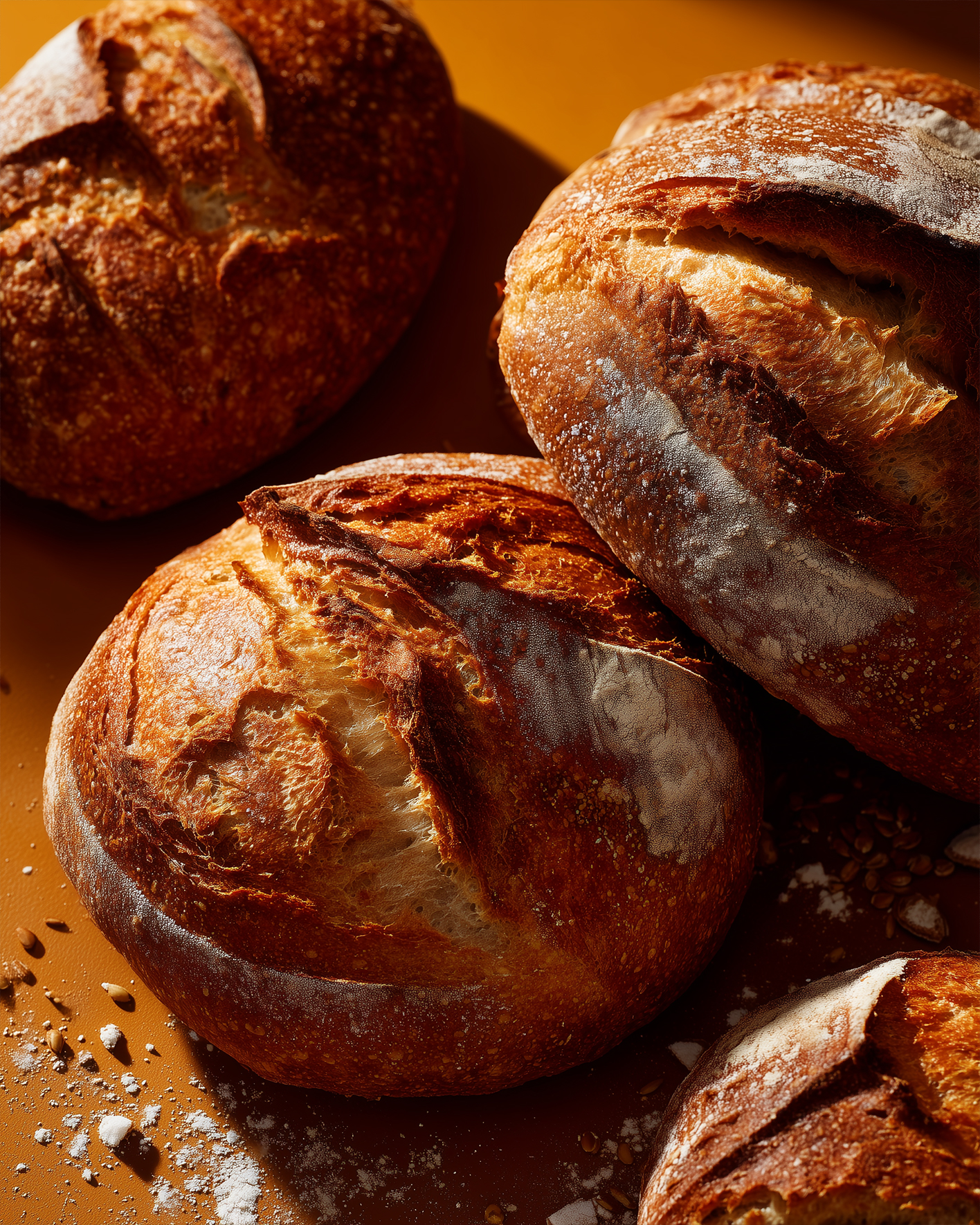
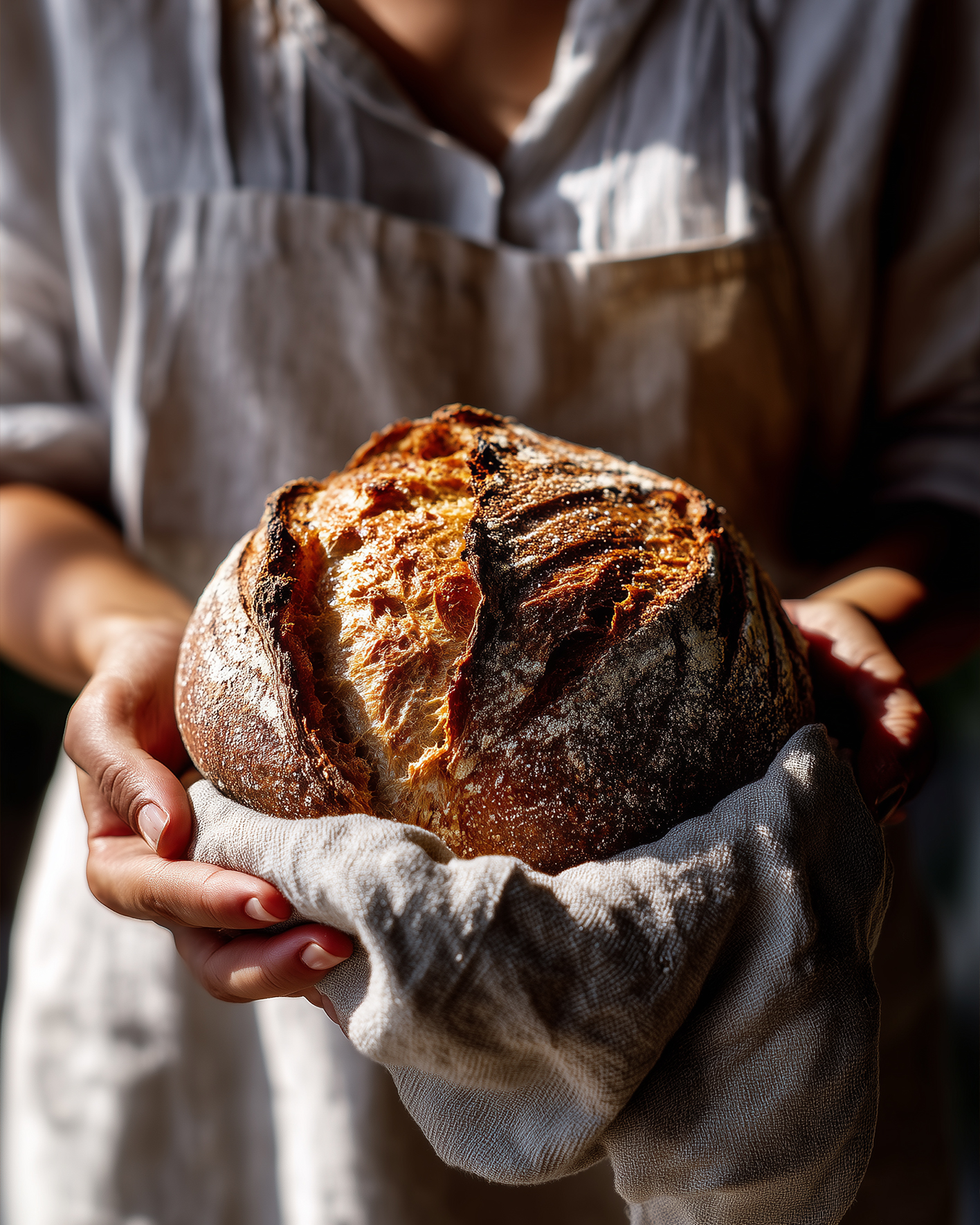
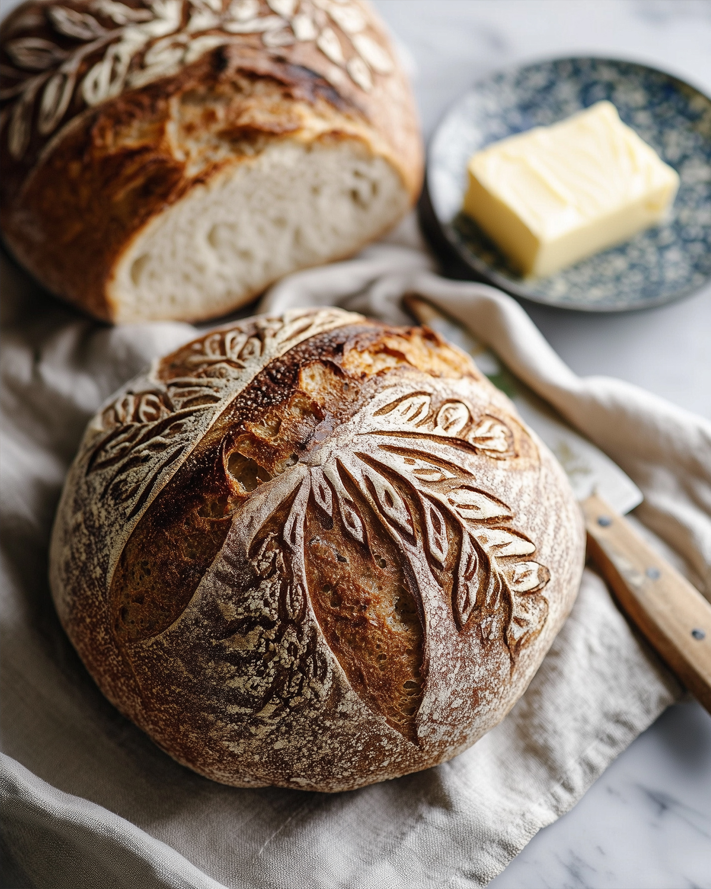
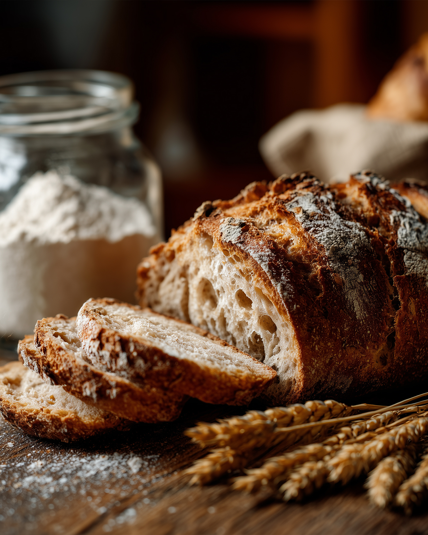
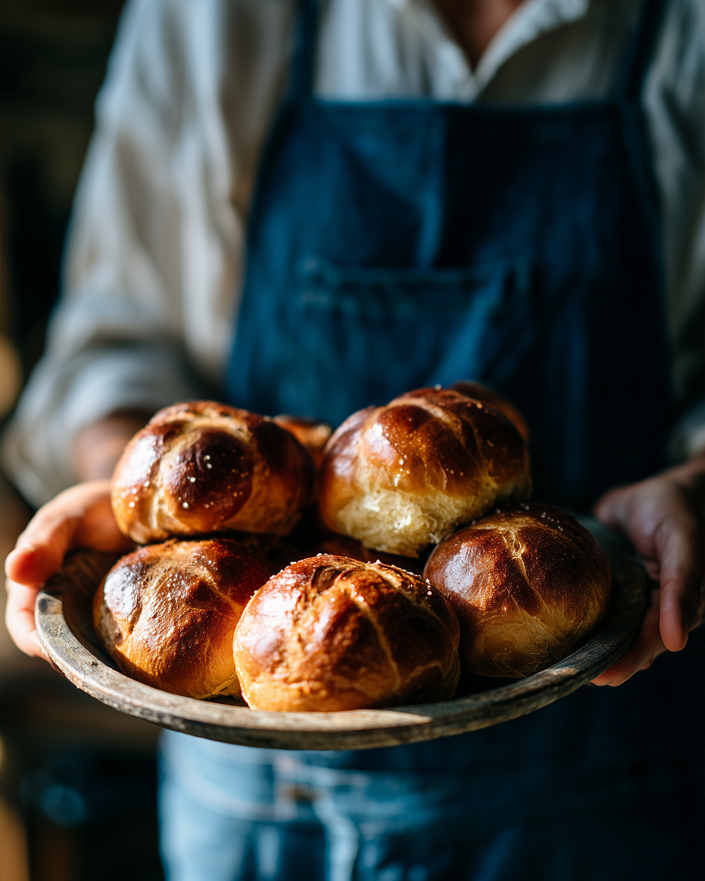
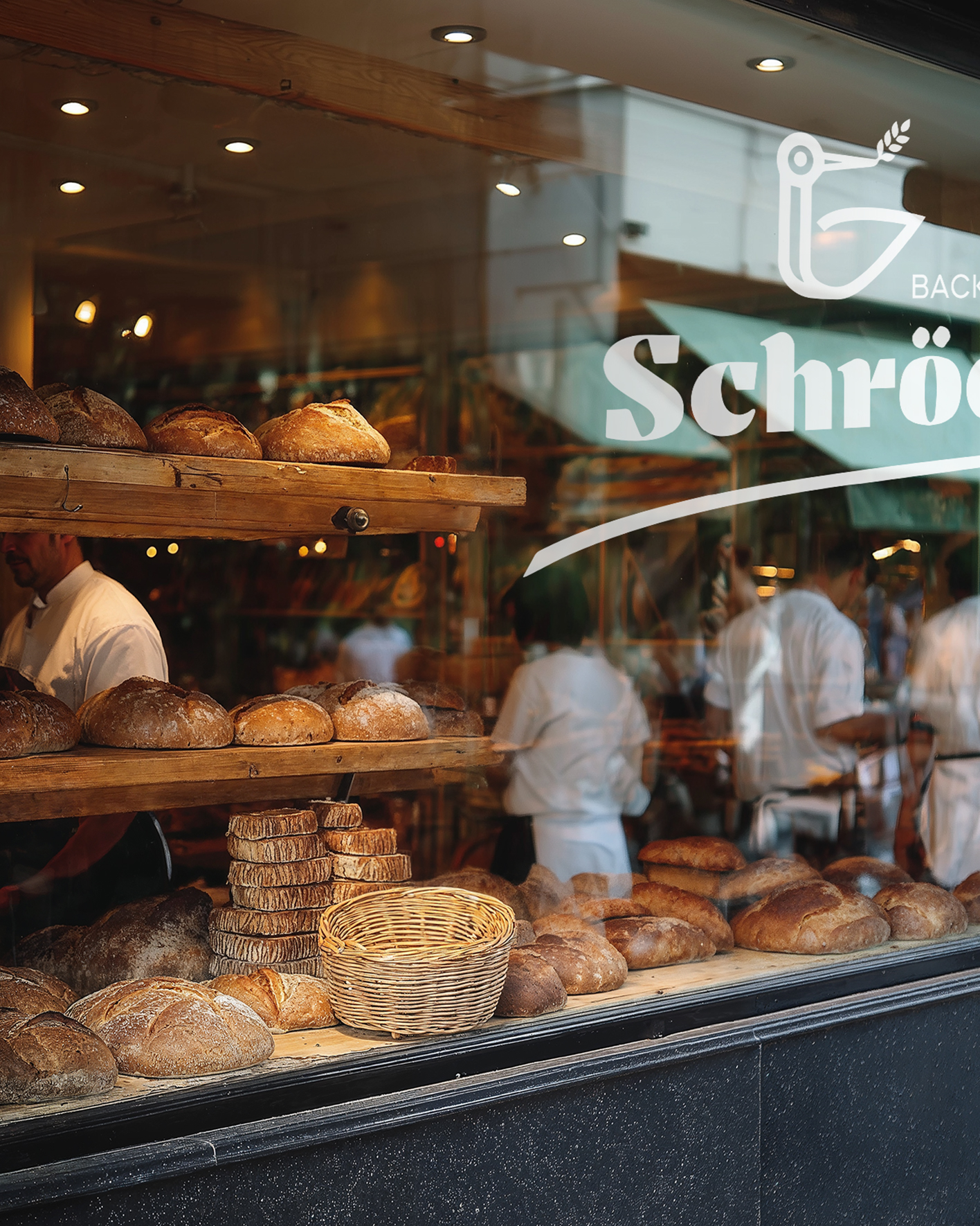

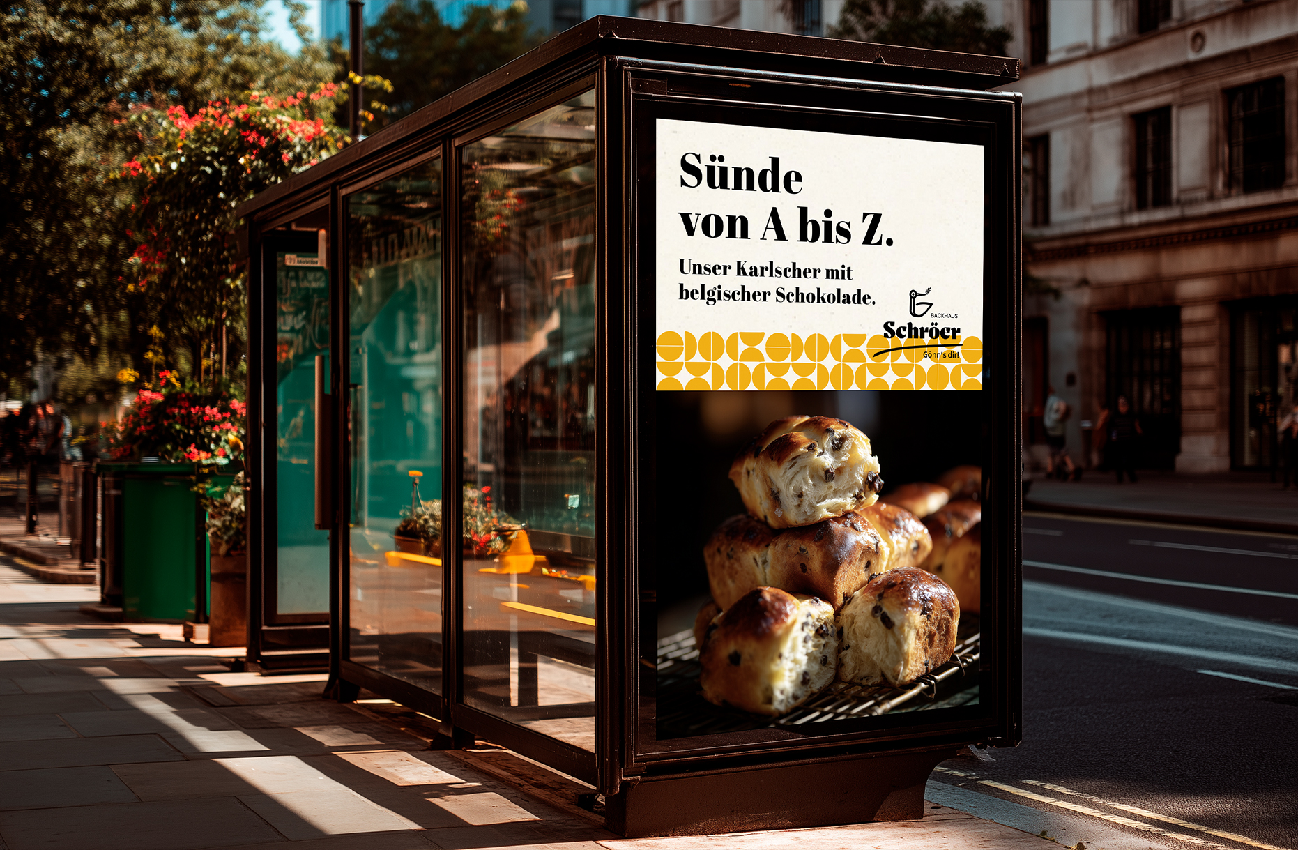
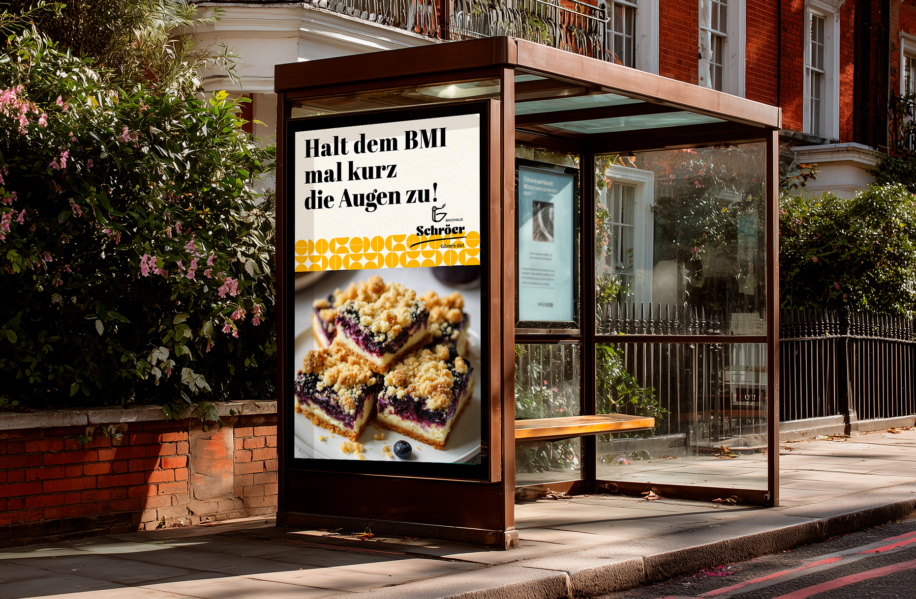
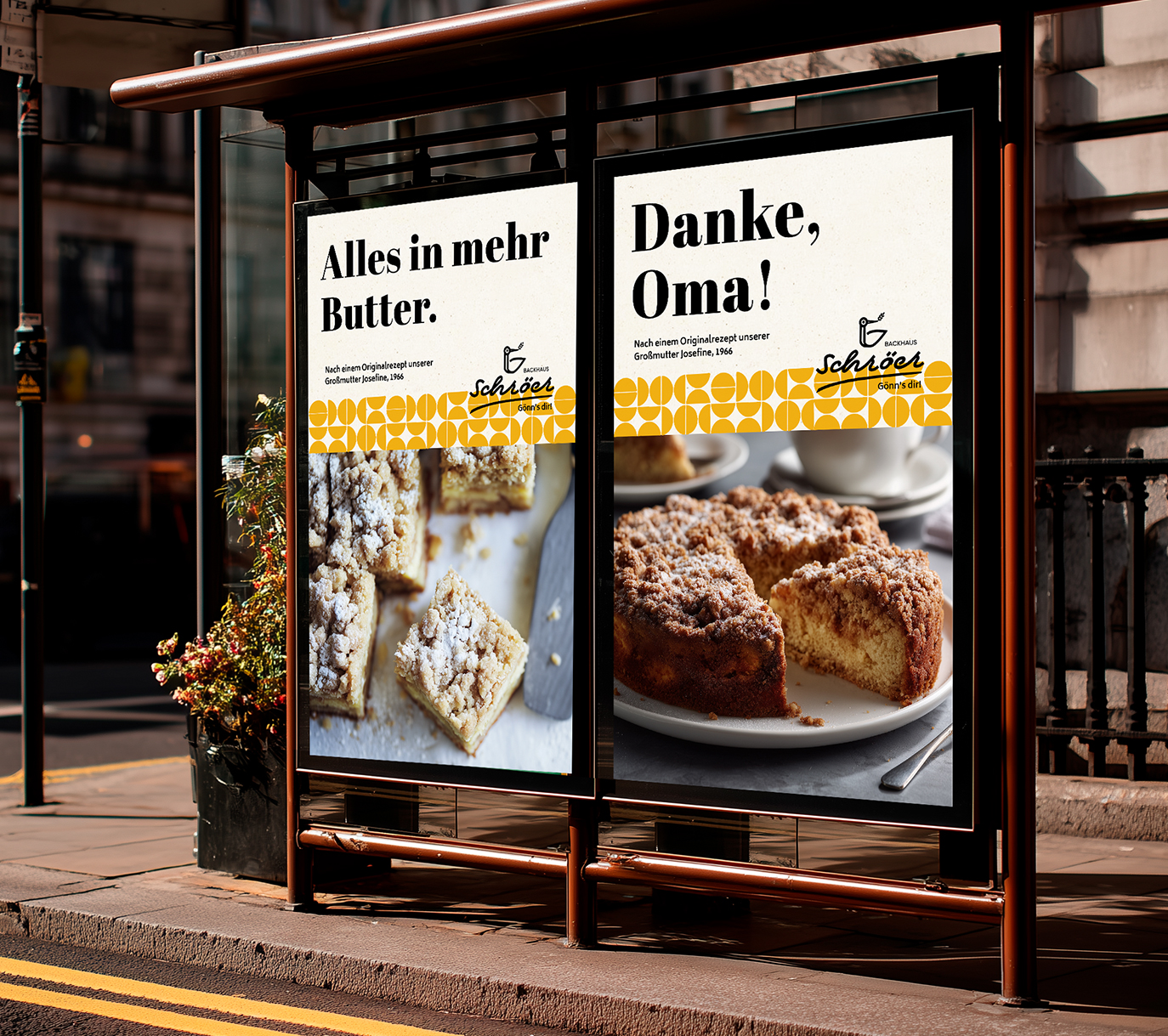
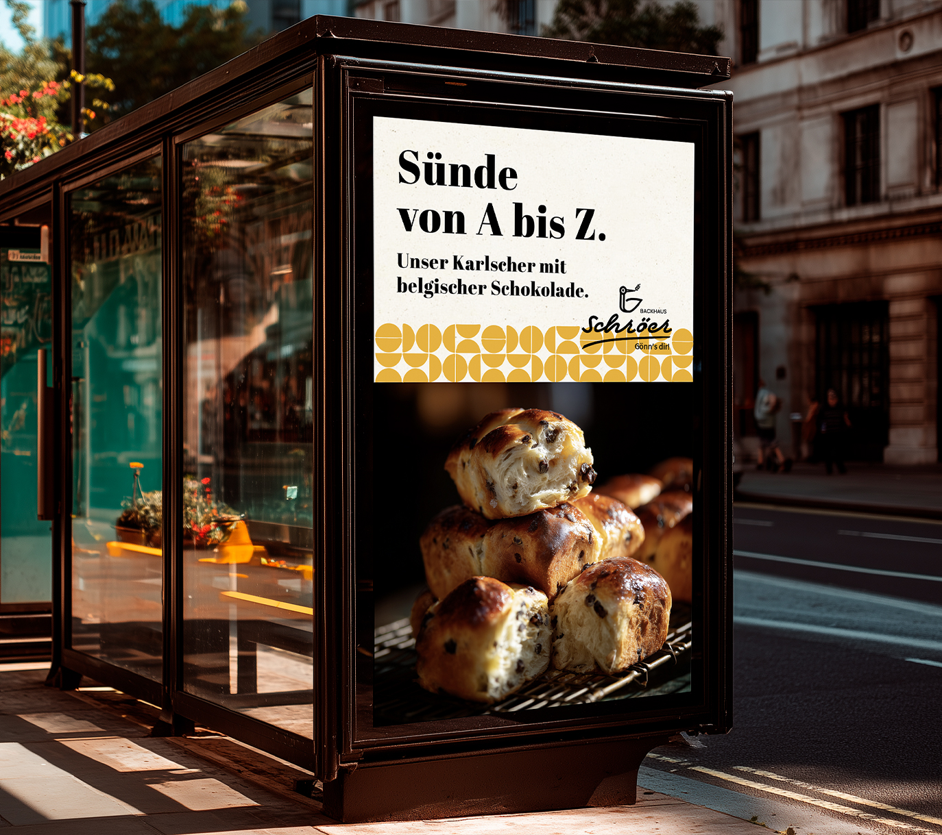
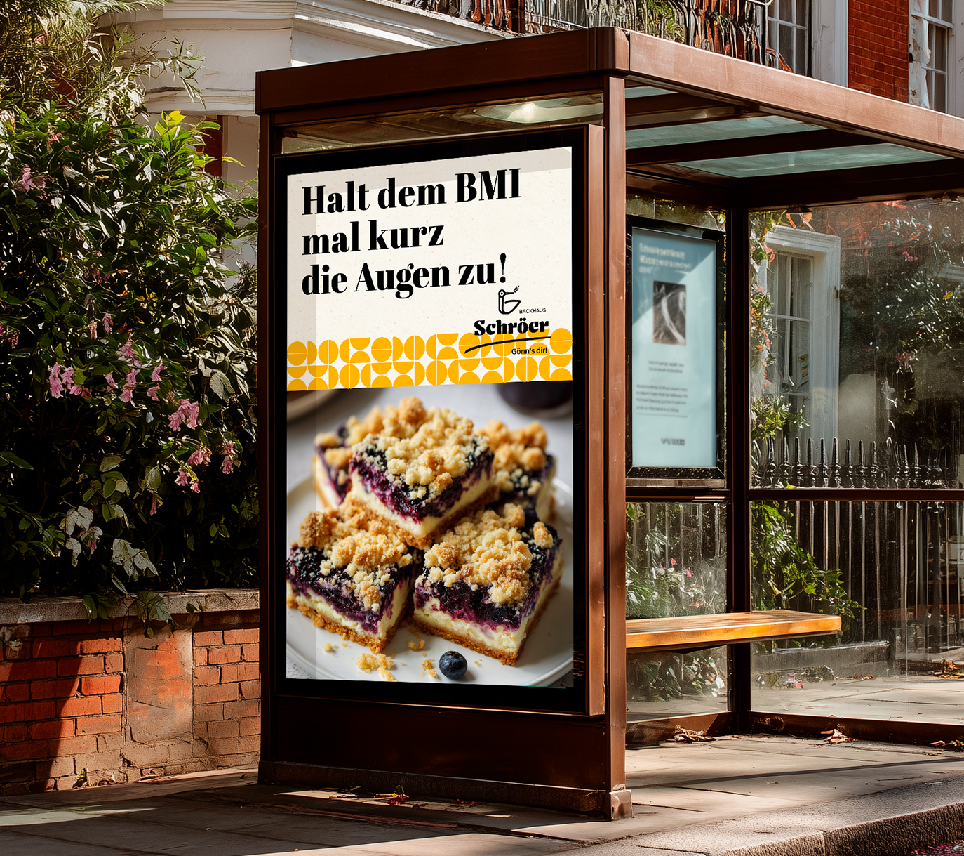
Turns out …
… a concept that smells like home, delivers premium on a plate – and makes you want to step out, step back in, and come back again with a smile. That’s how a brand stays on your mind.
Hungry for more?
See related cases.