NIVEA: Extreme Wild
Where brand heritage meets a nature: a Limited Edition with a packaging that fuses raw nature with urban cool with illustrations that evoke the rush of showering under an open sky.
Background
Over many years and more than 30 projects, we helped shape the packaging design for NIVEA and NIVEA MEN, from global lines to high-impact limited editions. We now bring this expertise independently, without exclusivity, ready for brands looking to make a fresh, high-energy statement in design and storytelling.
Brief
For the retail partner, the goal was a limited edition that would grab attention instantly and deliver a visual freshness hit. The key message: adventure and pure nature, experienced in seconds, on shelf and online.
Solution
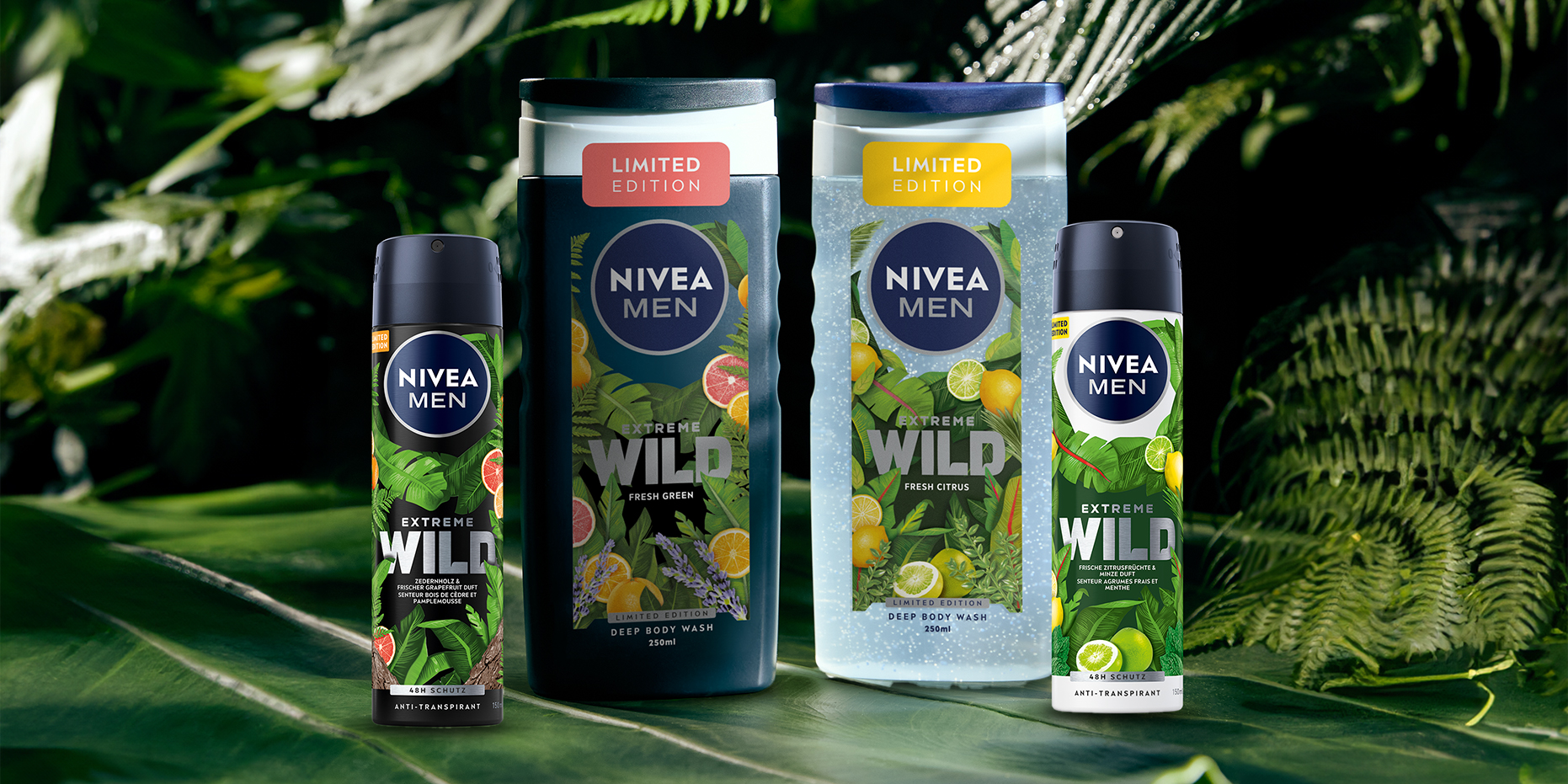
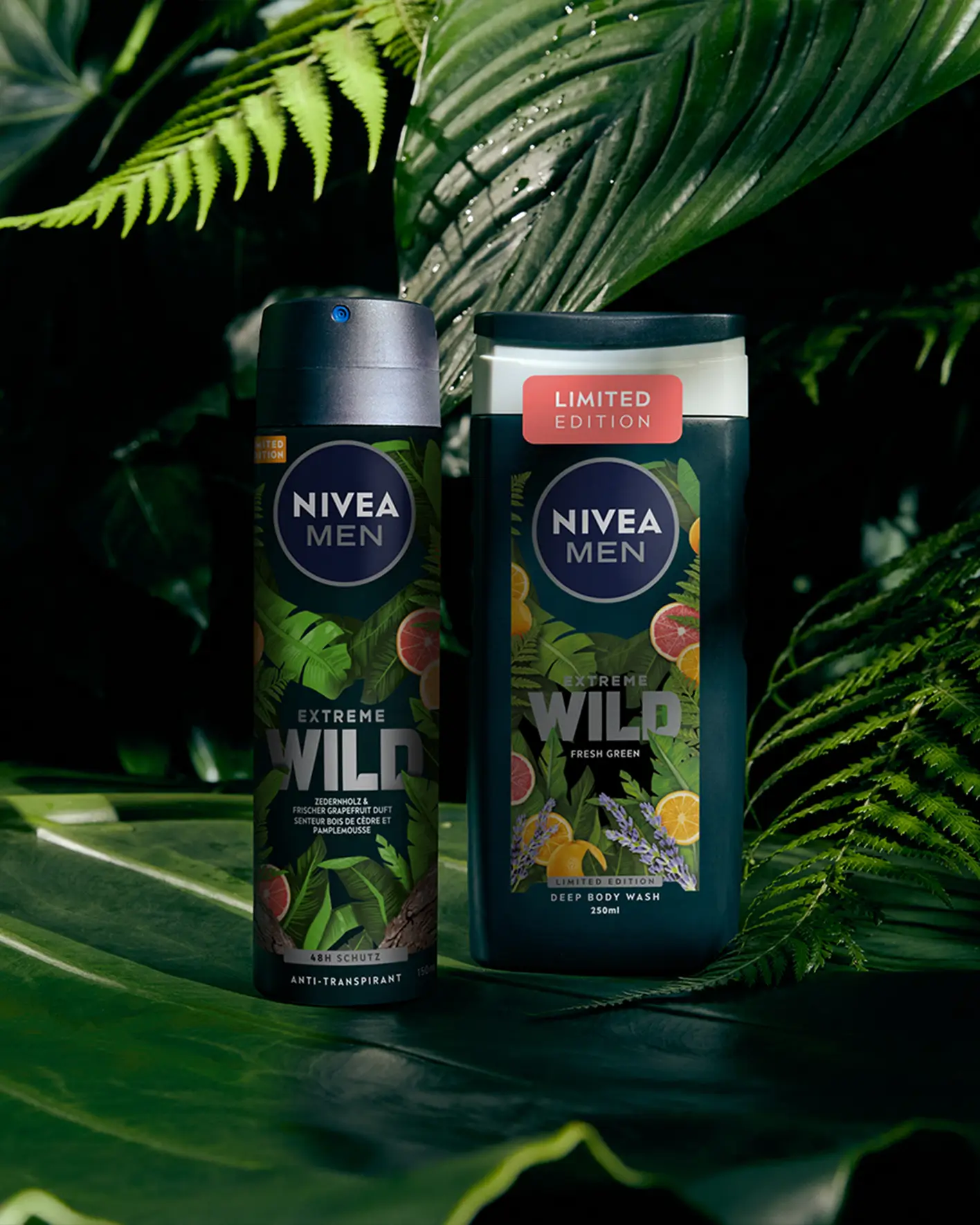
We combined a rich jungle-inspired aesthetic with vivid citrus and green accents, a striking silver-metallic wordmark, and illustrations that transform the bathroom into a private retreat in nature.


Photos: NIVEA, Ruska Martín
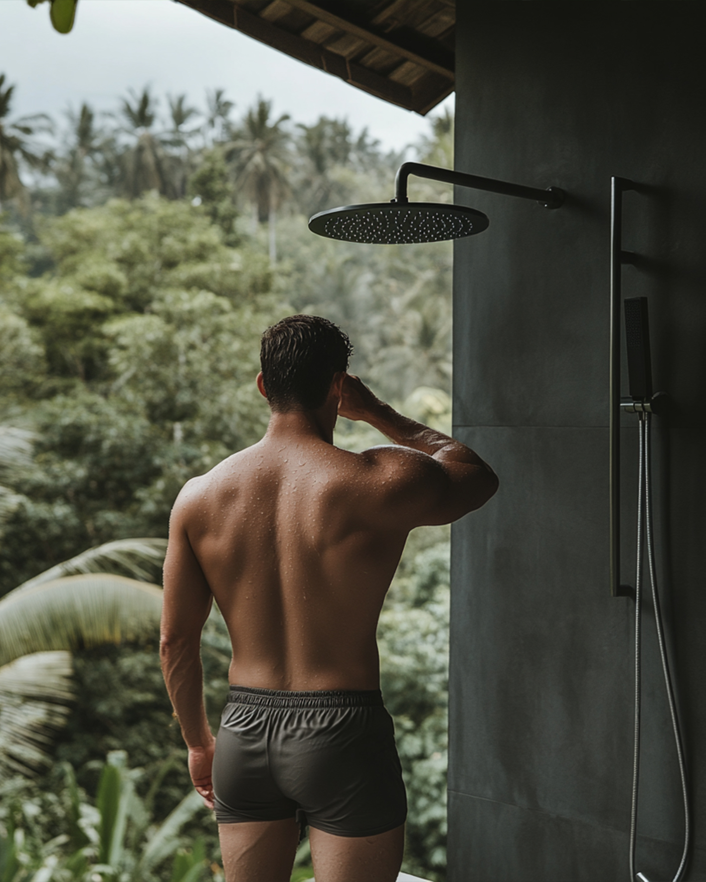
Freshness staged like an outdoor escape. Deep greens, sharp citrus pops, detailed botanical illustrations that seem to push out of the label; the design captures the feeling of standing in lush greenery while cool water runs down your skin.

Silver meets Green Rush
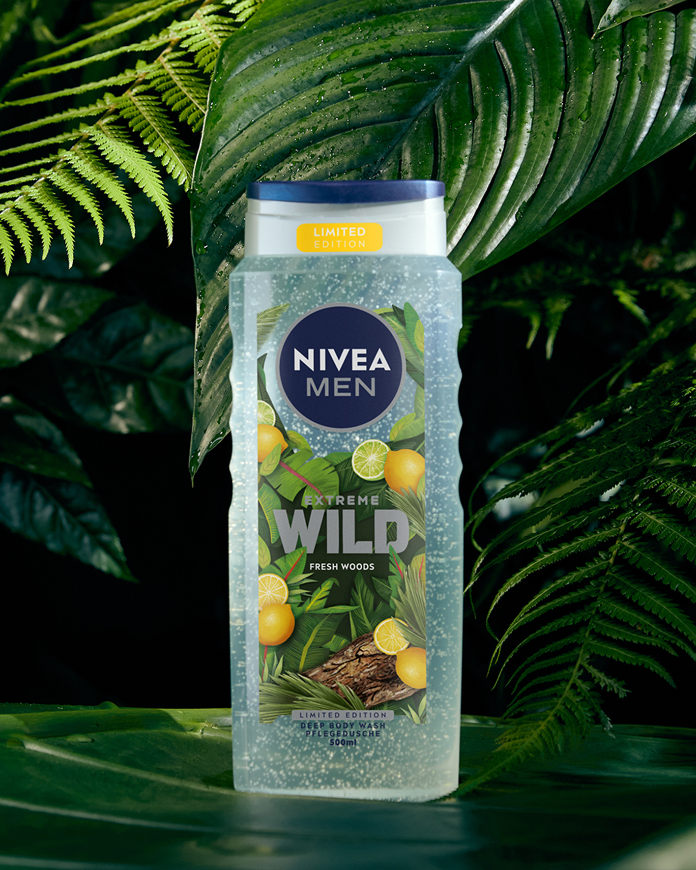
Cool drops on skin, the view from the shower into dense greenery, the scent of fresh leaves and zesty lemon in the air: the EXTREME WILD wordmark stands confidently at the forefront, gleaming like polished steel and bringing an urban edge into the bathroom without overshadowing the familiar NIVEA architecture.

Turns out…
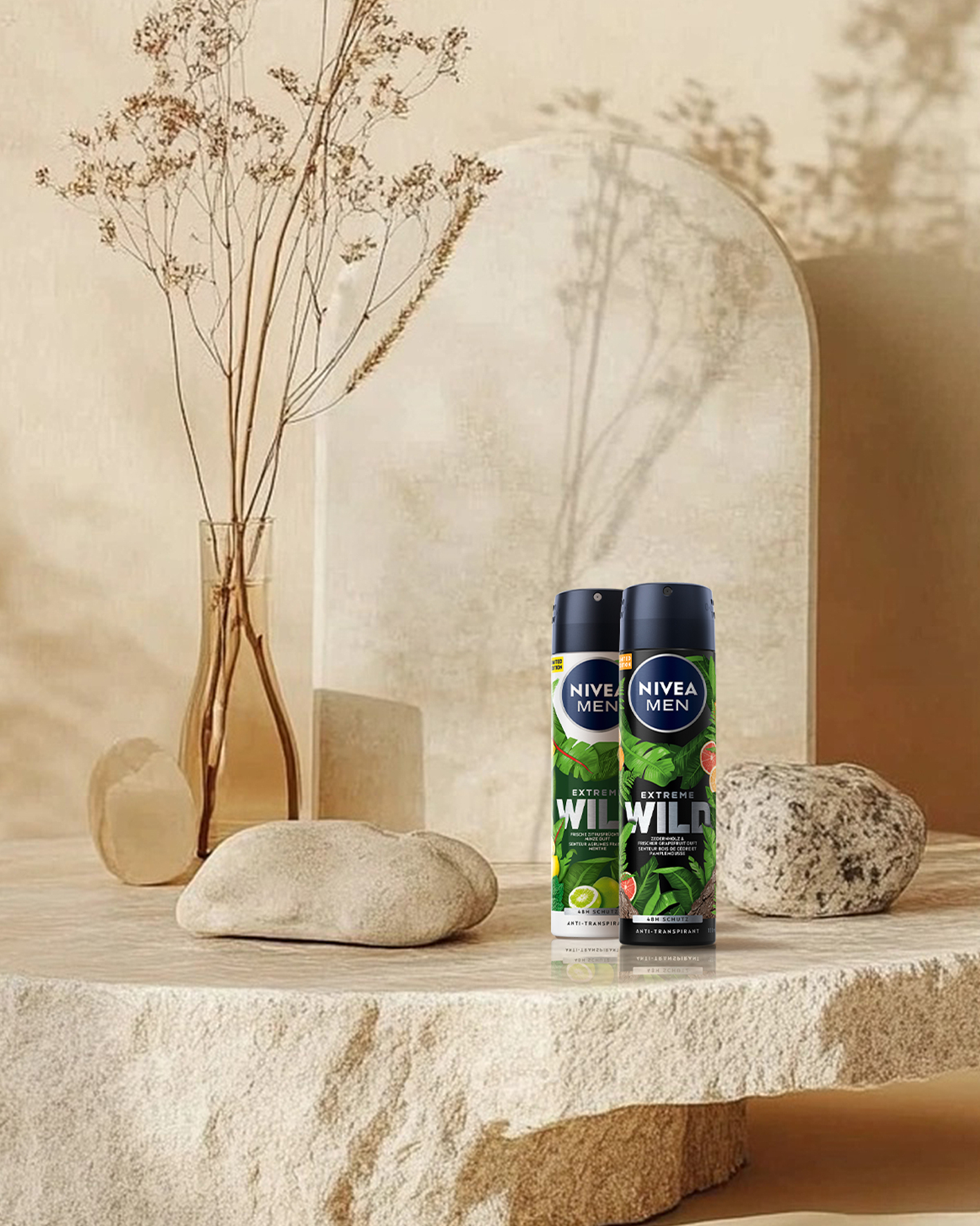
… limited editions don’t just sell products; they sell moments you can picture. EXTREME WILD shows that with the right visual concept, even a global icon can turn everyday routines into an experience and shine both on shelf and online.
Hungry for more?
See related cases.