VINOS: Brand Relaunch
VINOS didn’t just need a facelift. It needed a feeling. A sense of place. Of pride. Of pleasure. So we set out to redesign the entire visual identity – not for the sake of design, but to elevate how wine is discovered, talked about, and loved.
Background
VINOS is Germany’s leading specialist for Spanish wines – with a strong online presence, a loyal customer base, and a clear expertise in curation. But the existing look and feel no longer matched the quality of the offering. While the selection had become bolder, more diverse and editorial in spirit, the visual identity felt generic and fragmented. A new identity was needed to unify brand experience across print, digital, and retail touchpoints – and to sharpen VINOS’ profile as the destination for Spanish wine lovers.
Brief
Redesign the visual identity of VINOS – starting with the wordmark and core design codes (color, typography, image direction) and extending into all key assets: website, newsletters, print catalogues, packaging, and more. The goal was to create an editorial and emotional brand world with a strong sense of Spanish origin and a recognisable voice – warm, contemporary, and full of character.
Solution
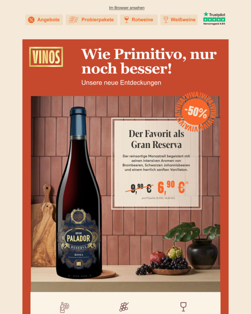
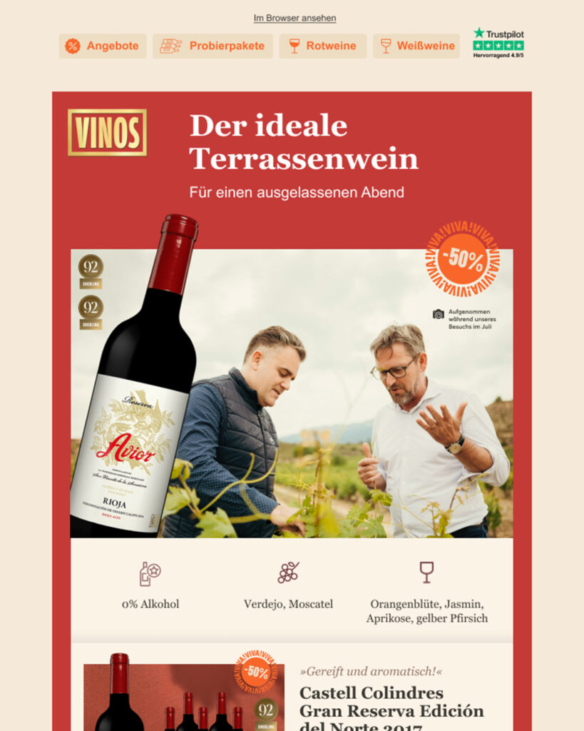
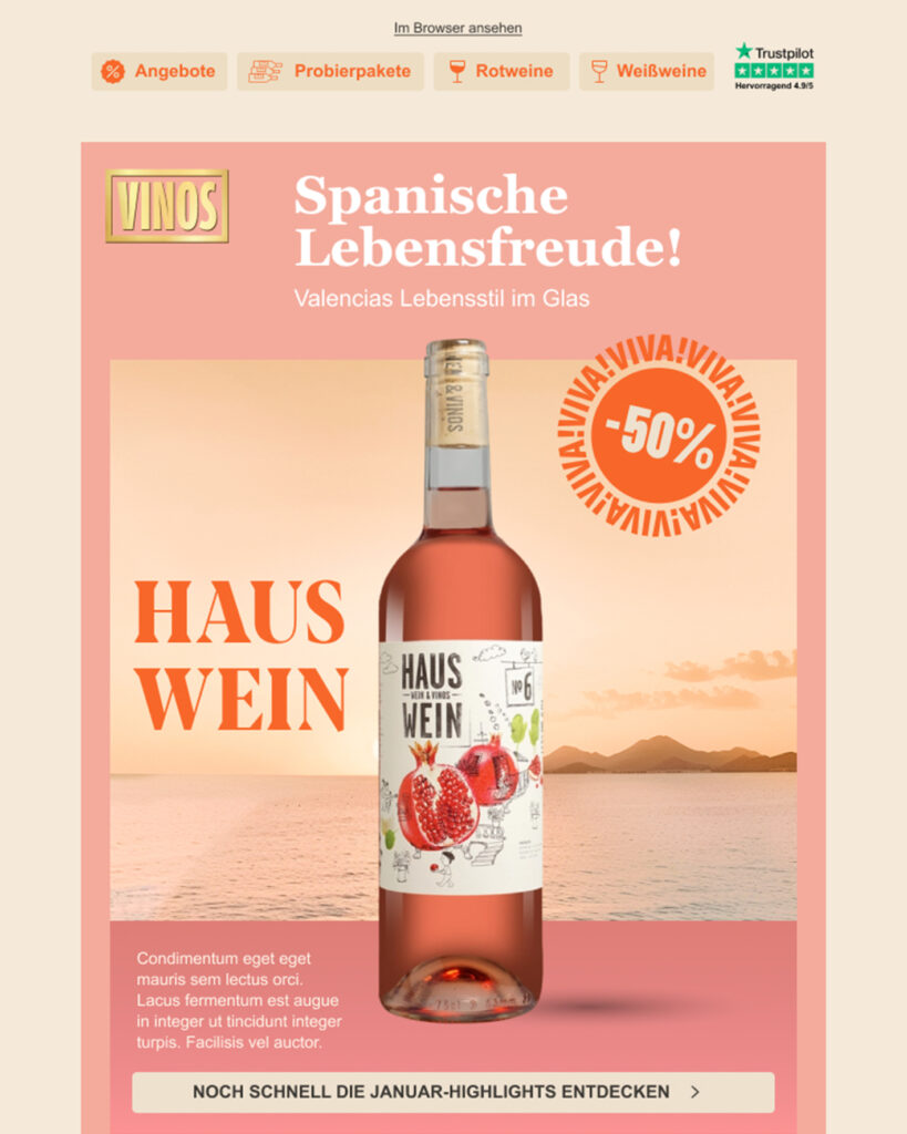
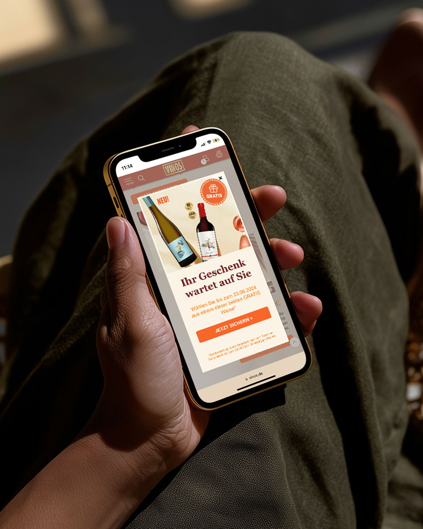
We developed a cohesive brand system that connects all channels – with expressive typography, bold use of colour, and a curatorial approach to storytelling. A new tone of voice, new design structure and a sharper hierarchy make each touch point more engaging. All of this adds up to a brand that no longer just sells wine – it creates a world to dive into.
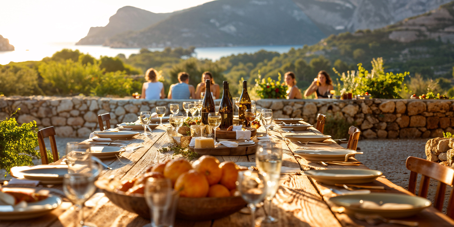

Photos: VINOS, Ruska Martín
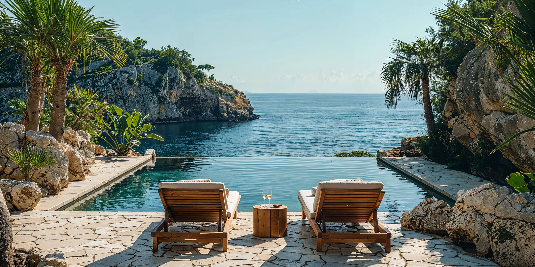
A new light on Spanish wines. No matter where you are, you’re always on vacation!
From the logo to the last page of the catalogue: everything now feels like VINOS.
Confident. Editorial. Emotional. And unmistakably Spanish.
Spain is open to everybody!
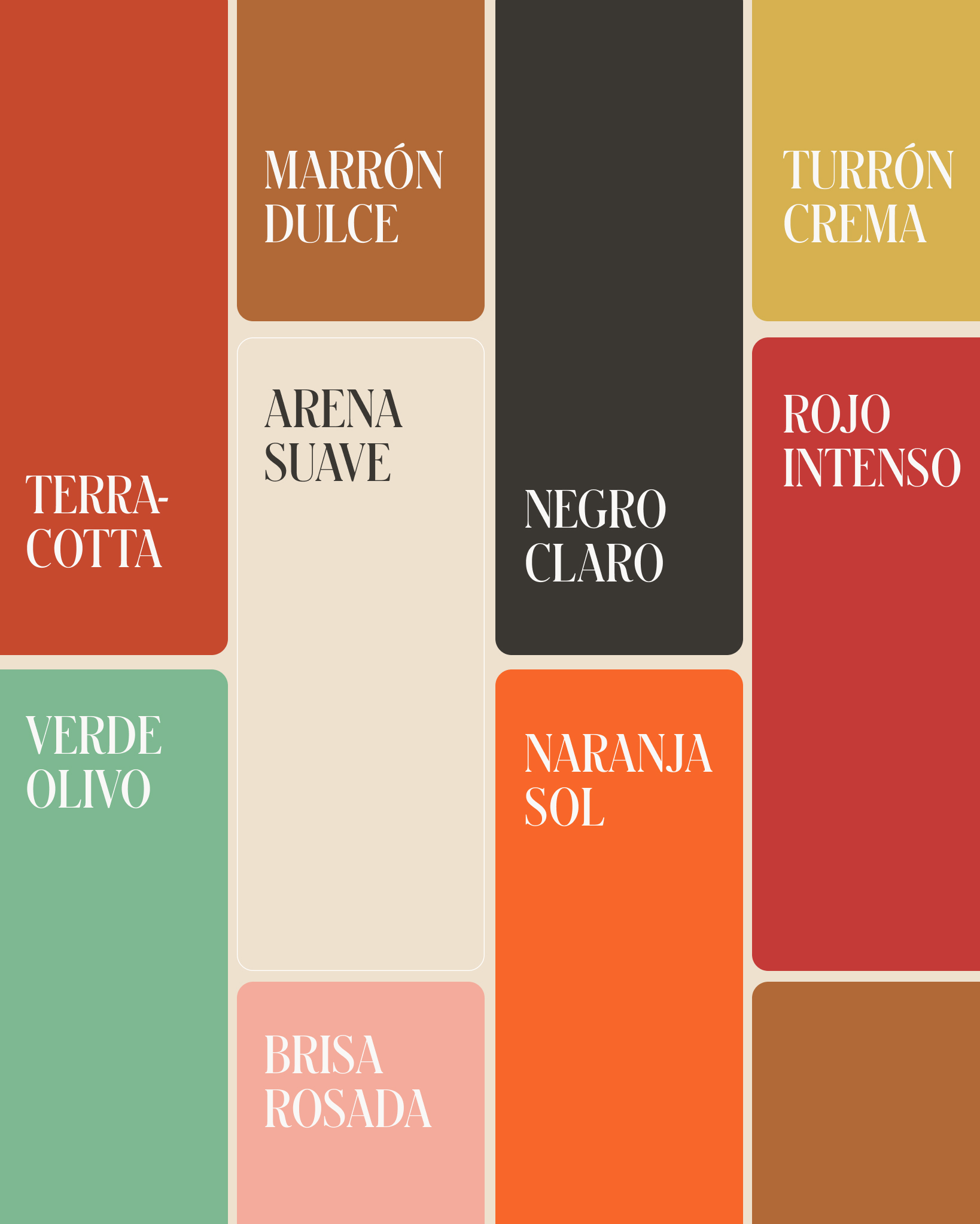
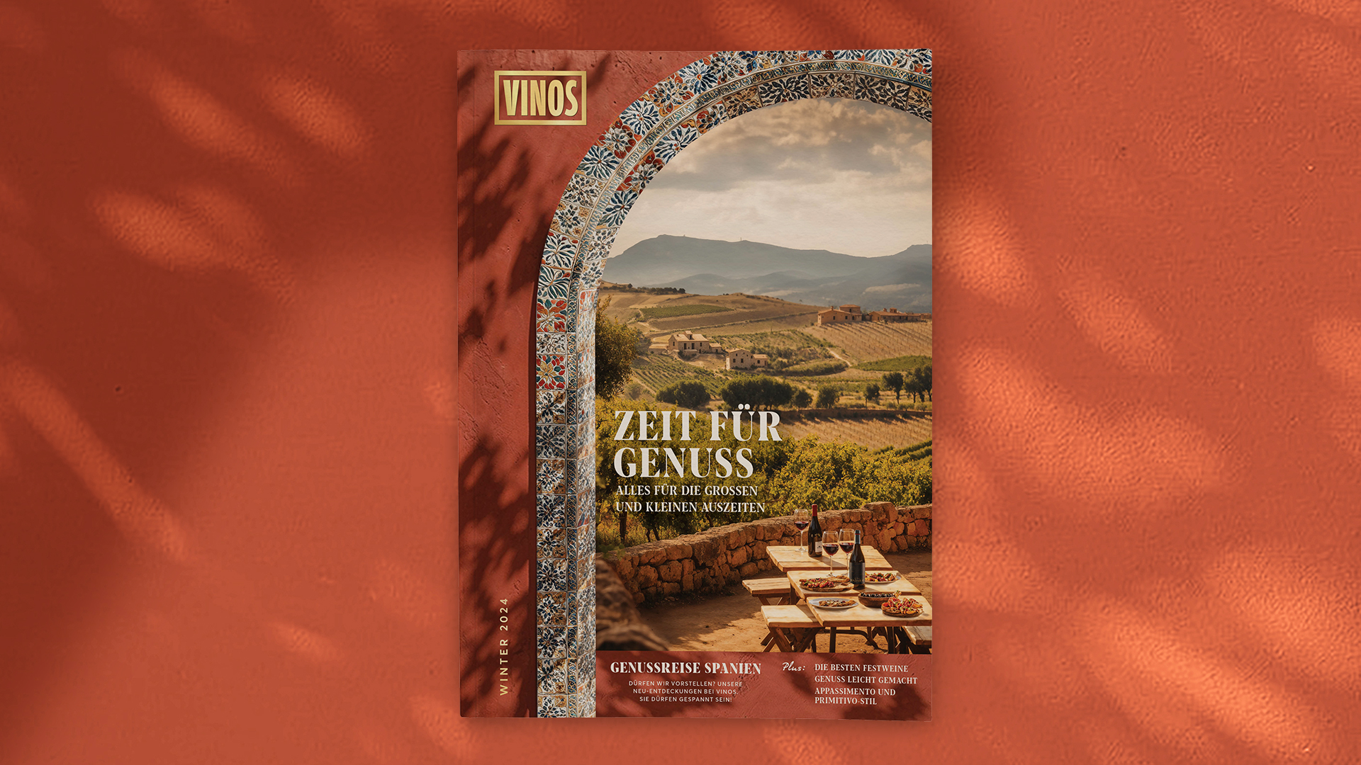
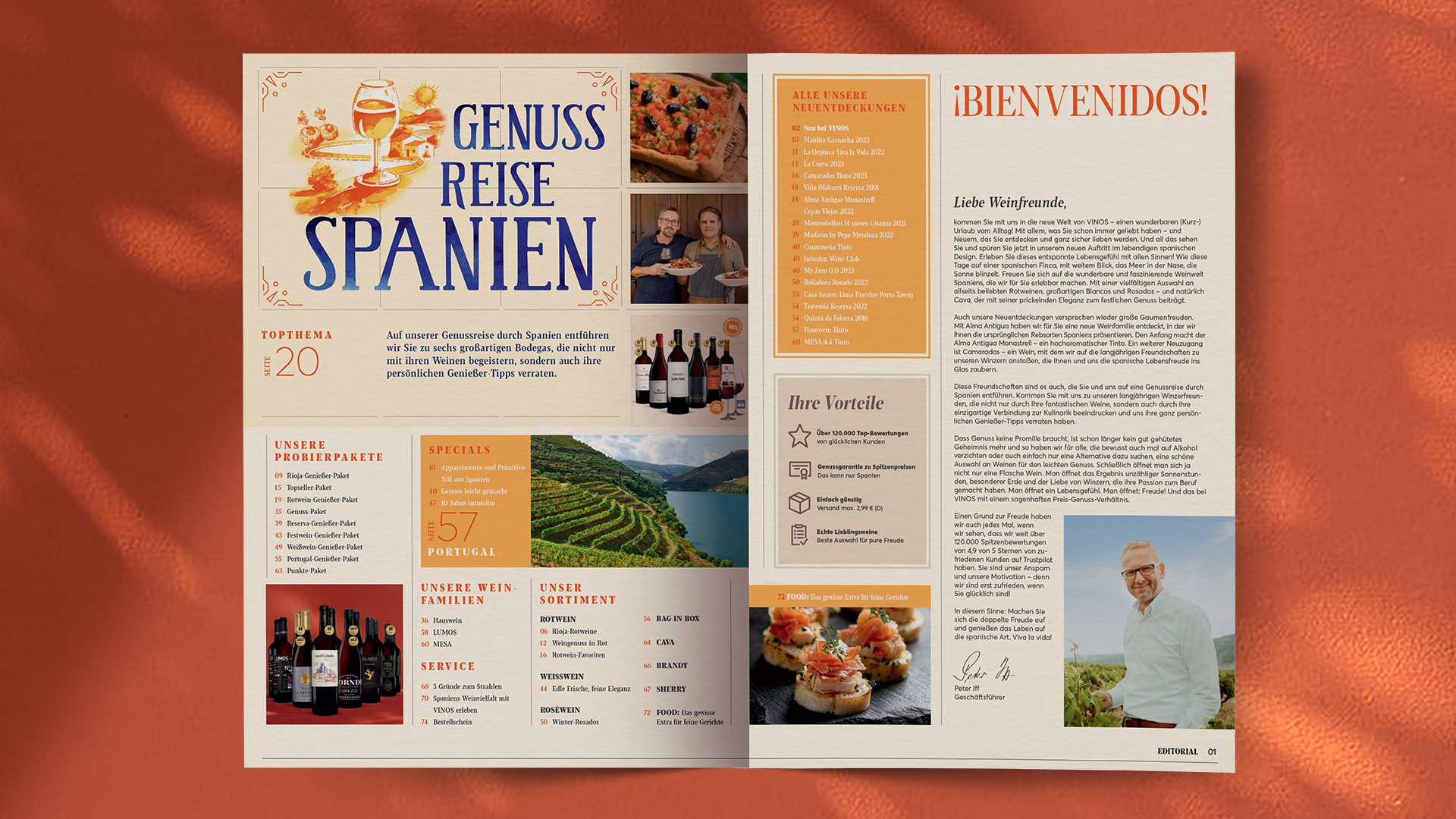
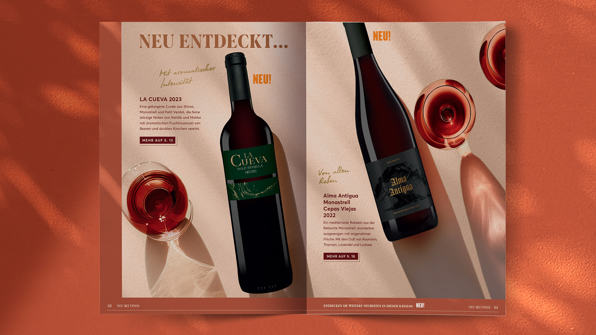
We developed a new colour system and typographic hierarchy that adds freshness and rhythm to every application. Warm reds and soft neutrals hint at sun, soil, and siesta – while structured layouts ensure consistency across print and digital.
“As part of our relaunch, the Ruska Martín team precisely identified the essence of our brand, created a distinctive positioning in the market, and developed a unique visual world that inspires emotion and conveys VINOS’ USP to our customers in a lasting way.”
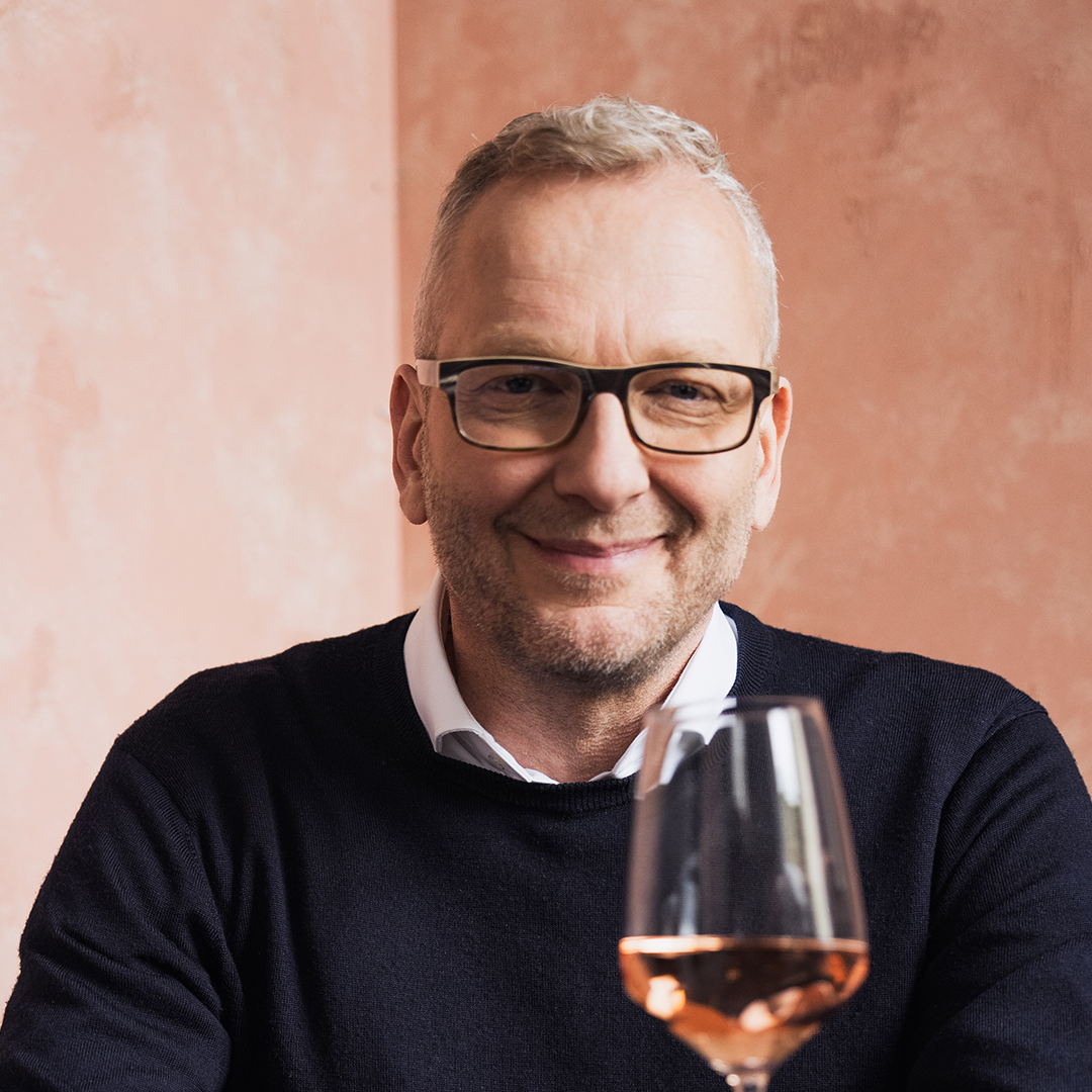
Peter Iff
managing director
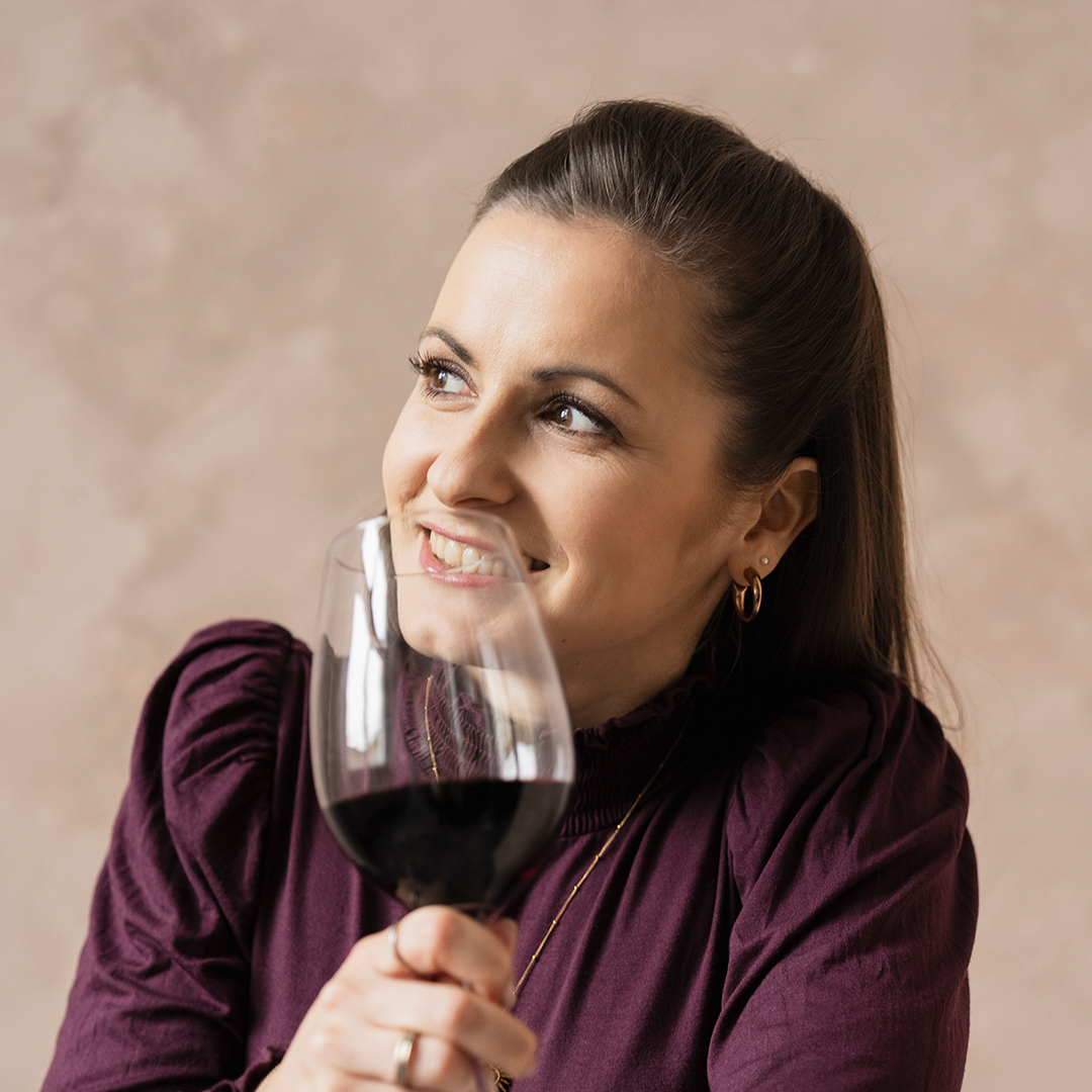
Ines Hackbarth
Head of CRM, Product & Brand

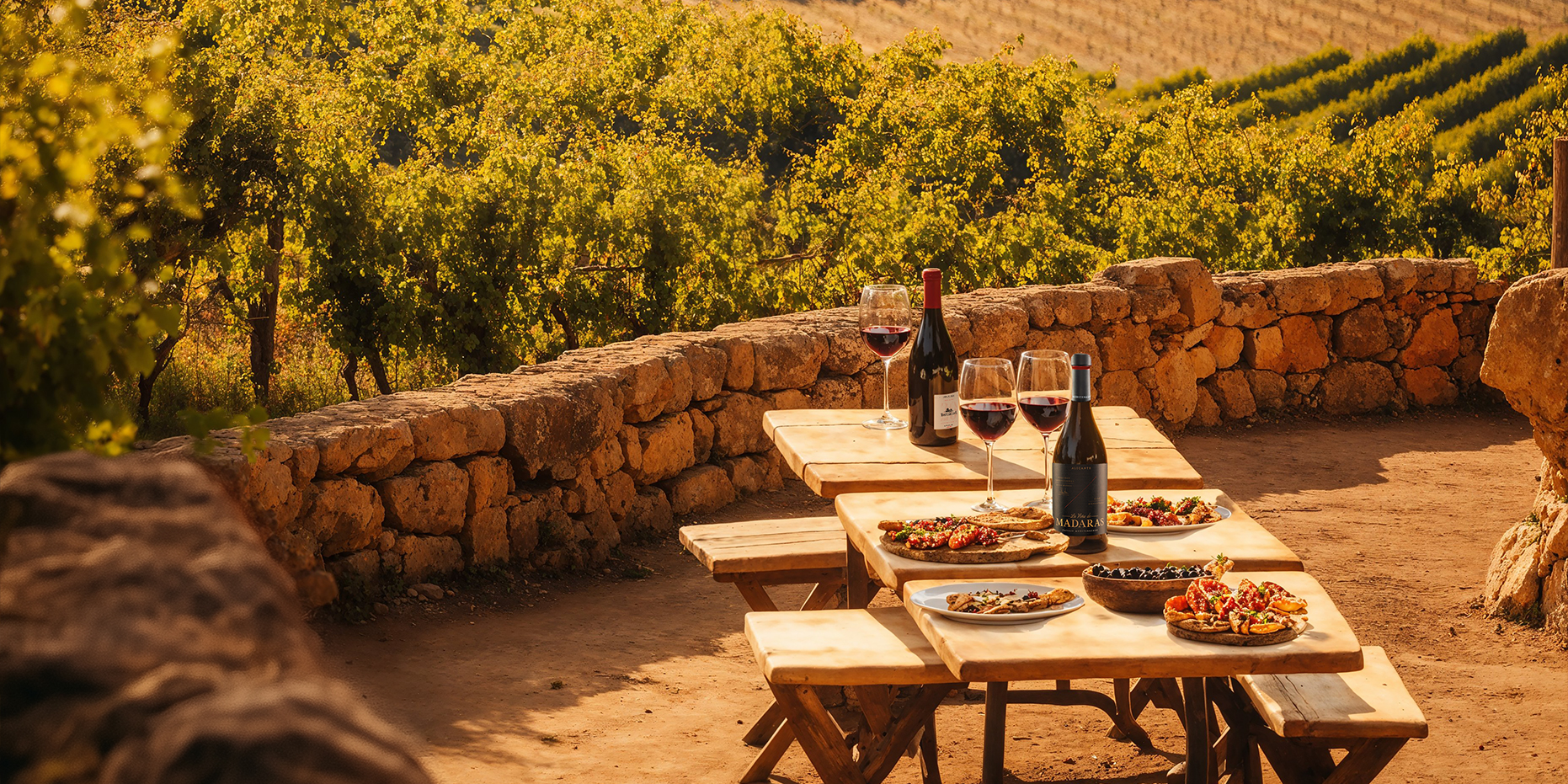
The sun comes out!
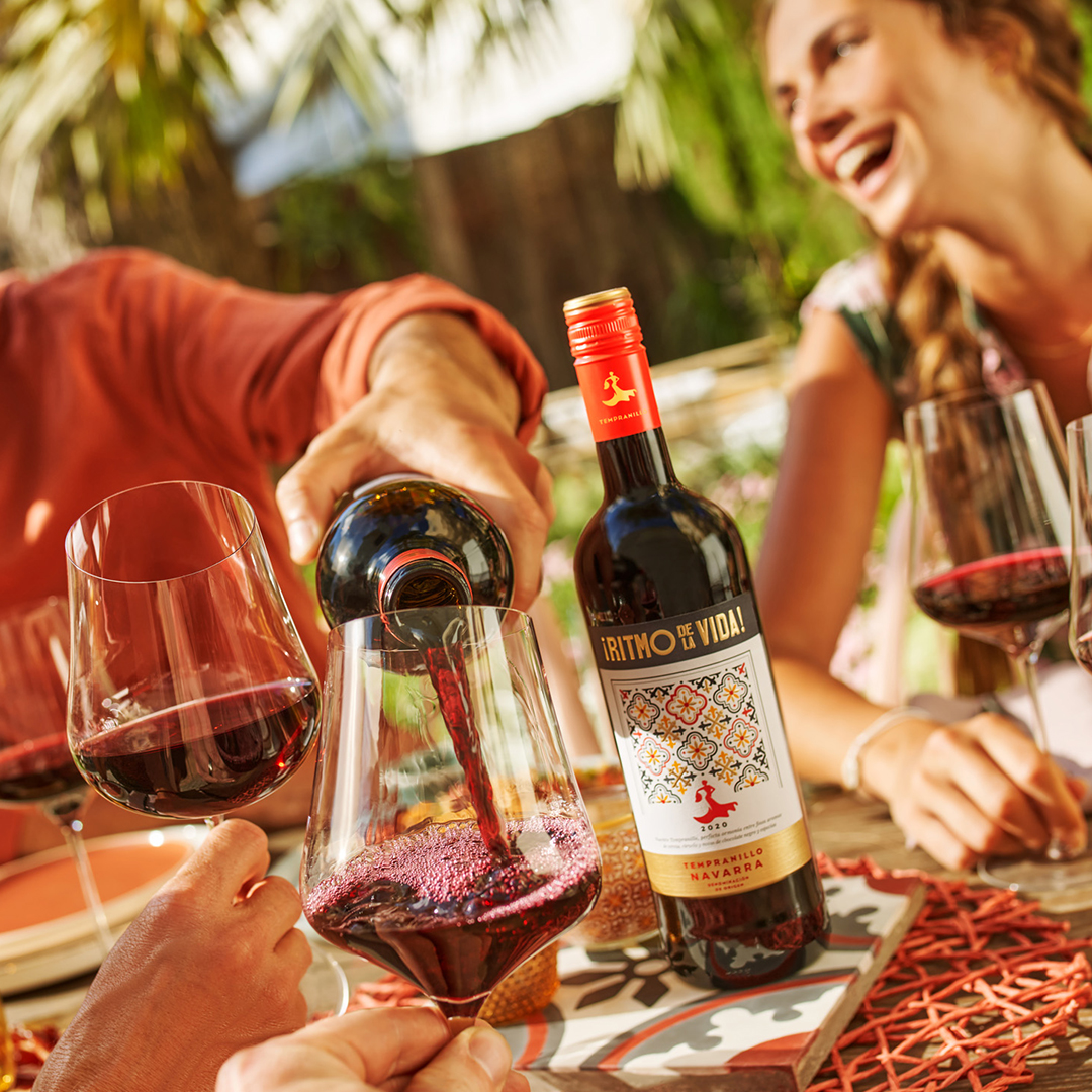
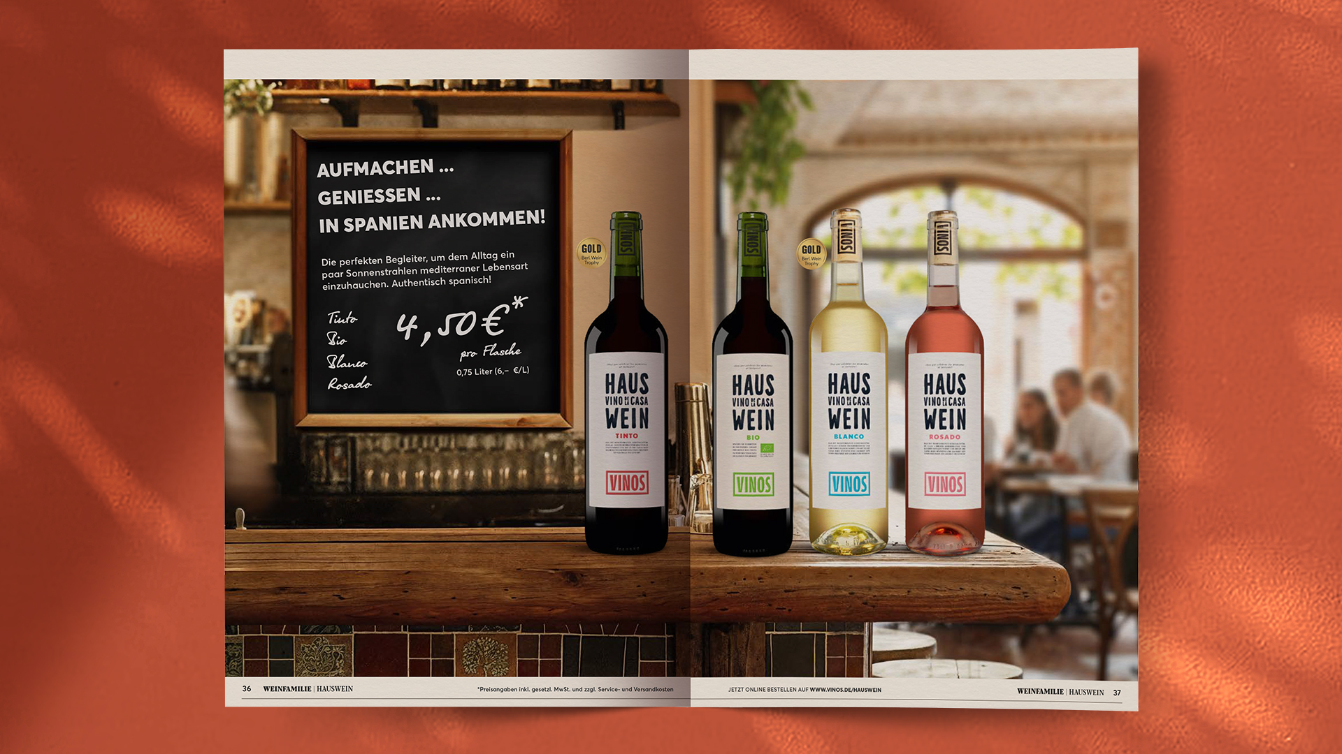
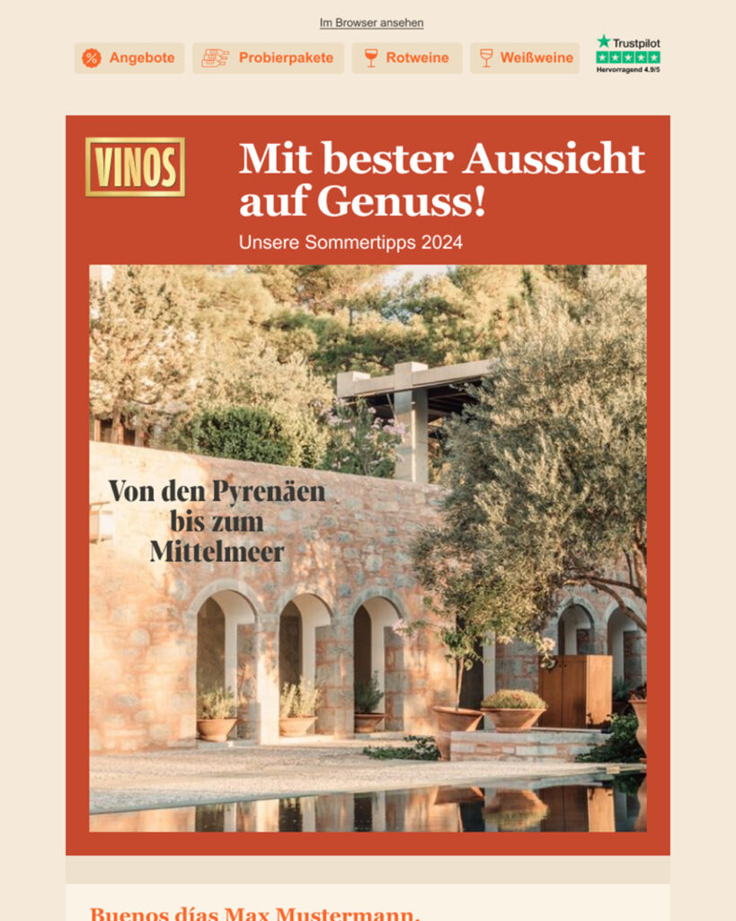
From German wine clichés, interchangeable landscapes, fireside coziness and interiors, we head outside. It goes into Spanish patios, fincas, alleyways, vacation moods; life takes place outside.

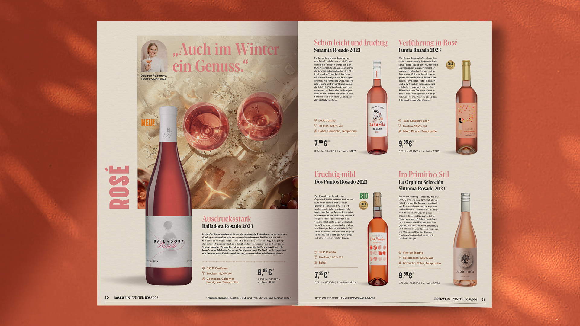
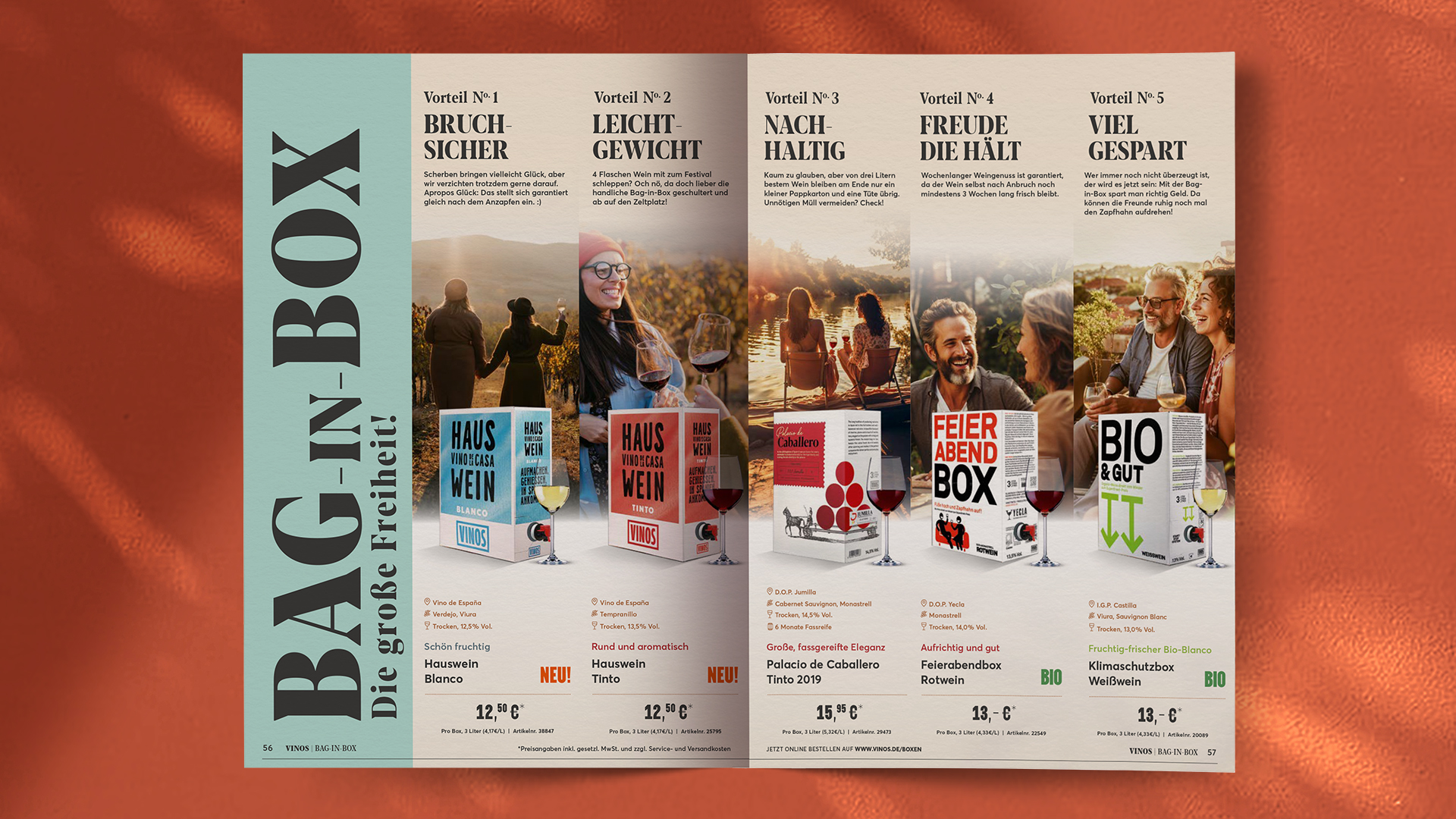
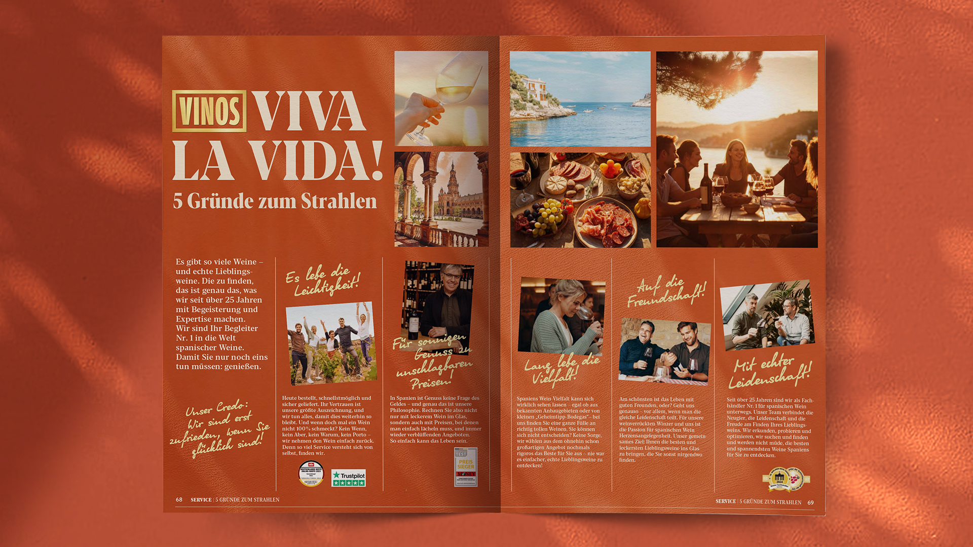

A catalogue worth reading
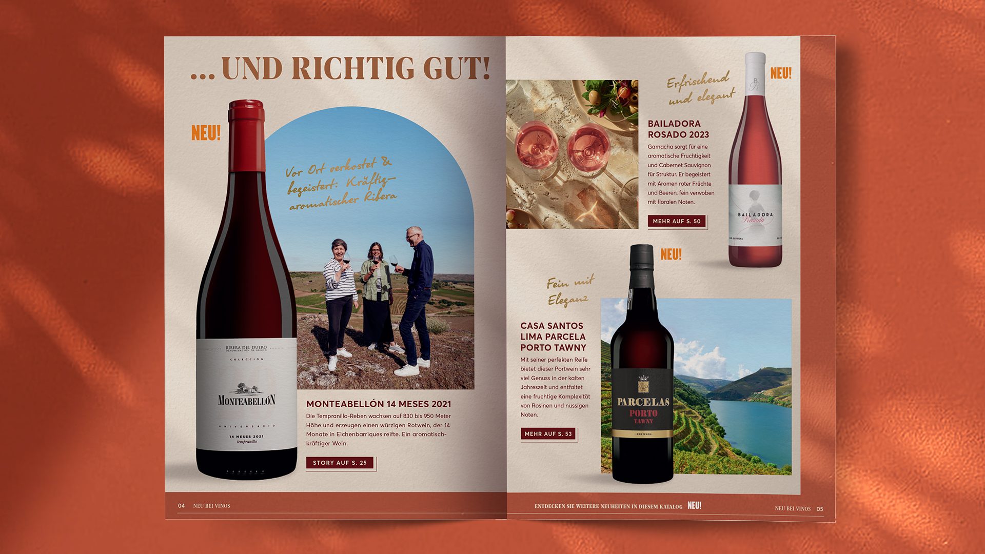
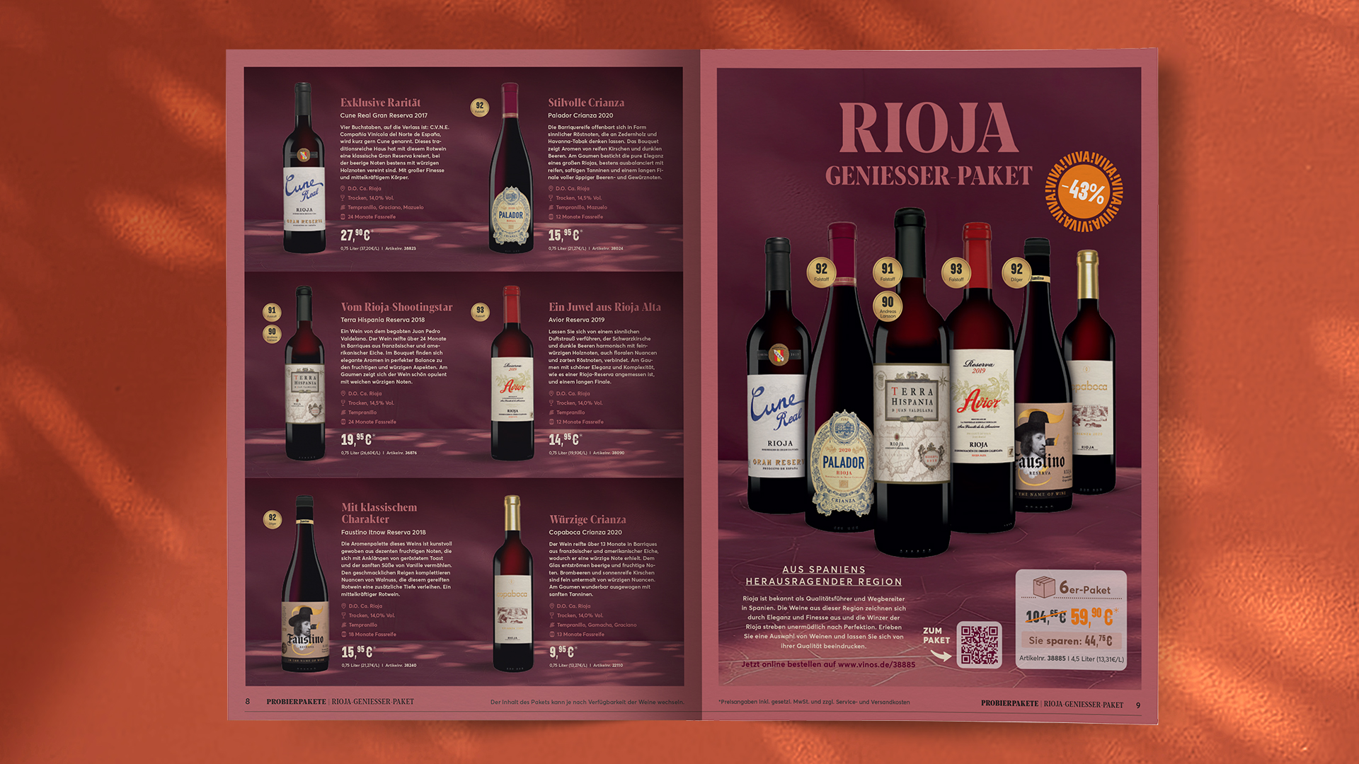
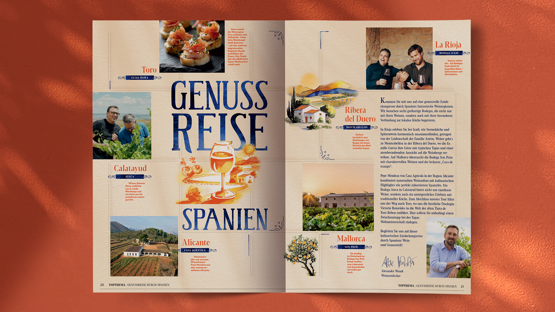
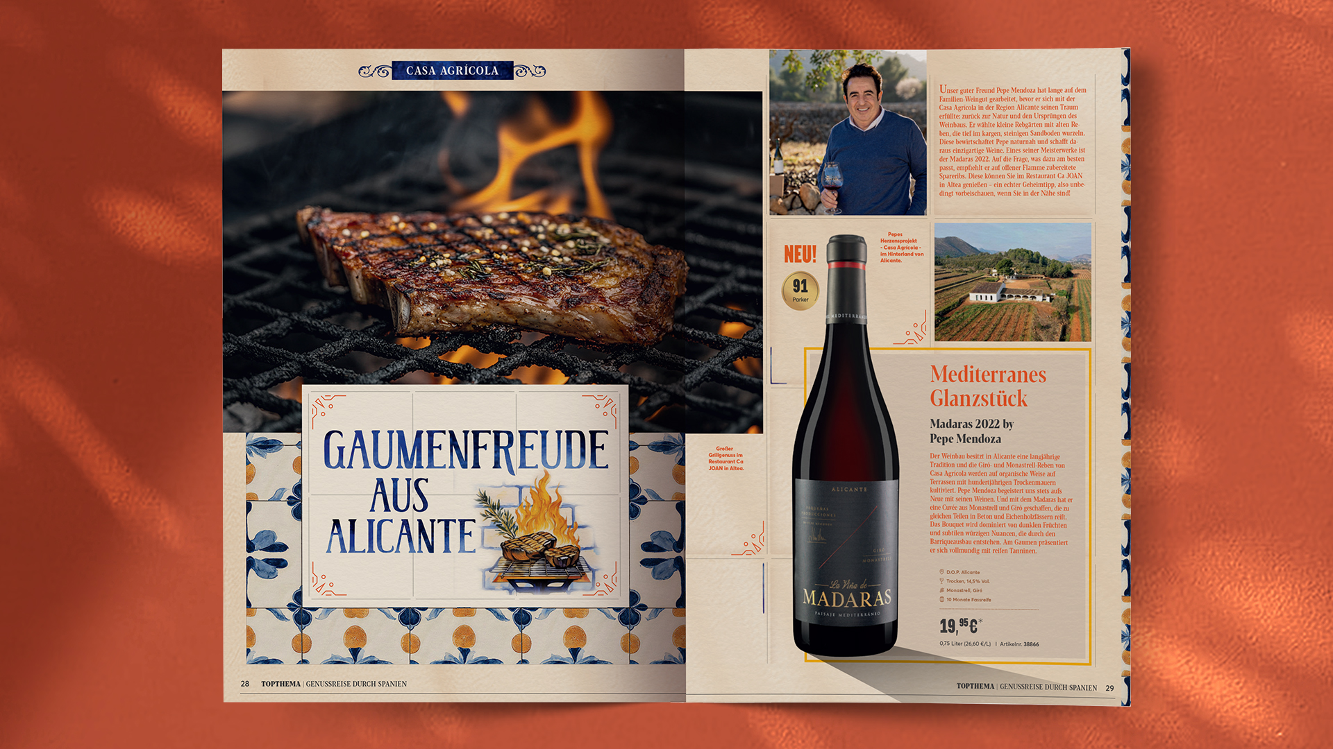
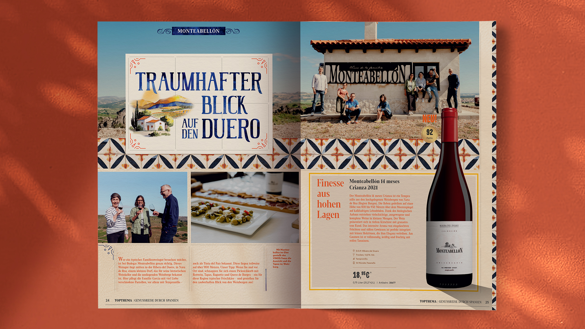
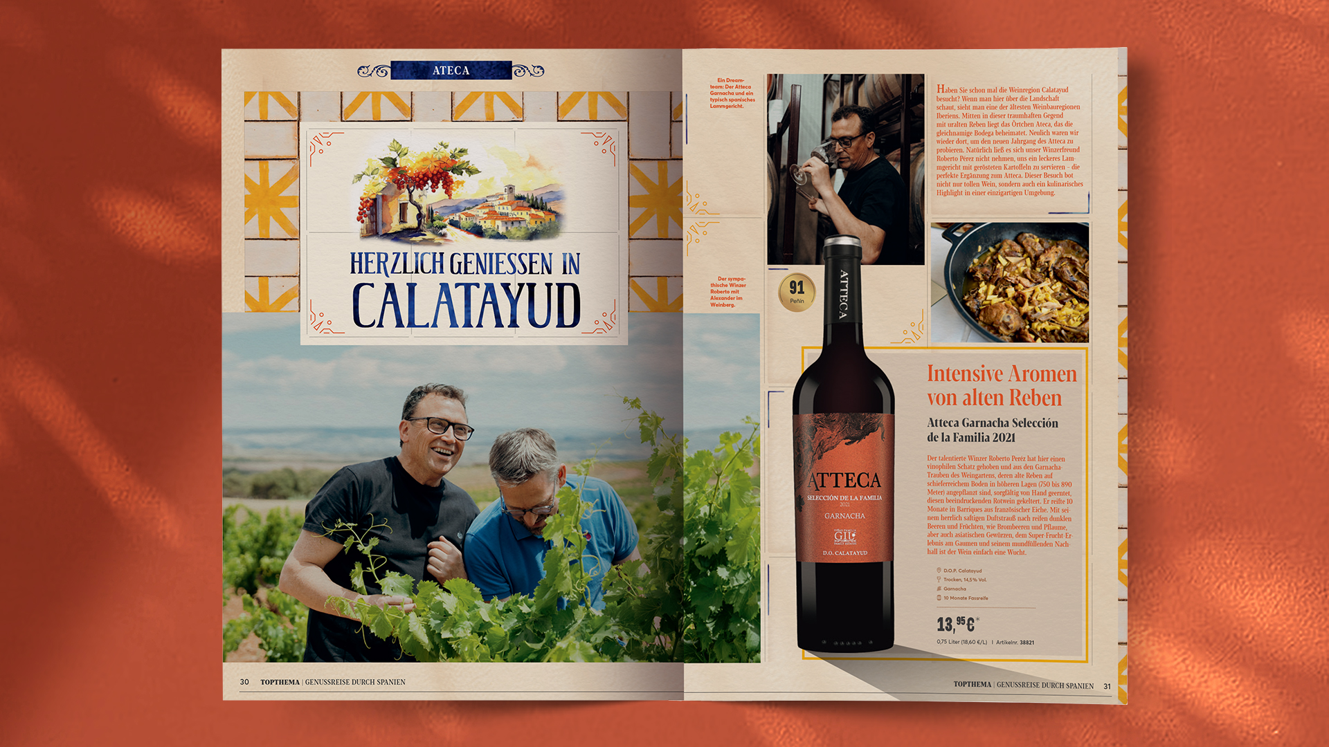
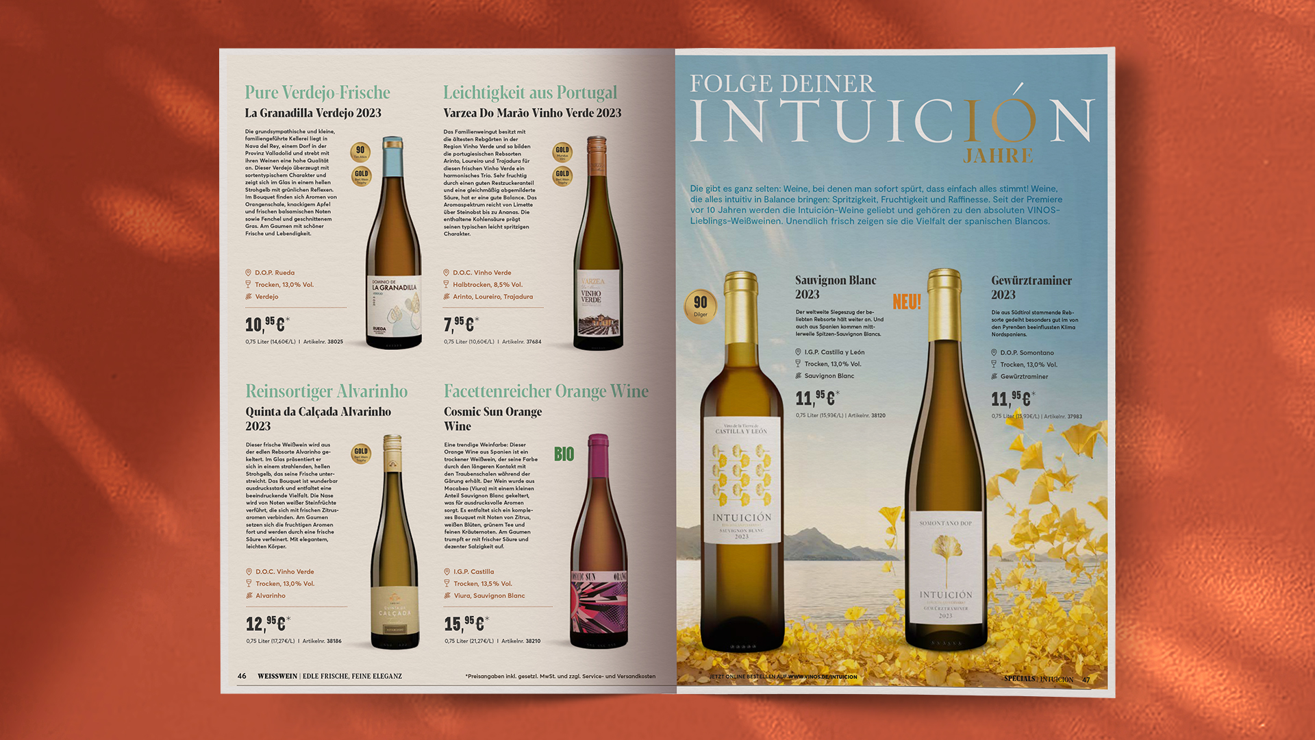
Each seasonal wine catalogue is now a journey. Not just a product listing, but an inspiring dive into Spanish wine culture. Strong visual storytelling, editorial layouts, and thoughtful copywriting turn sales into stories – and shoppers into fans.
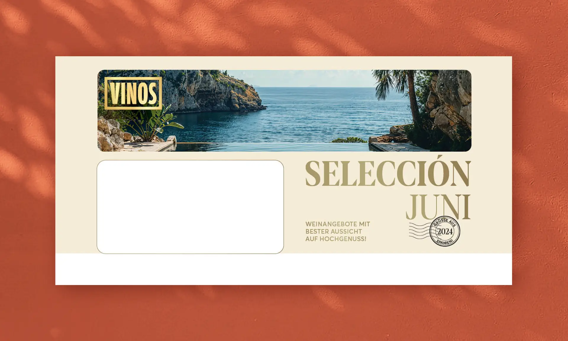
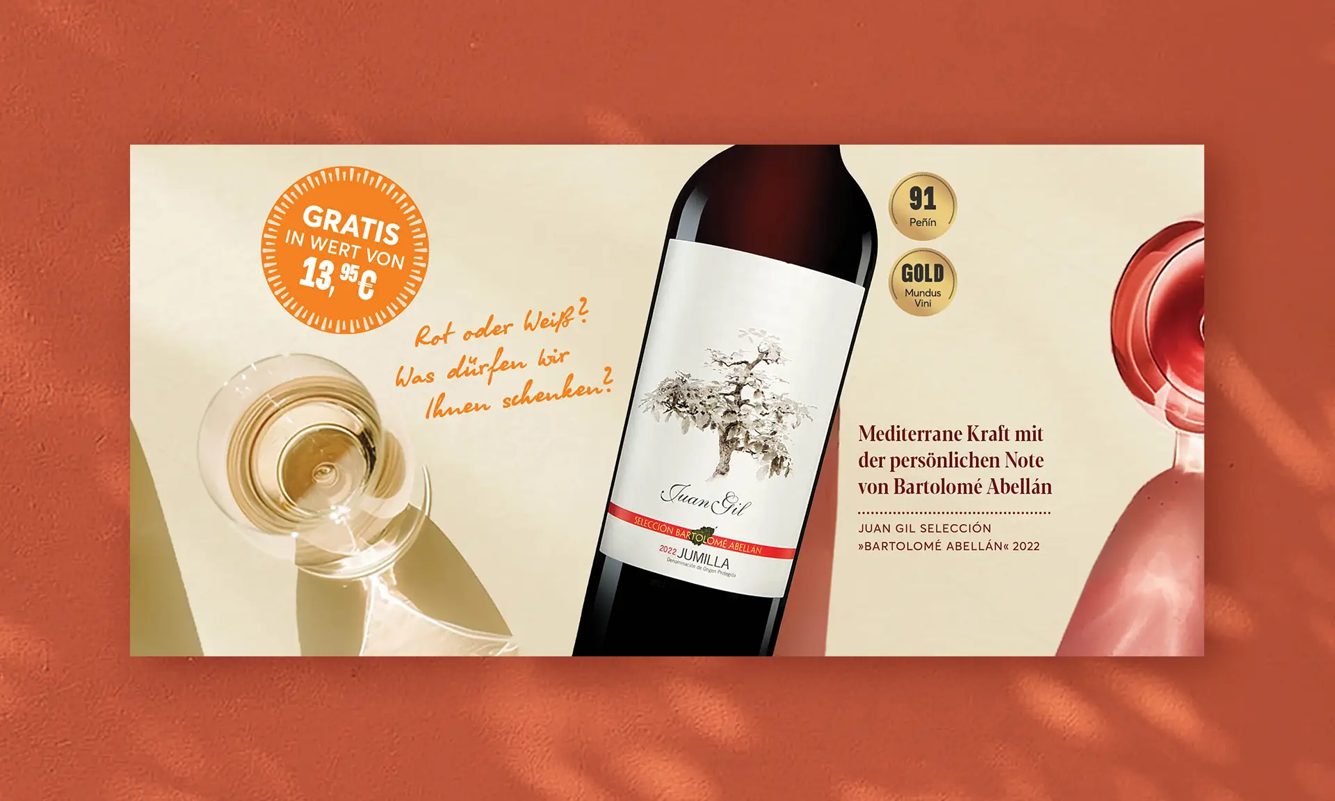
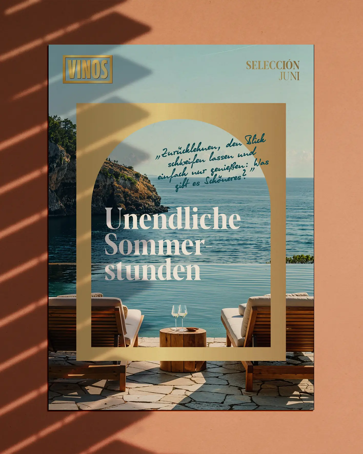
From fragmented assets to a cohesive identity: at the heart of our work stood the strategic goal to transform VINOS from a transactional platform into a destination brand that doesn’t just sell Spanish wine – but curates a world around it. The result is a brand world that creates recognition, trust, and desire – and turns every catalogue, every mailing, and every message into an invitation to return.


A voice that sticks
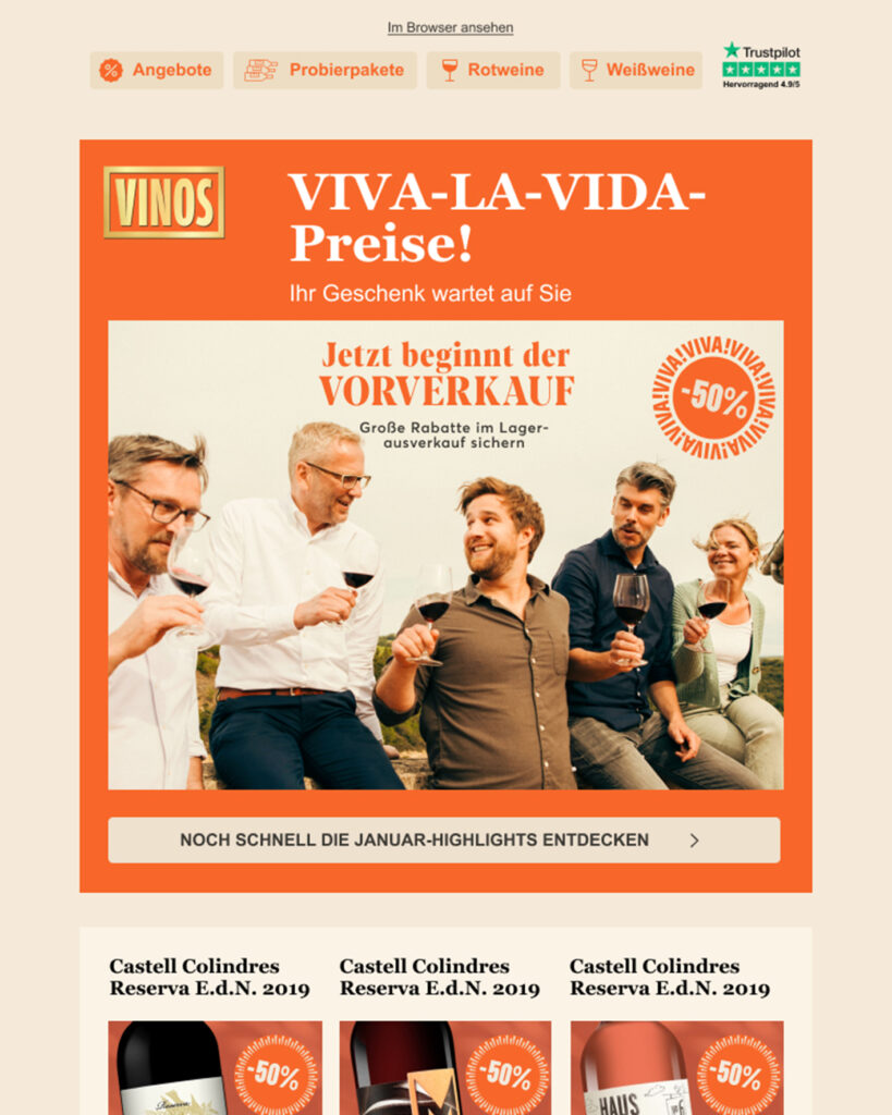
The brand’s new tone of voice is confident, sunny, and a little bit cheeky – always passionate, never pushy. We developed a modular messaging system and copy style guide that ensures consistency across all media, from newsletters to packaging.


15 years of support.
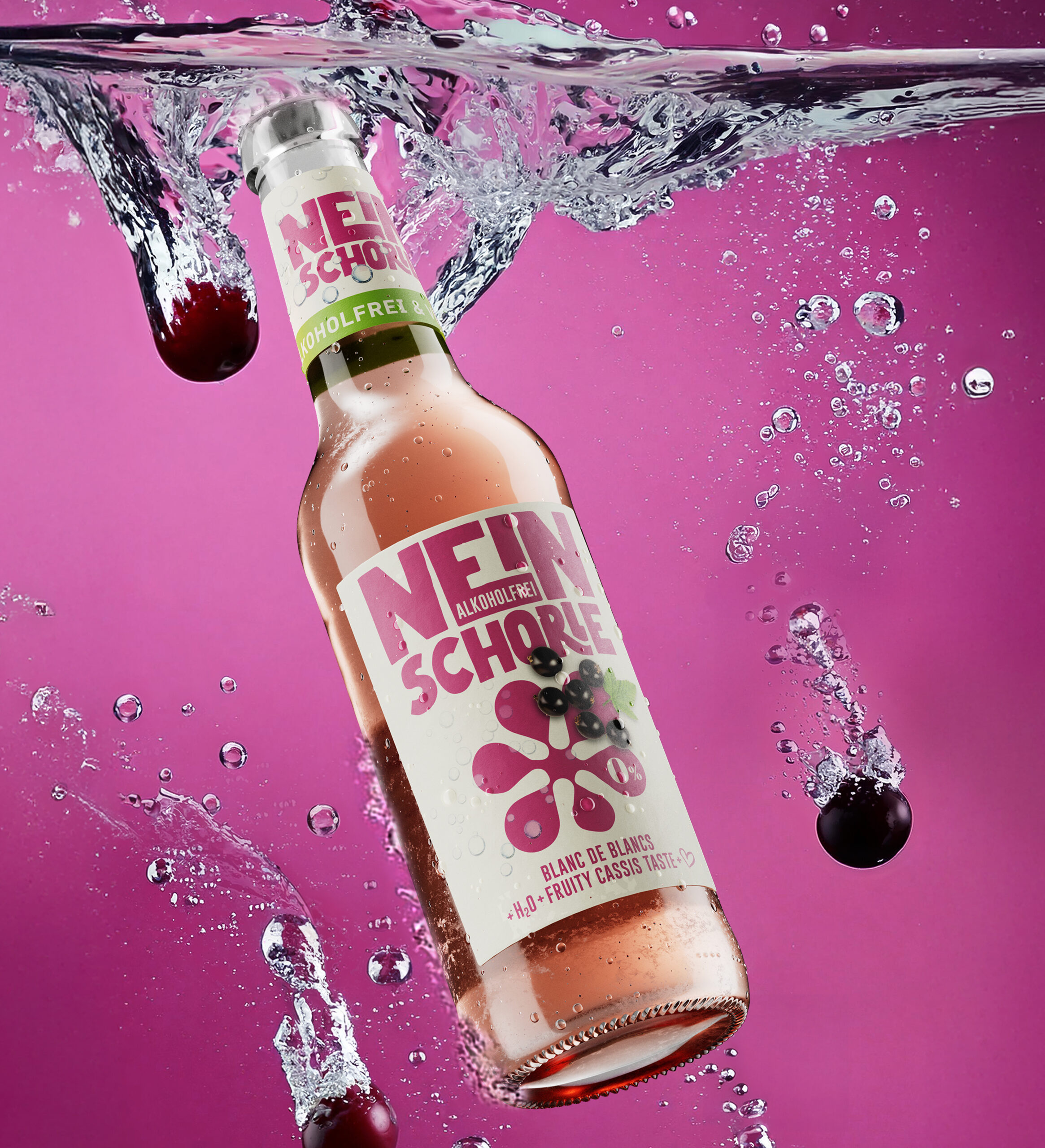
Over 350 own brands!
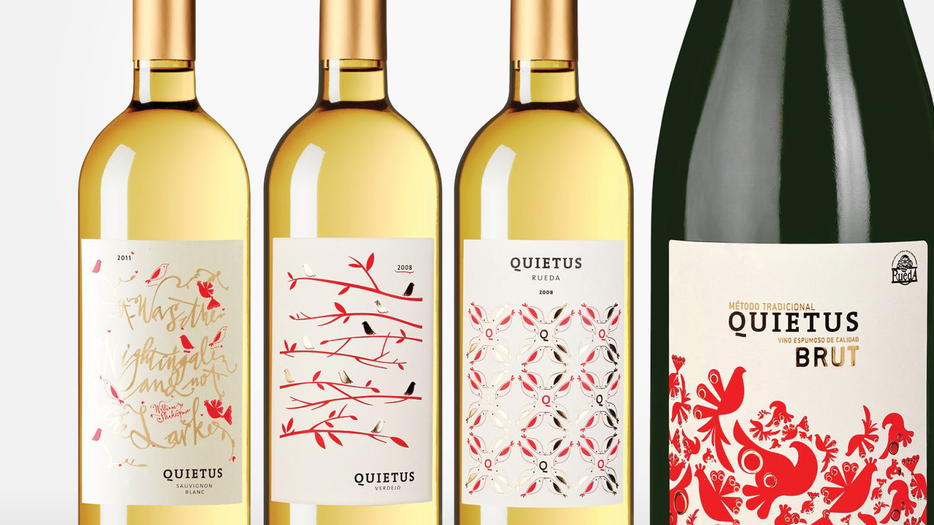
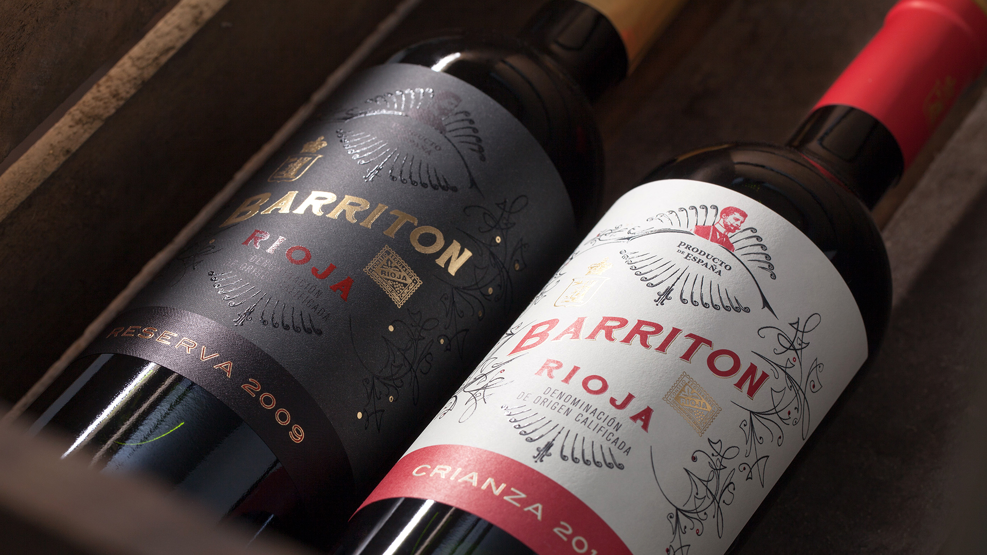
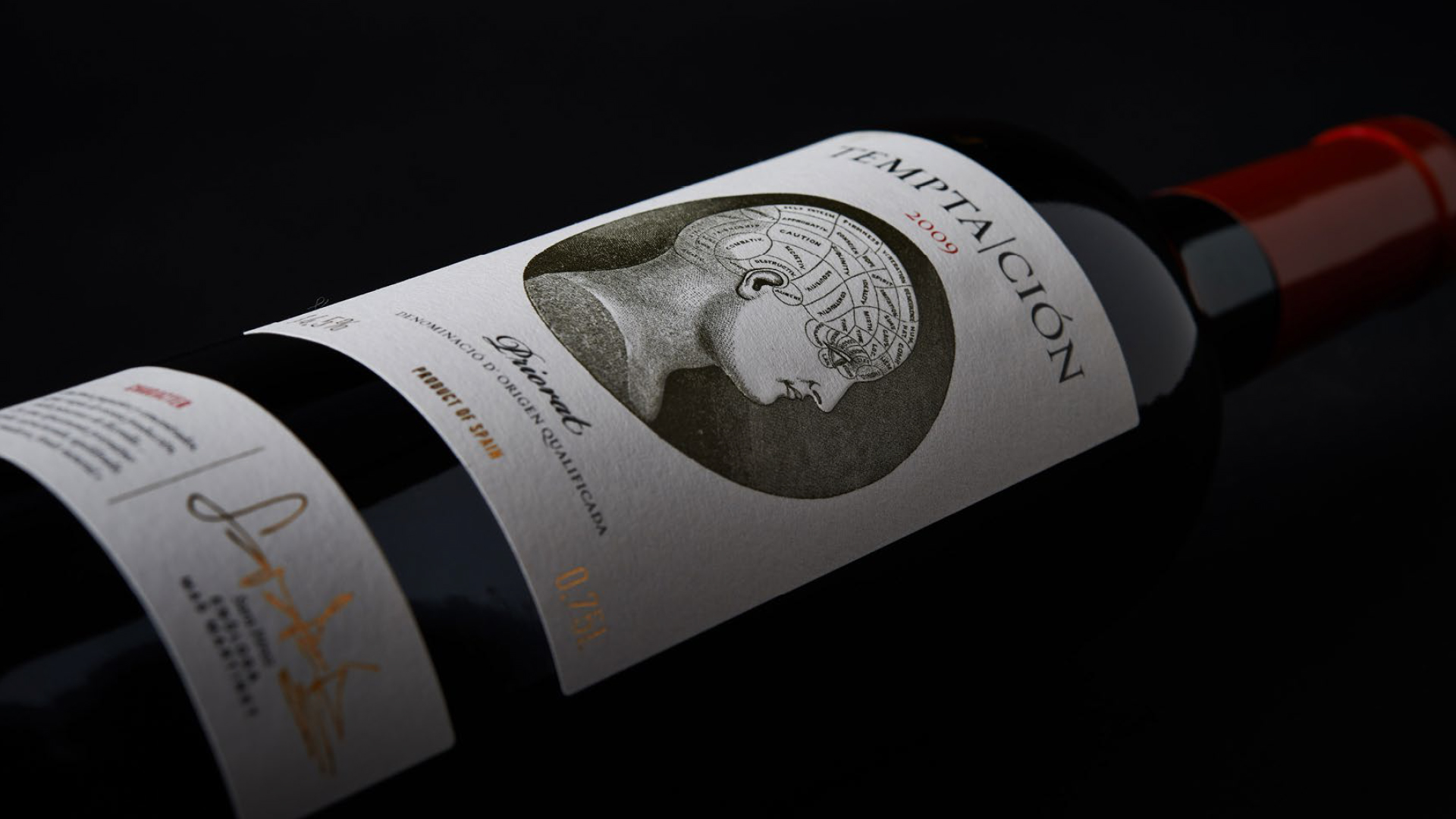
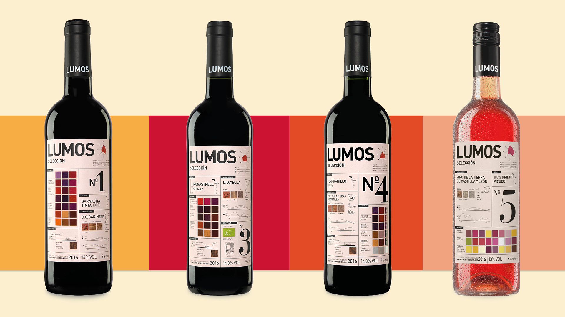
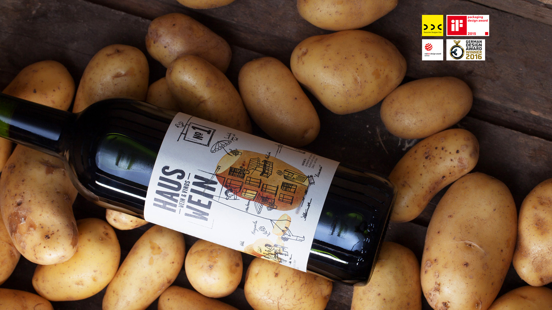
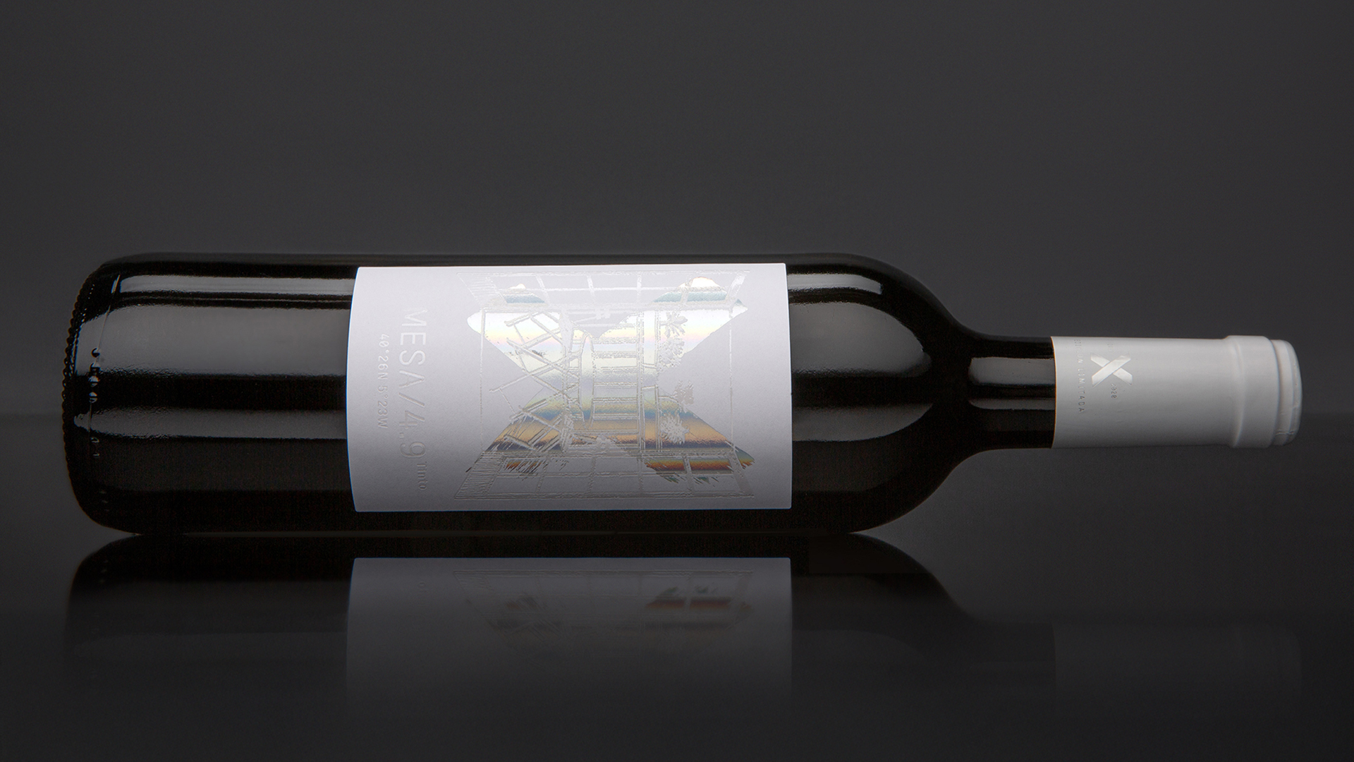
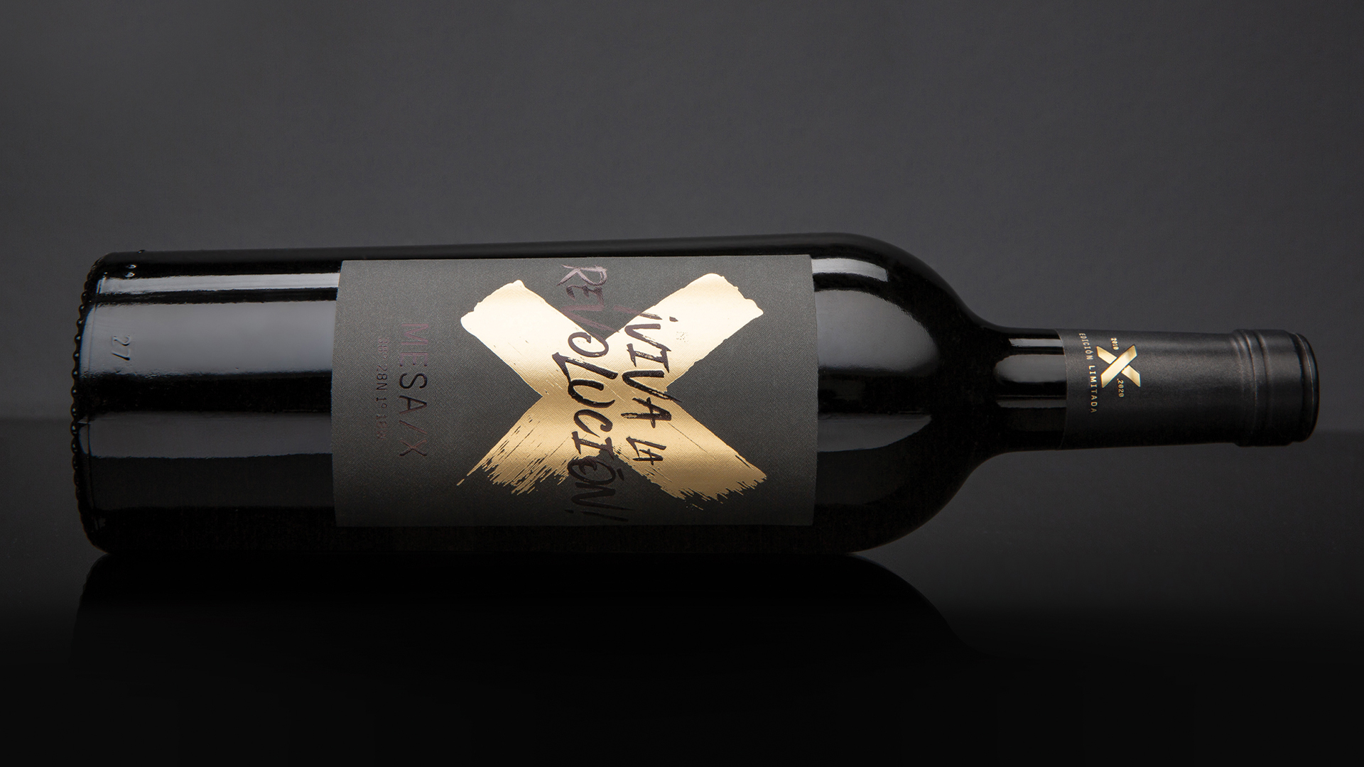

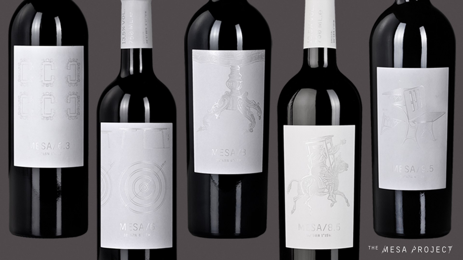

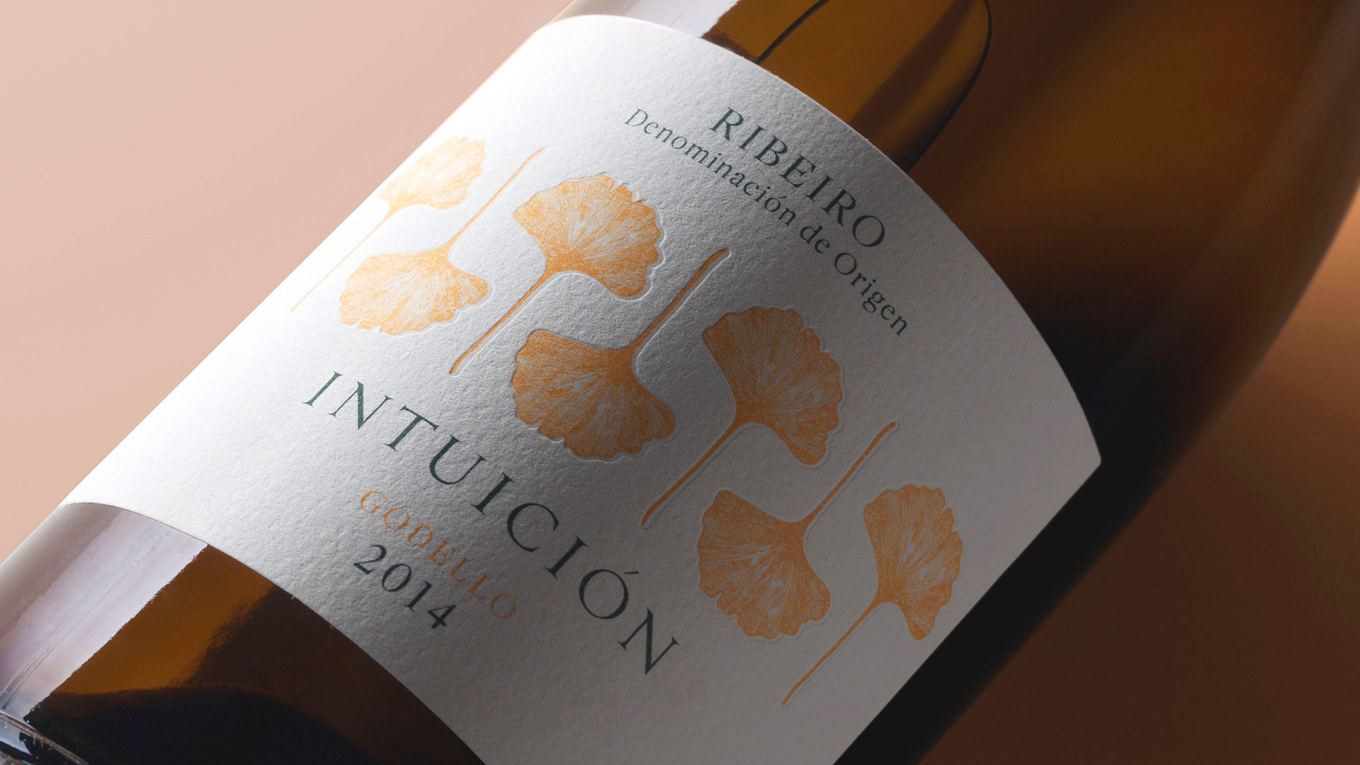
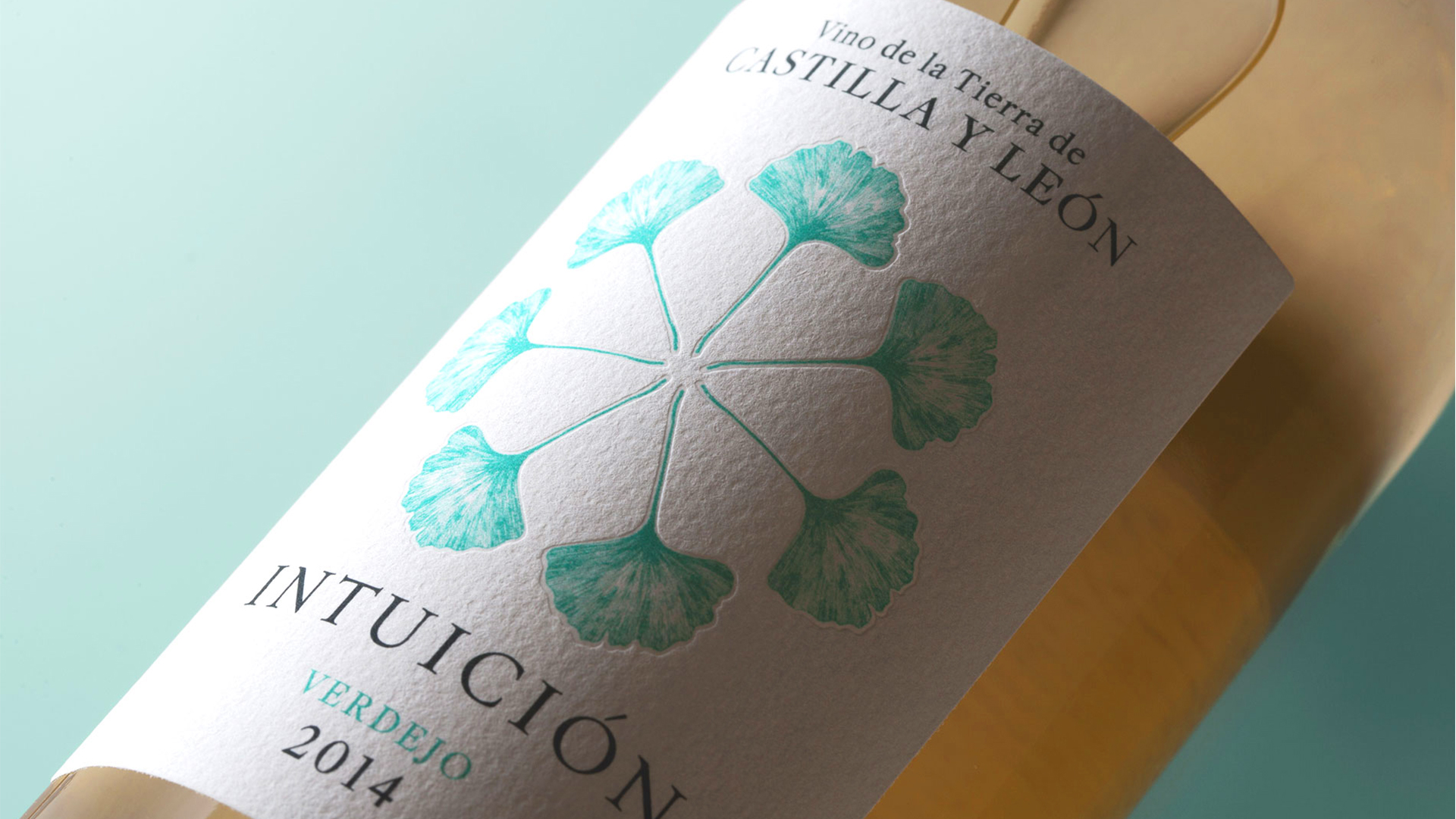
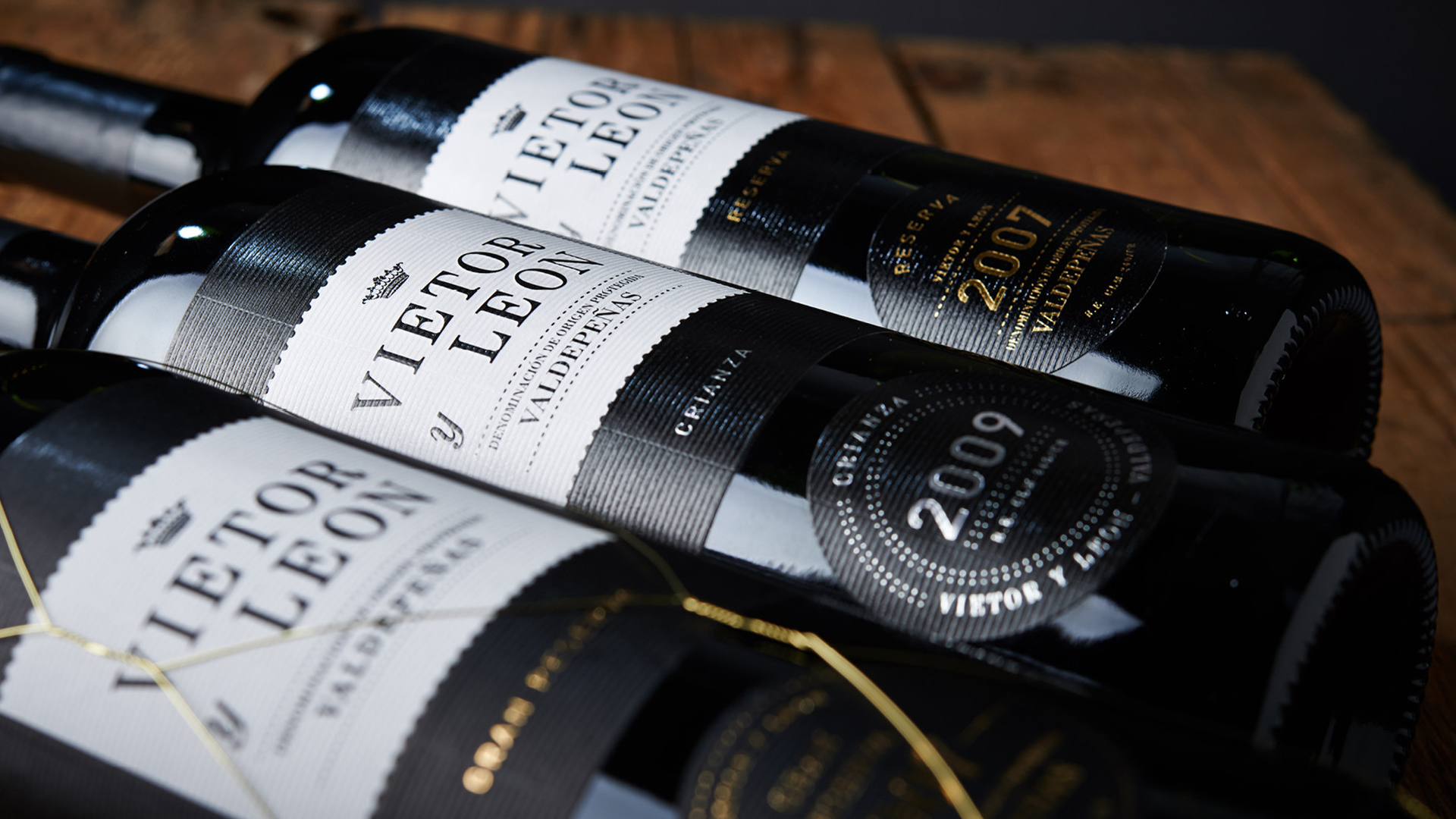
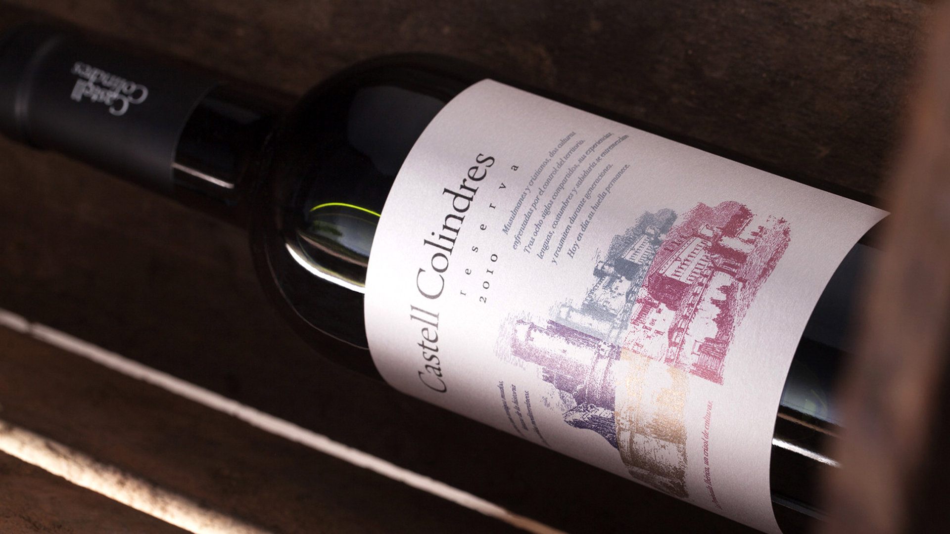
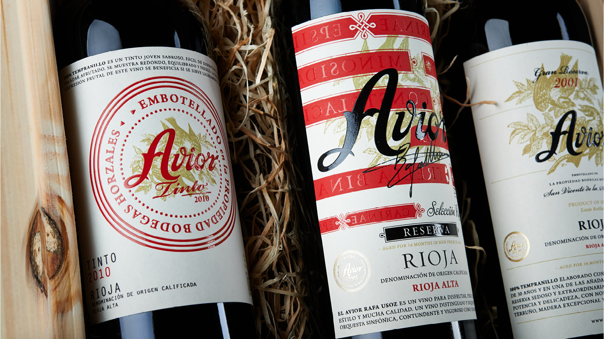
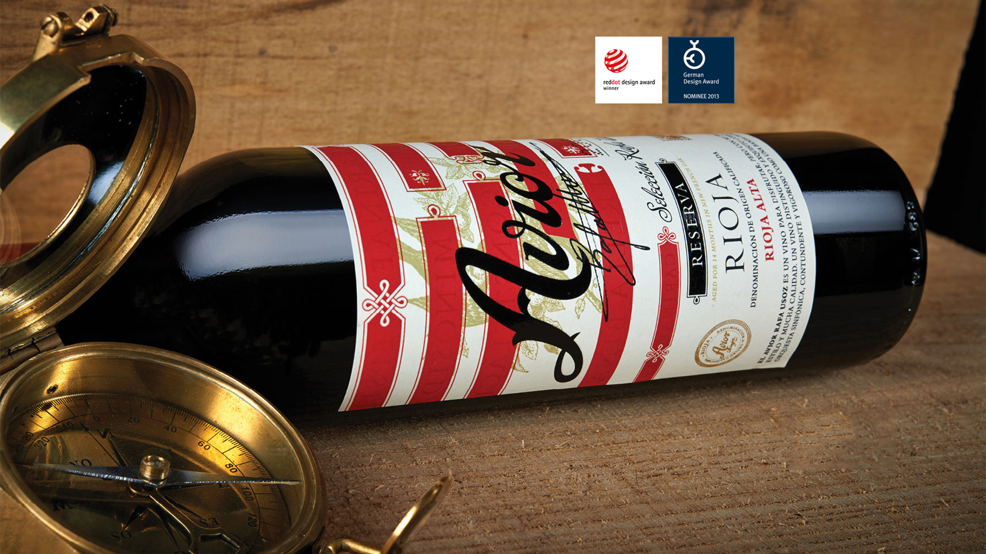

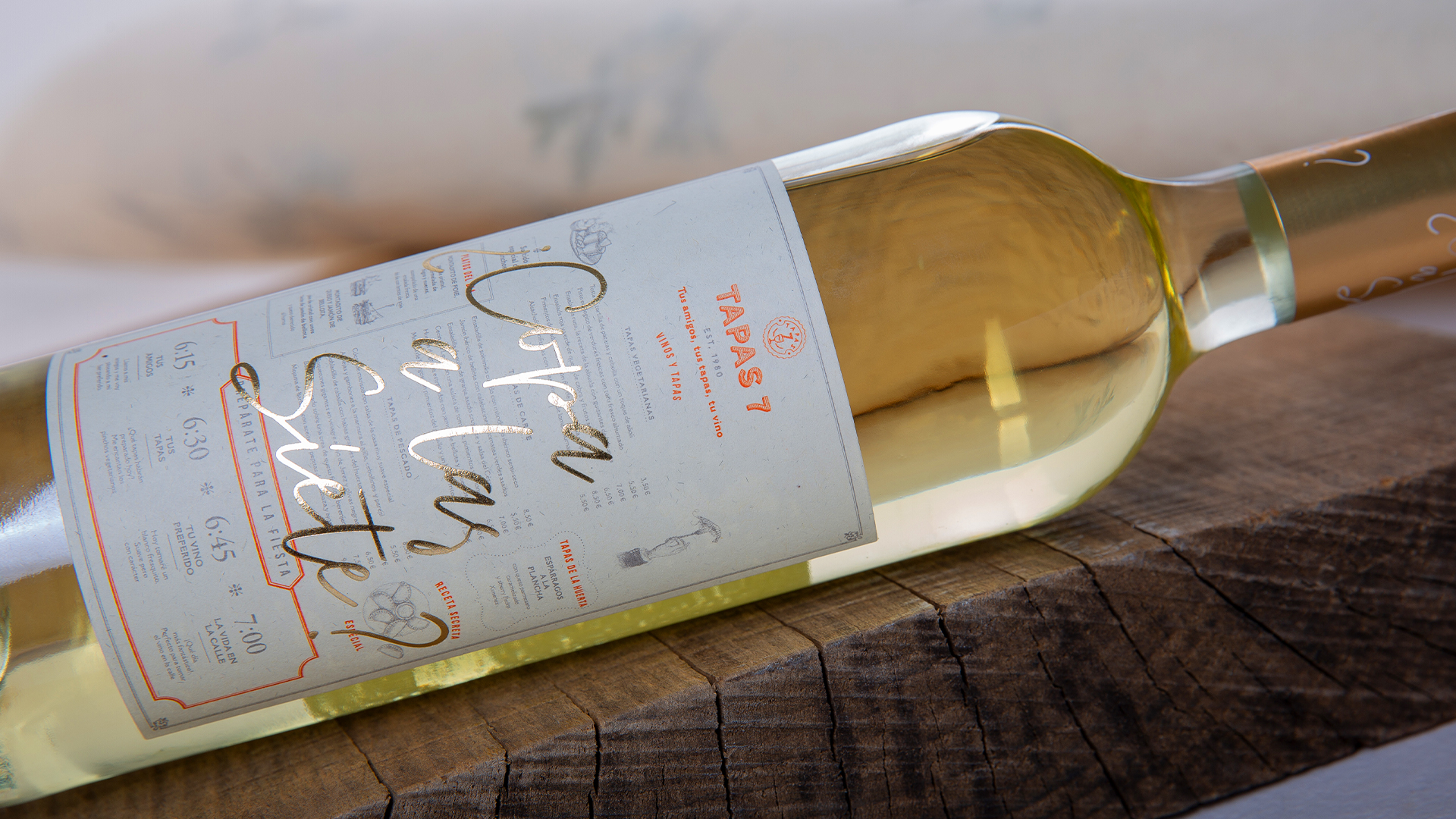
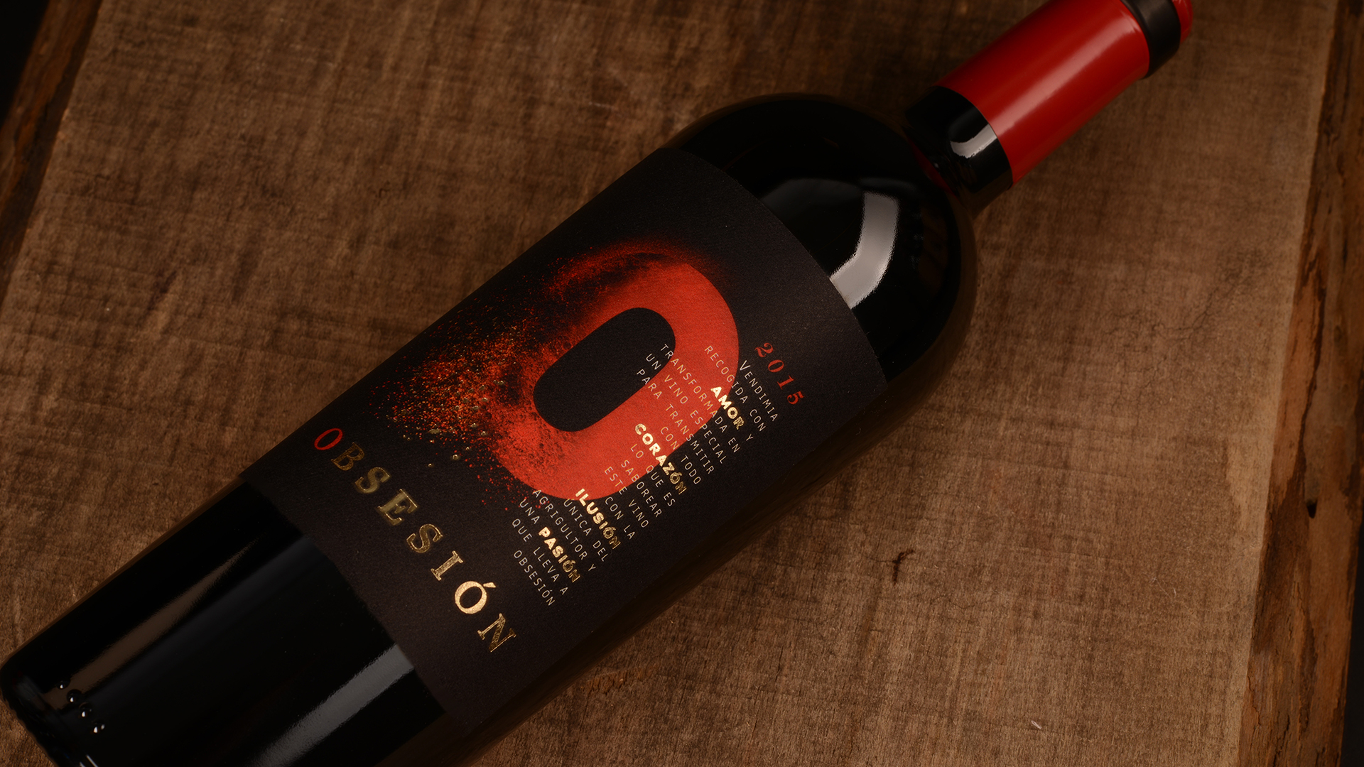
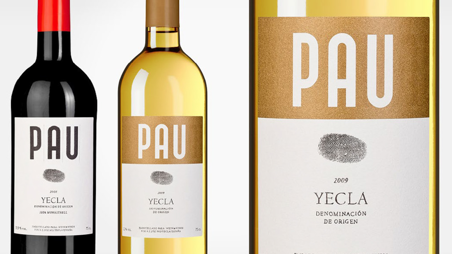
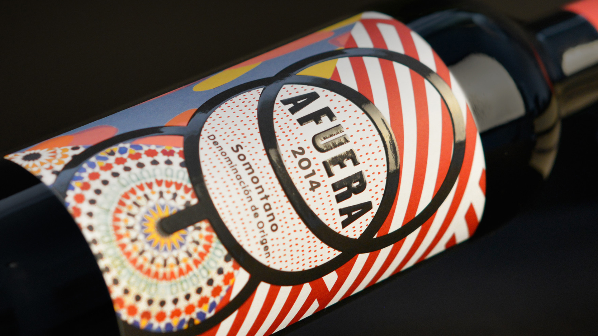

Foto credits: Rúska Martín Associates; Reena Troue; Ragner Schmuck; Jens Bösenberg
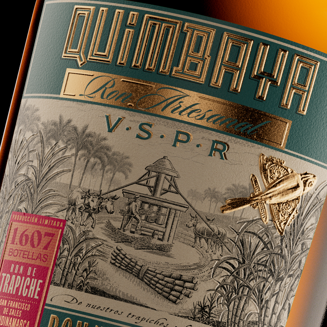
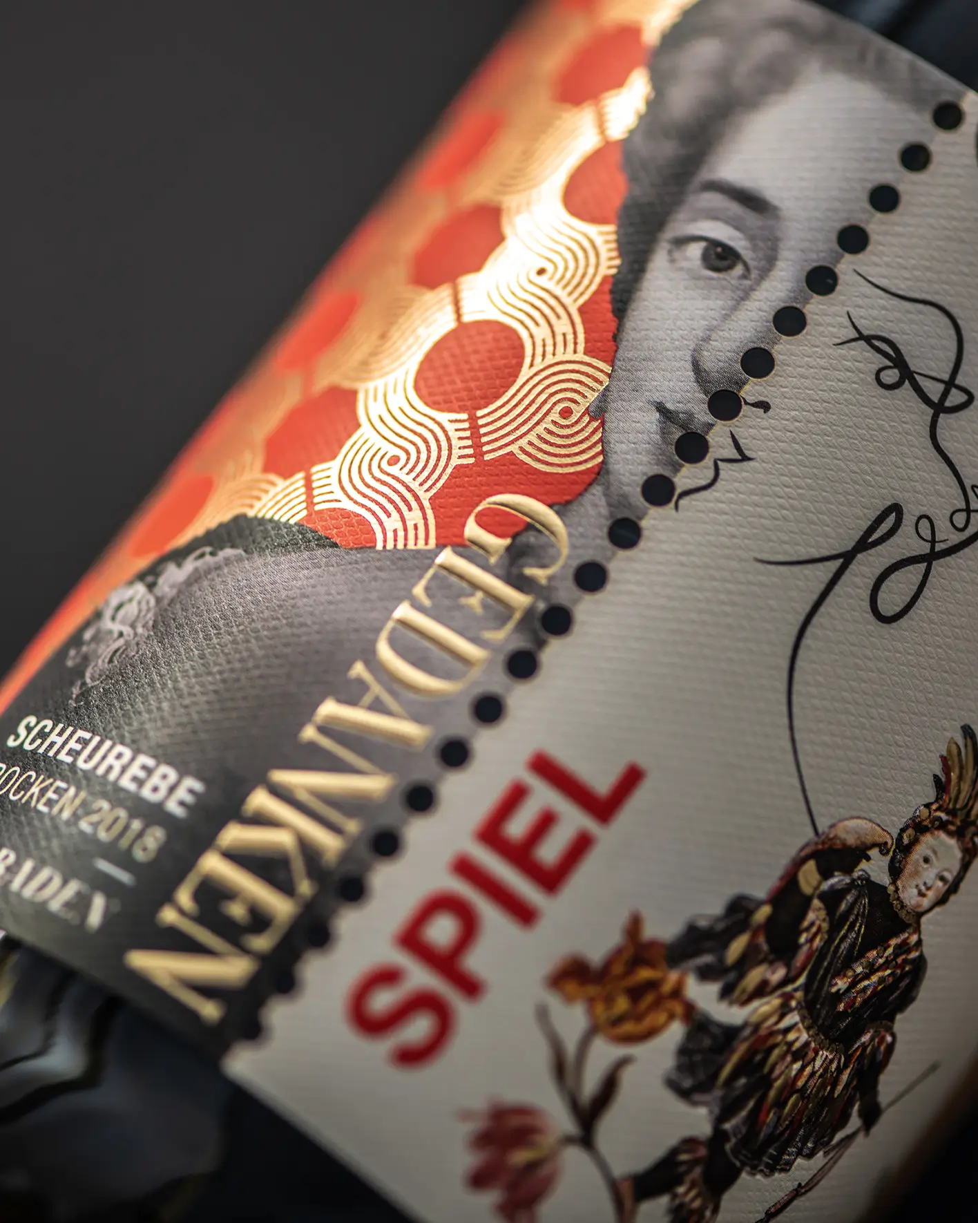
Passion for a new Spanish Lifestyle
Spanish wine is about far more than clichés. It is about quality, innovation and a contemporary way of life. That vision marked the beginning of our collaboration with VINOS more than 15 years ago, inspired by Francisca Martín’s passion not only for wine, but also for the belief that design should be as enjoyable as the product itself.
What followed is a long-standing partnership built on continuous improvement. To date, we have created more than 300 individual Labels together, united by a shared commitment to the Japanese philosophy of kaizen – the belief that every day is an opportunity to question, refine and improve what we do.

Turns out…
… VINOS didn’t just look better – it performed better. The new design system increased recognition, simplified production workflows, and gave the brand a clearer, more desirable voice across all channels. From every channel the response from customers was immediate – more engagement, more return visits, more emotional connection.
Scope of Services
• Brand Strategy
• Logo Design & Visual Identity
• Typographic System & Color Concept
• Editorial Design for Catalogues & Mailings
• Copywriting & Tone of Voice
• UI/UX Guidelines for Web & Newsletter
• Packaging
Hungry for more?
See related cases.