FUTURE FORGE
There are brands that tell stories, and then there are brands that build systems for new stories to emerge. FUTURE FORGE belongs to the latter—Branding a Movement of Minds.
Background
Sustainability used to be a message — now it’s a system. When investor and serial entrepreneur Ralf Wenzel initiated FUTURE FORGE, the goal wasn’t to launch another green platform, but to create a living ecosystem where innovation, data, and behavior design intersect. The challenge: translate a complex, global vision into a brand that feels tangible, human, and scalable across disciplines.
Brief
The task was to build a brand infrastructure — not just an identity. A name, language, and visual system that could hold a multi-layered vision: from a sustainability fund and investor platform to a collaborative think-tank. The creative direction needed to balance intellectual credibility with emotional clarity, appealing to both innovators and investors, without drifting into tech jargon or moral rhetoric.
Solution
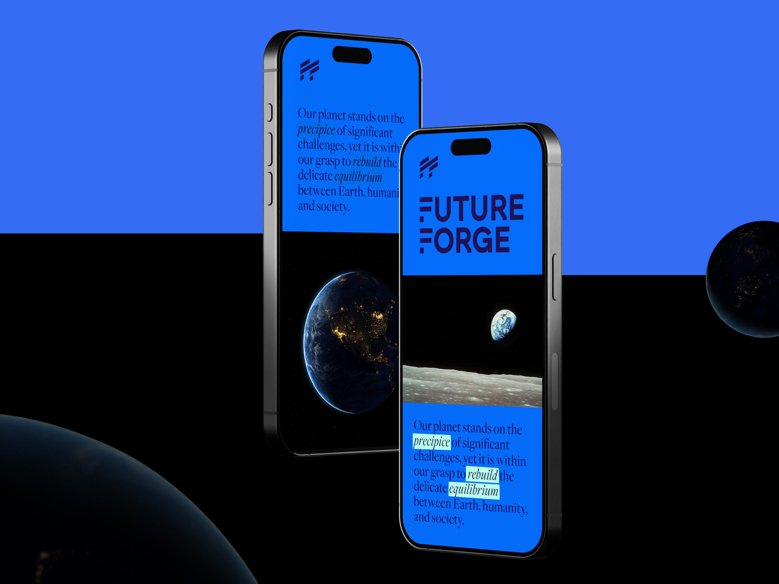
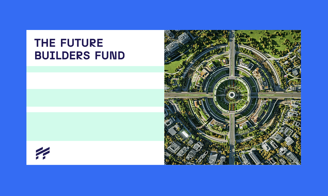
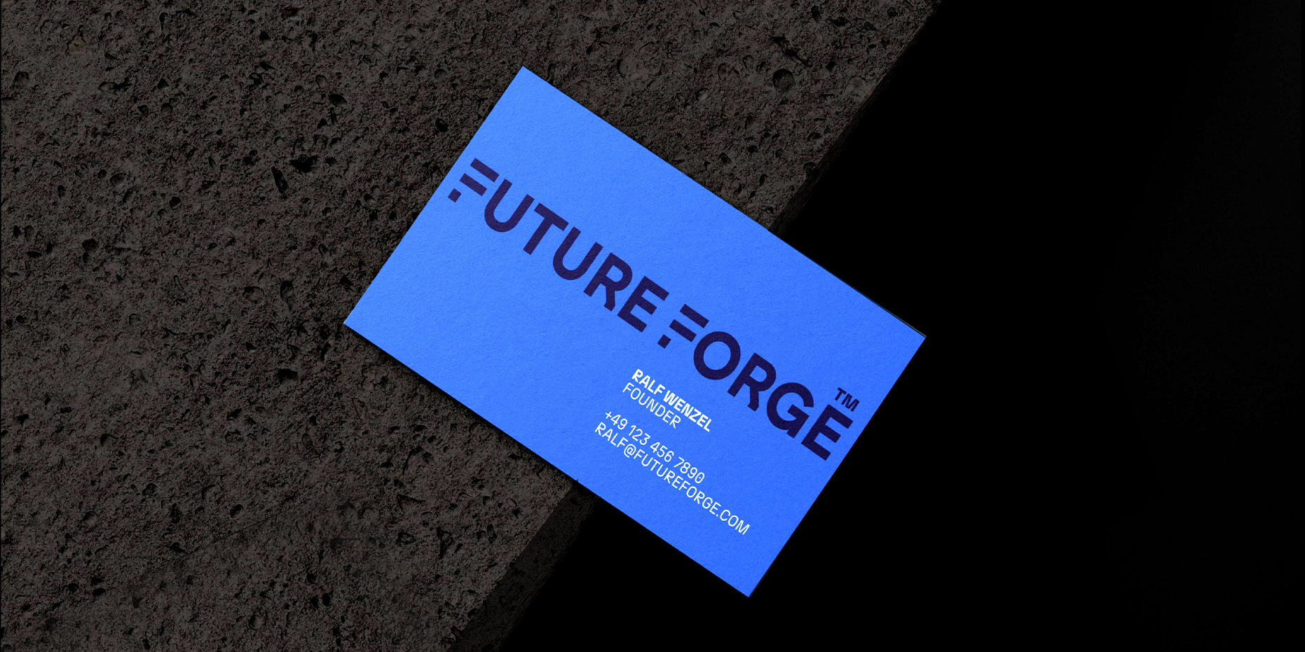
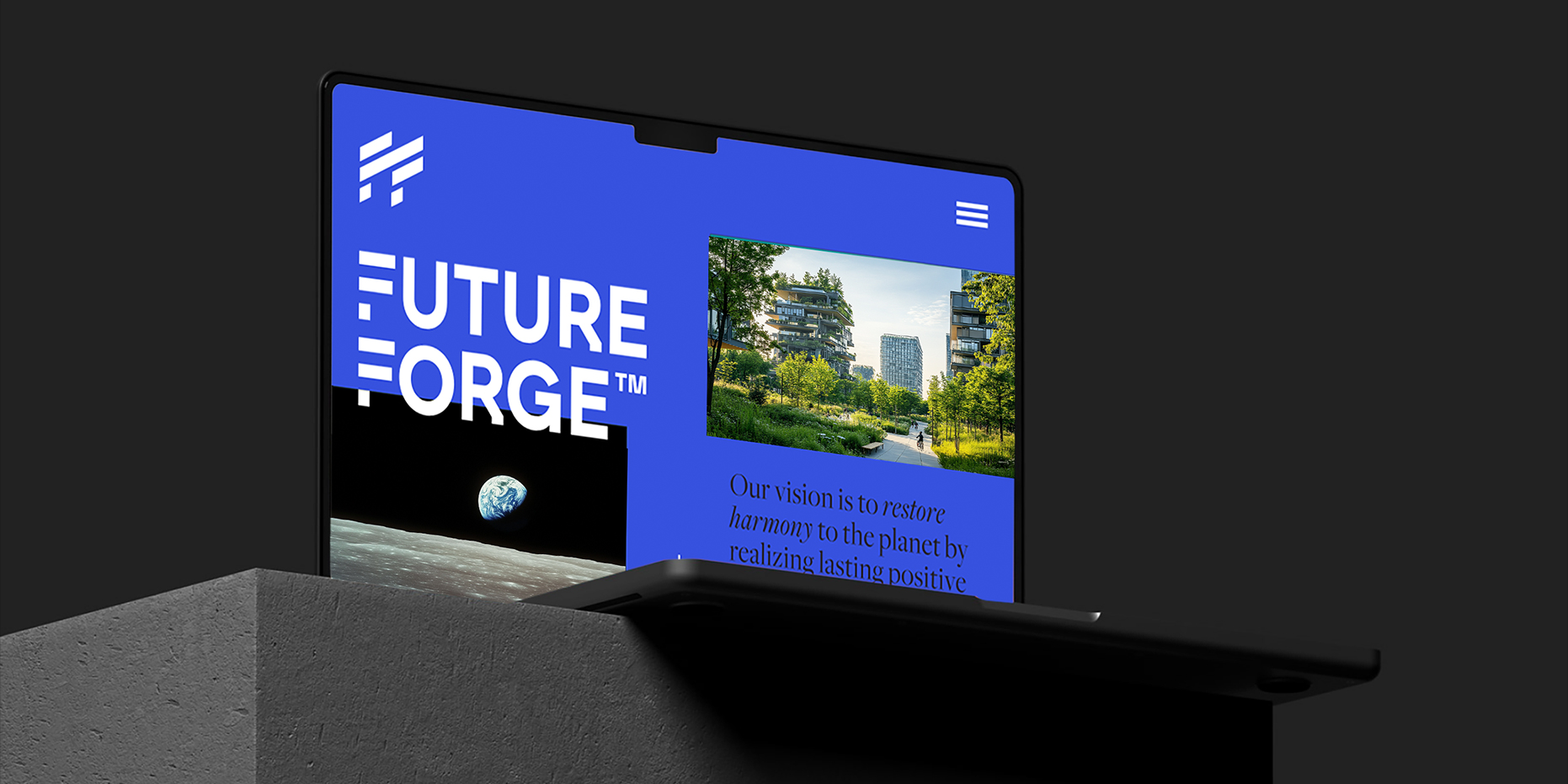
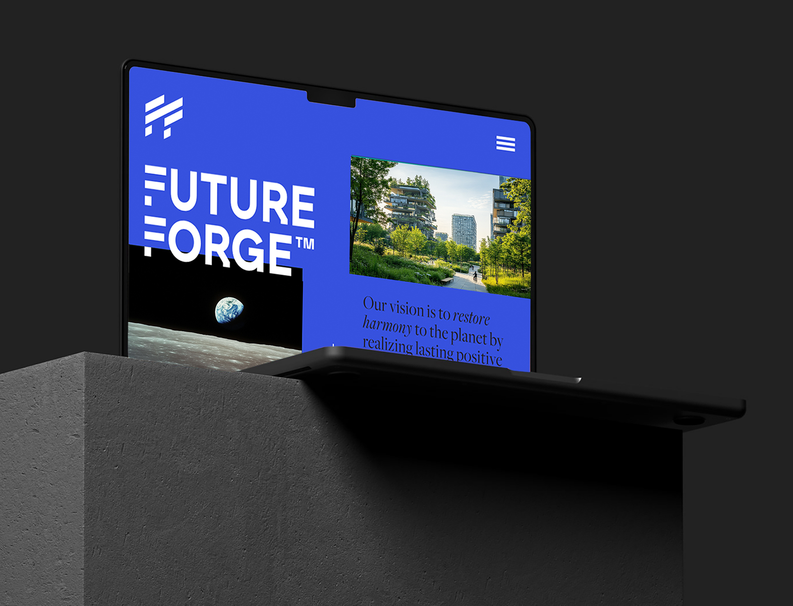
The result is a brand that thinks like a system and communicates like a magazine. FUTURE FORGE turns sustainability into a design language — modular, sharp, and human at once. Every element, from the forged logotype to the editorial voice, builds coherence between purpose and progress. Strategy, identity, and storytelling merge into a single interface: an intelligent brand engine built to scale ideas that matter.

The brief was as open as it was complex: to create a brand that could hold a global sustainability platform, a fund, and a think-tank in one — without drifting into corporate cliché or greenwashed utopia.
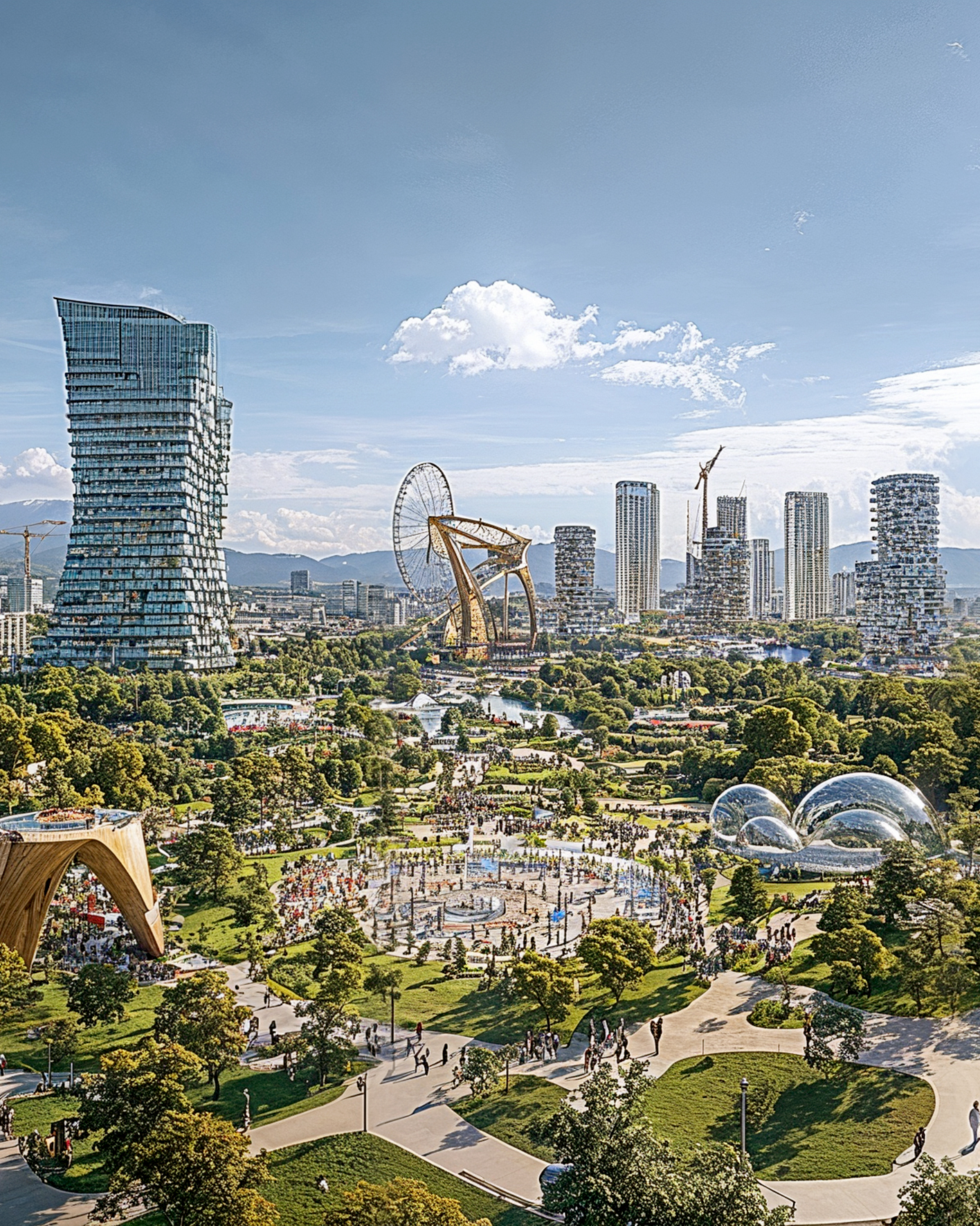
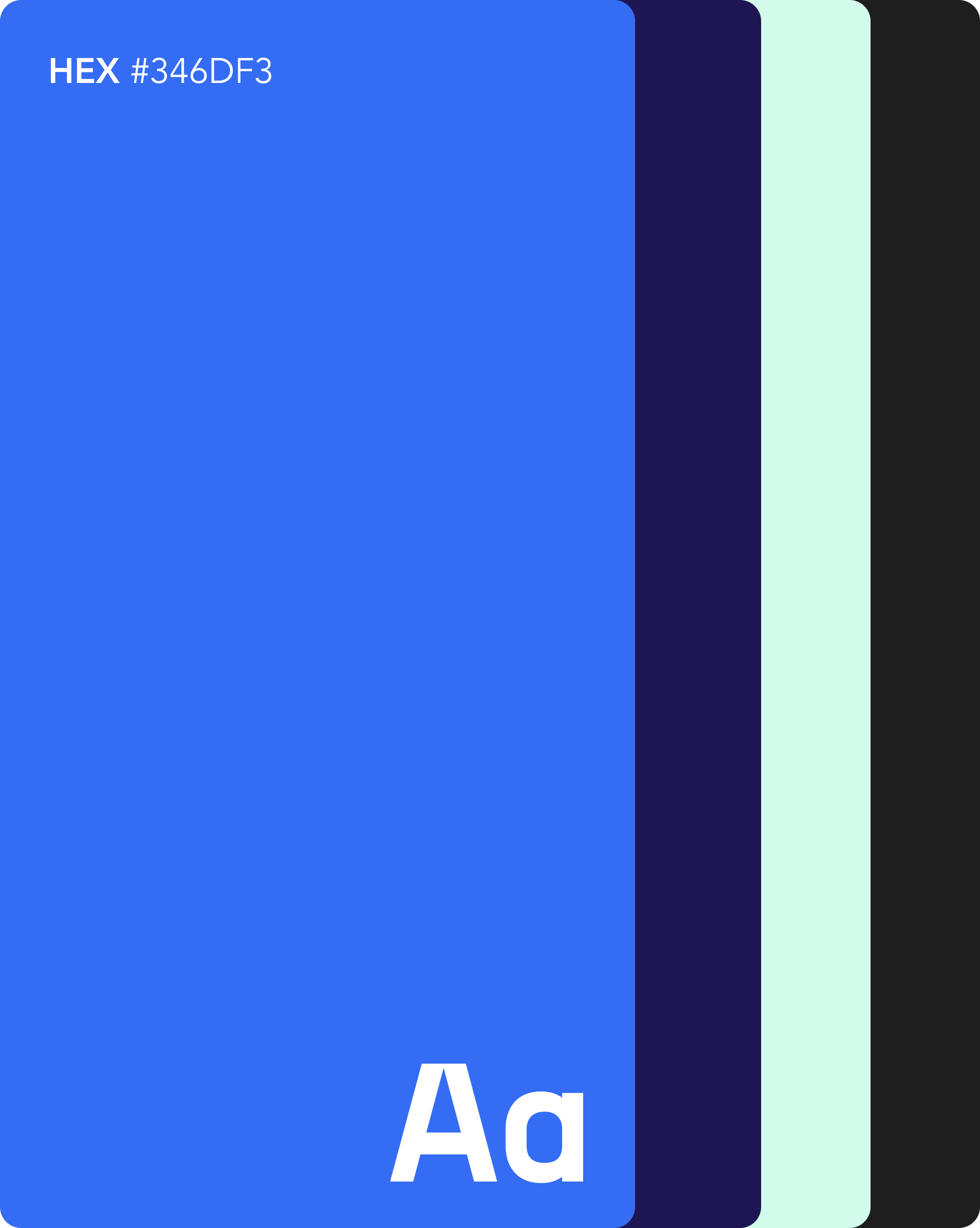
The identity was built around the concept of forging intelligence: data, technology, and human insight colliding into new, tangible progress. The visual system merges metallic precision with organic motion — a hybrid aesthetic that mirrors the dialogue between science and society. Every design decision serves this duality: grounded yet optimistic, futuristic but distinctly human.


NAMING
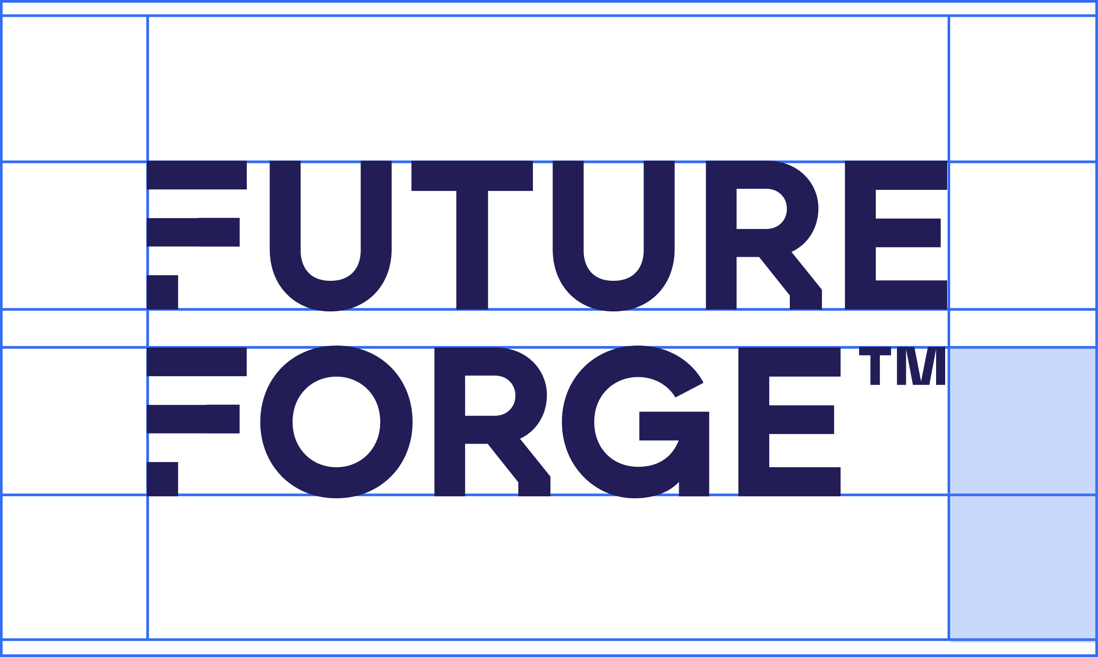
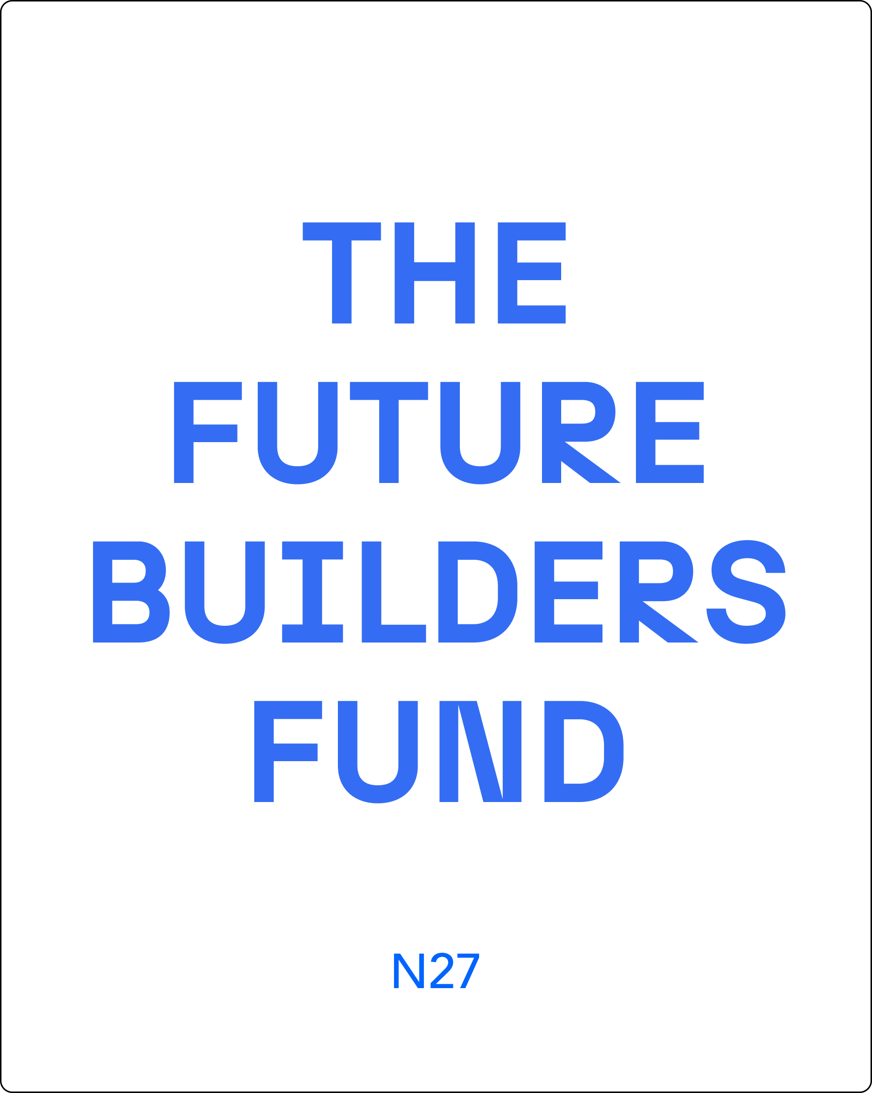
A name that feels both elemental and constructive; a word that works like a verb. Something that implies heat, friction, transformation. The typography and symbol system followed that same logic— modular, scalable, sharp-edged but warm in tone.
“Working with RUSKA MARTÍN ASSOCIATES feels less like hiring an agency and more like expanding your founding team. They think in systems, not deliverables — challenging assumptions, connecting dots, and shaping narratives that last. It’s strategy disguised as design.”
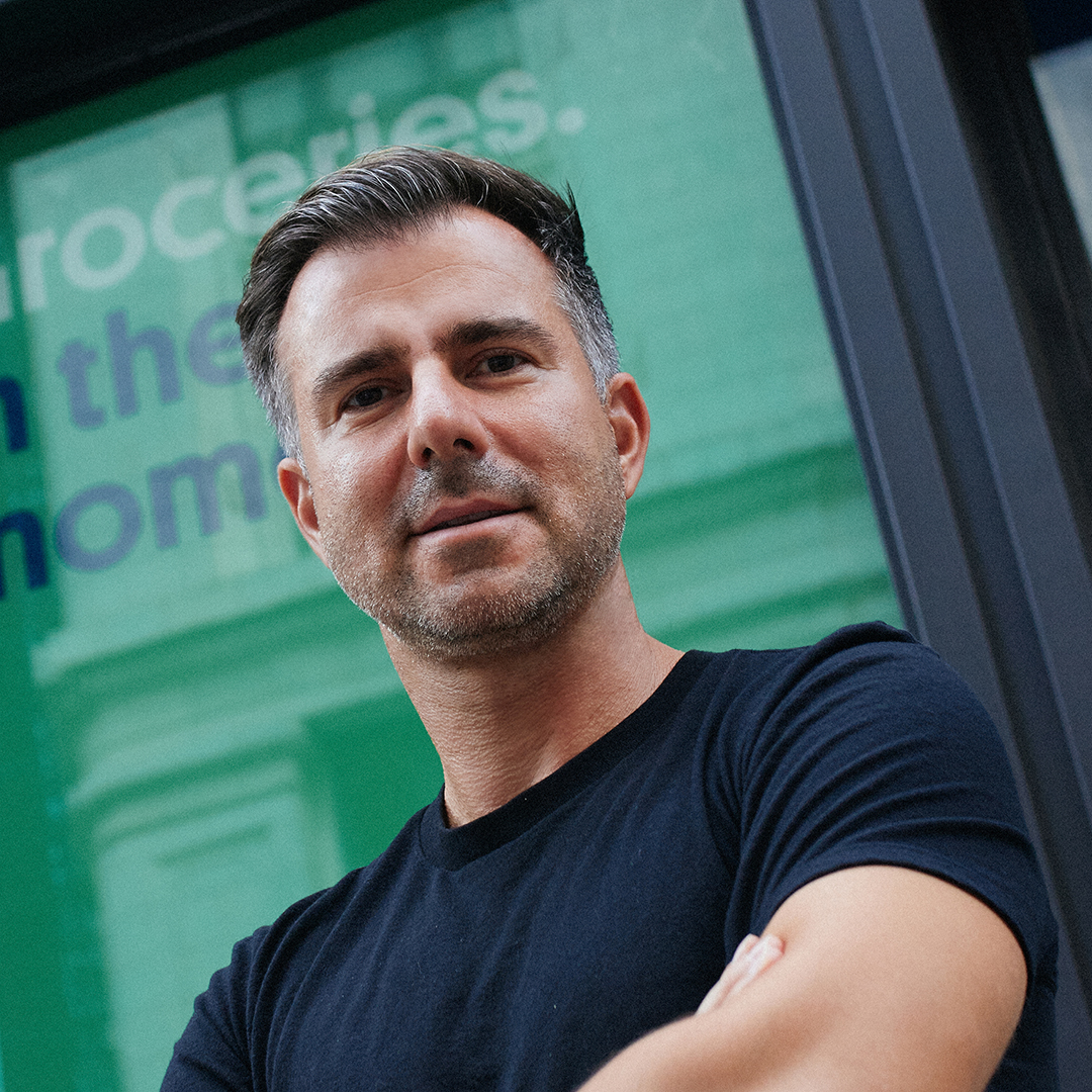
Ralf Wenzel
Founder
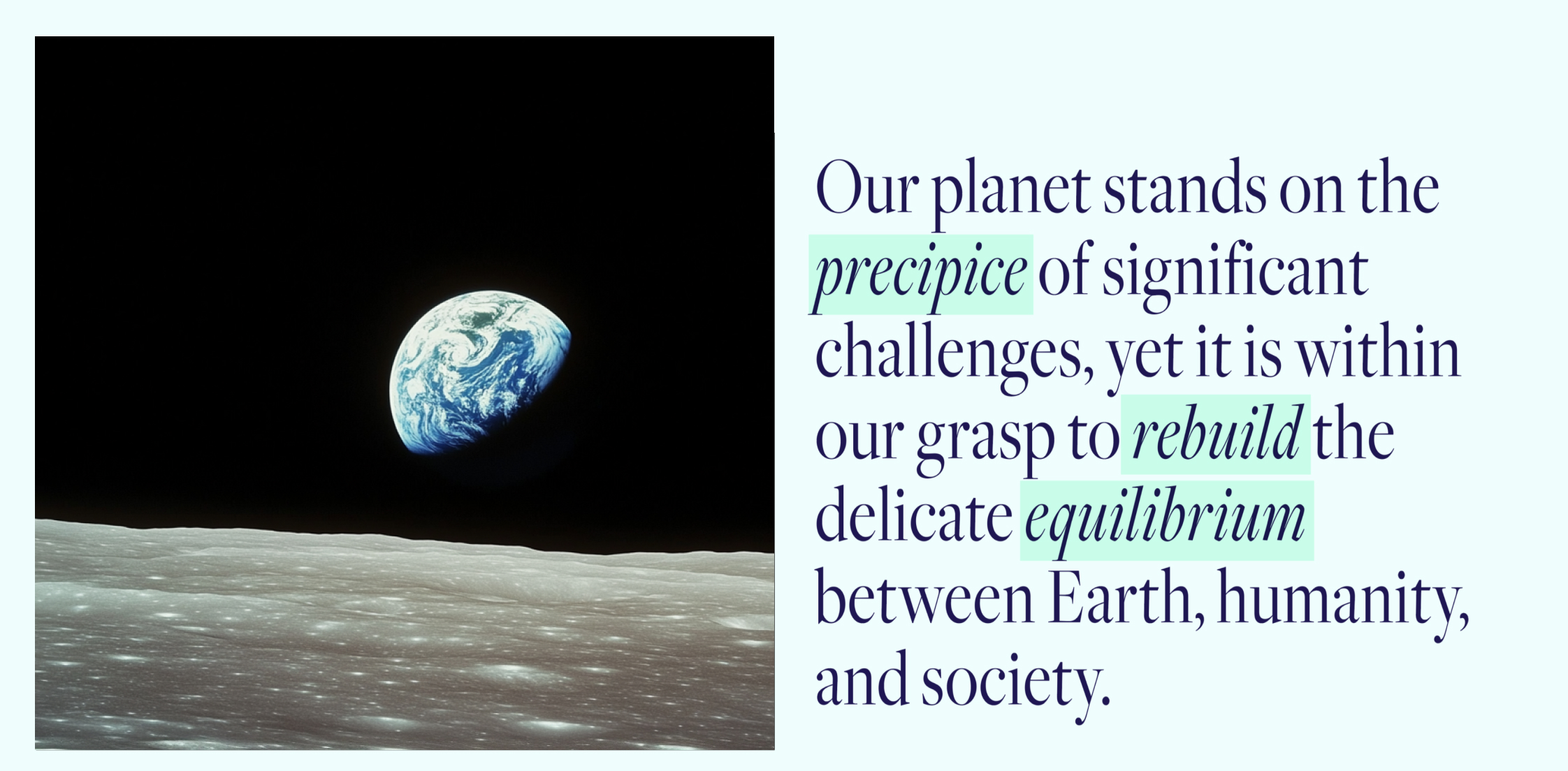
Copywriting
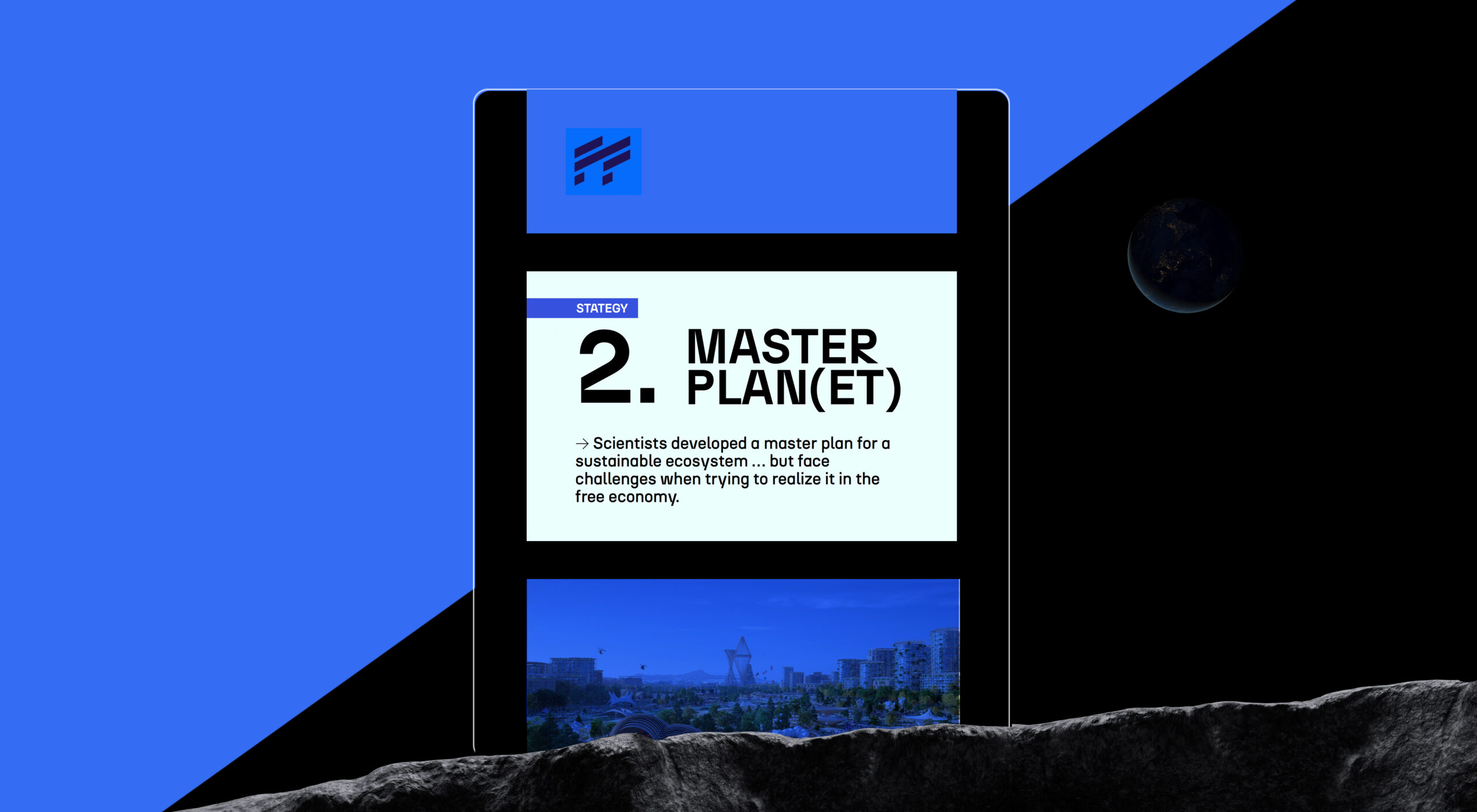
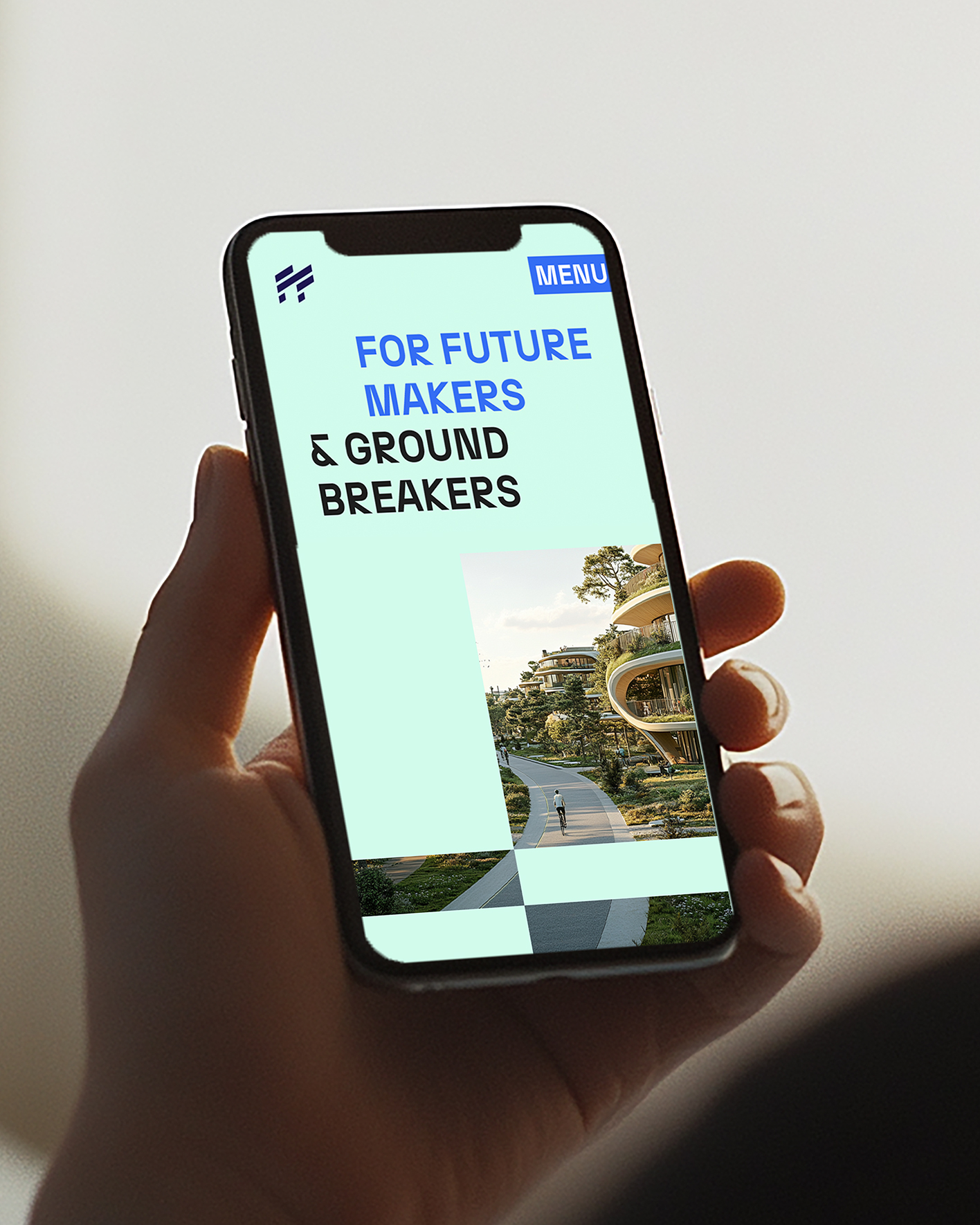
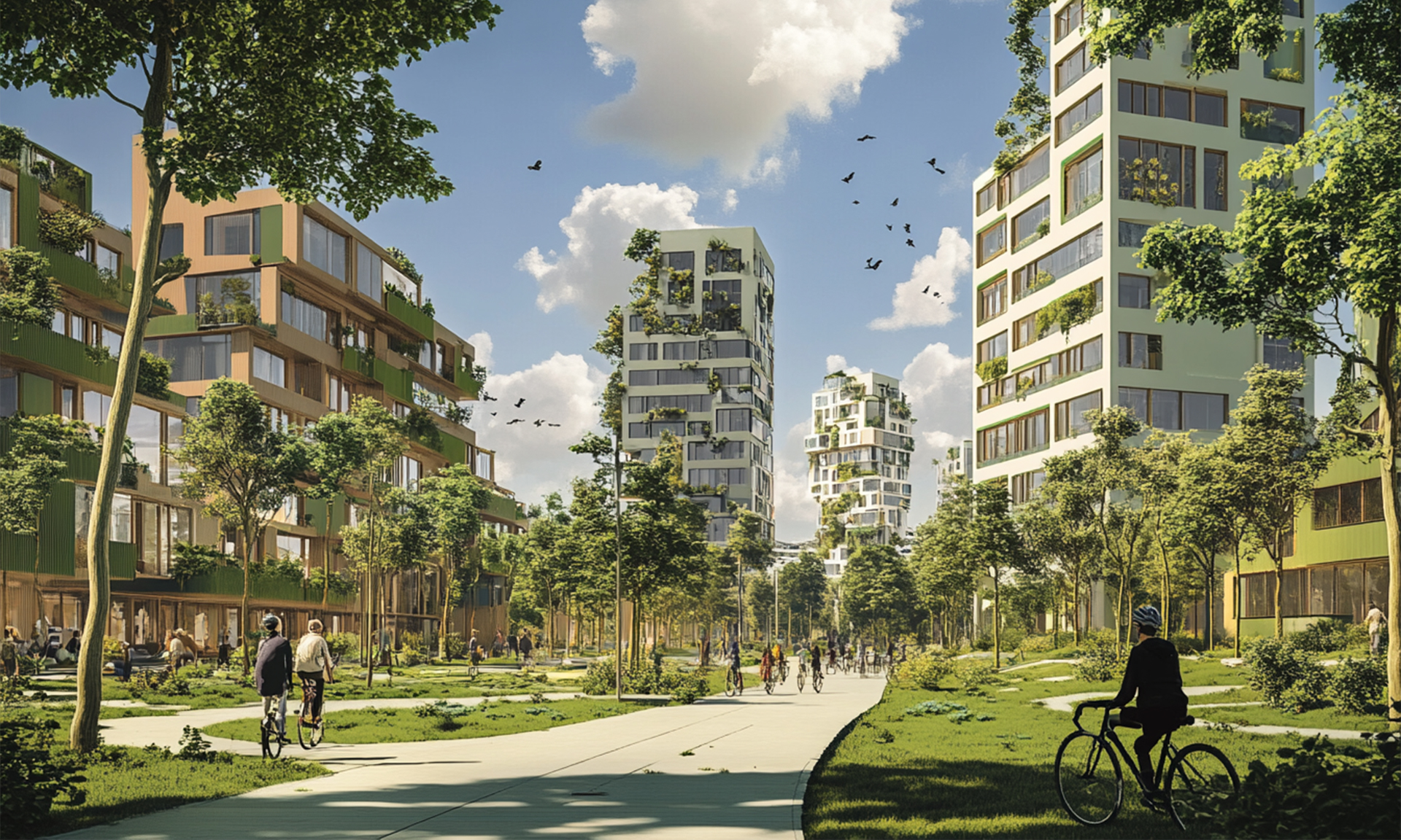
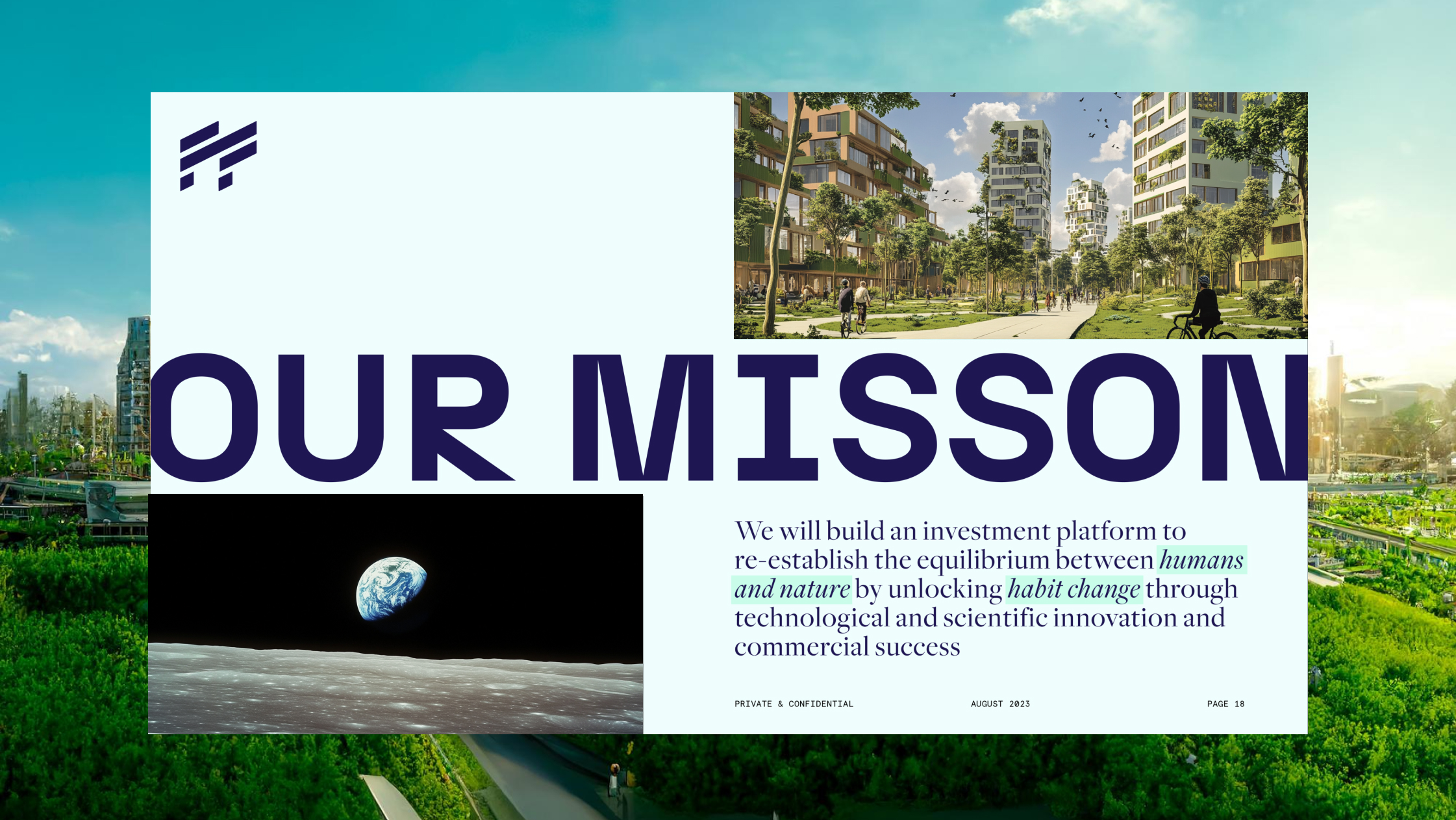
For the Investor Deck and Website, the editorial approach became the real differentiator. Instead of drowning readers in dystopian climate graphs, the narrative reframed urgency into opportunity. The copy doesn’t preach; it provokes. It treats sustainability not as sacrifice but as evolution — from the way we eat and move to how we build, produce, and connect.
Hungry for more?
See related cases.