Satsuki Matcha
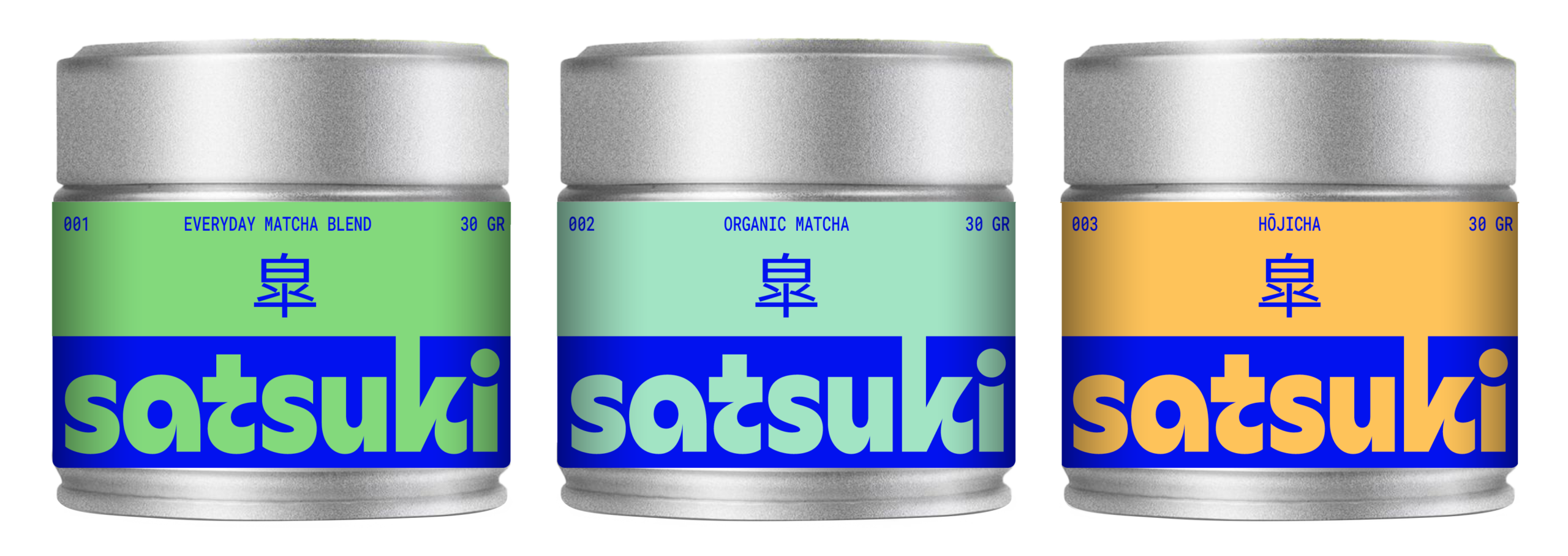
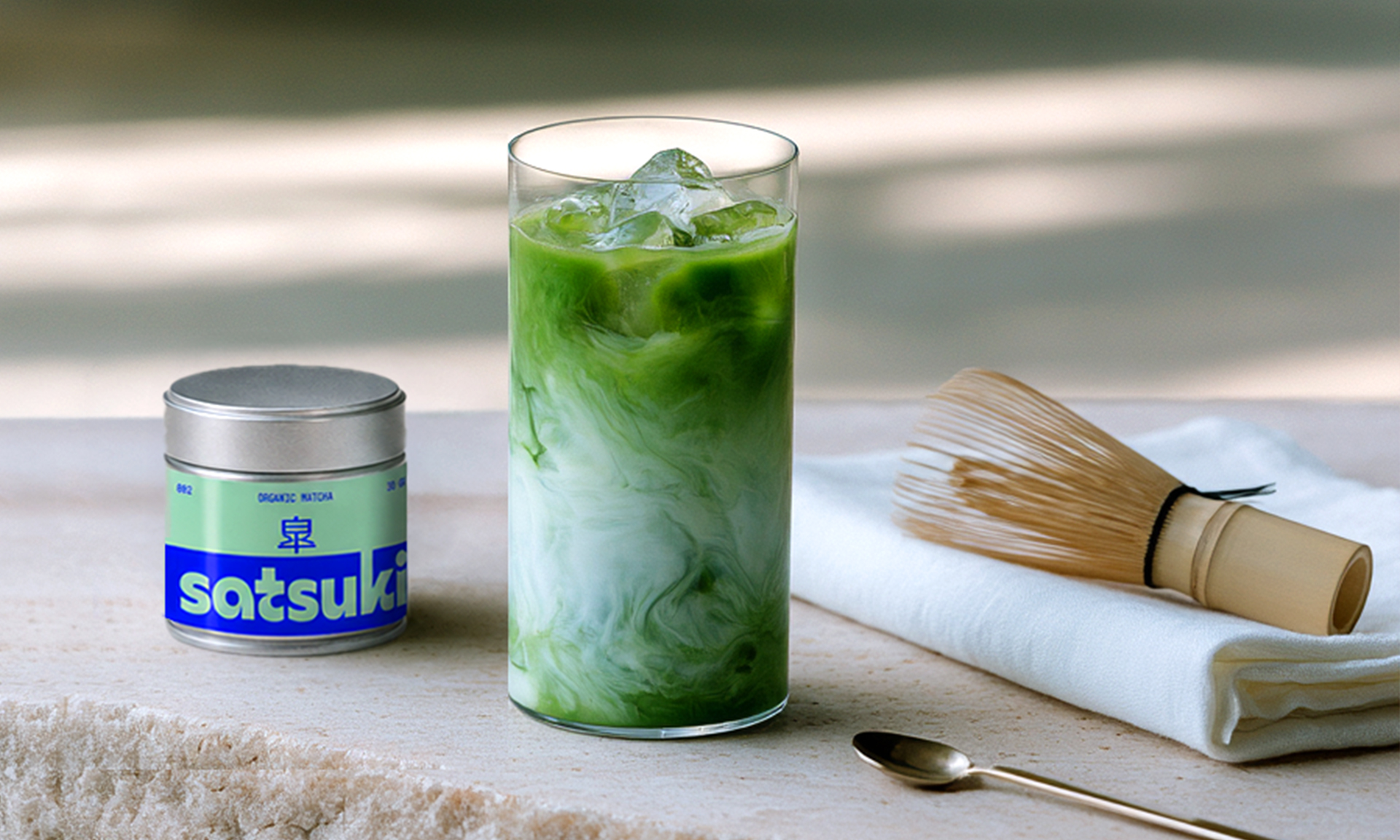
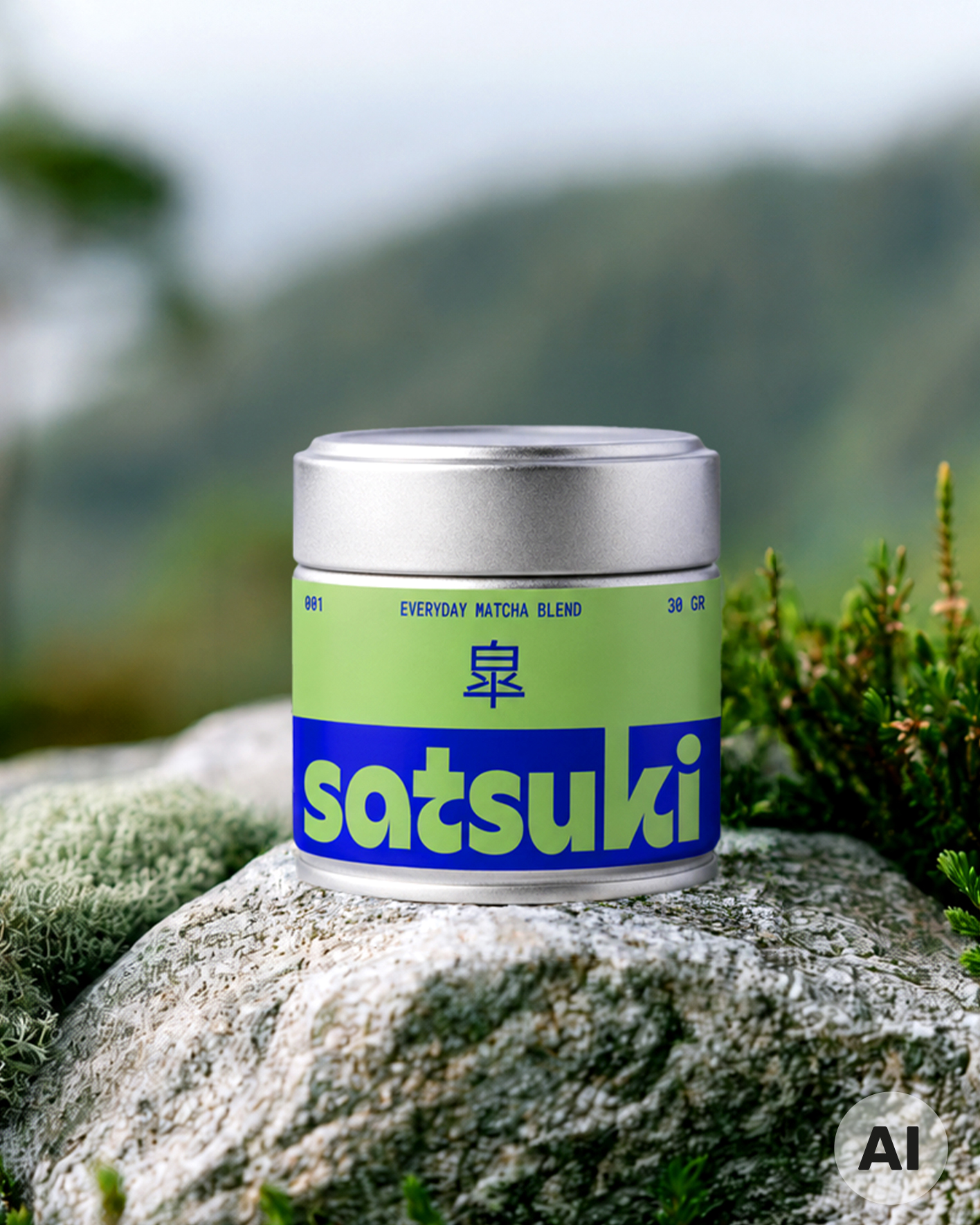
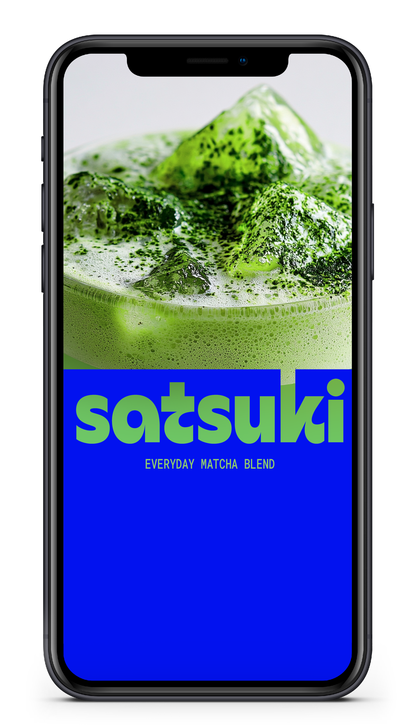
For Satsuki, Japanese tea tradition meets a bold contemporary identity. Vibrant colours, confident typography and a clean, reduced design give the Matcha range a distinctive presence while the compact metal tins add a tactile, premium feel.
Background
Matcha is deeply rooted in Japanese culture, yet has become part of a contemporary everyday lifestyle far beyond Japan. For Satsuki, the opportunity was to bring these two worlds together: respecting the product’s origin and quality while giving it a fresh and distinctive presence.
Brief
Create a premium identity for authentic Japanese Matcha that feels relevant, approachable and anything but traditional in its appearance. The design should stand out with confidence while retaining the simplicity and attention to detail associated with the product itself.
Solution
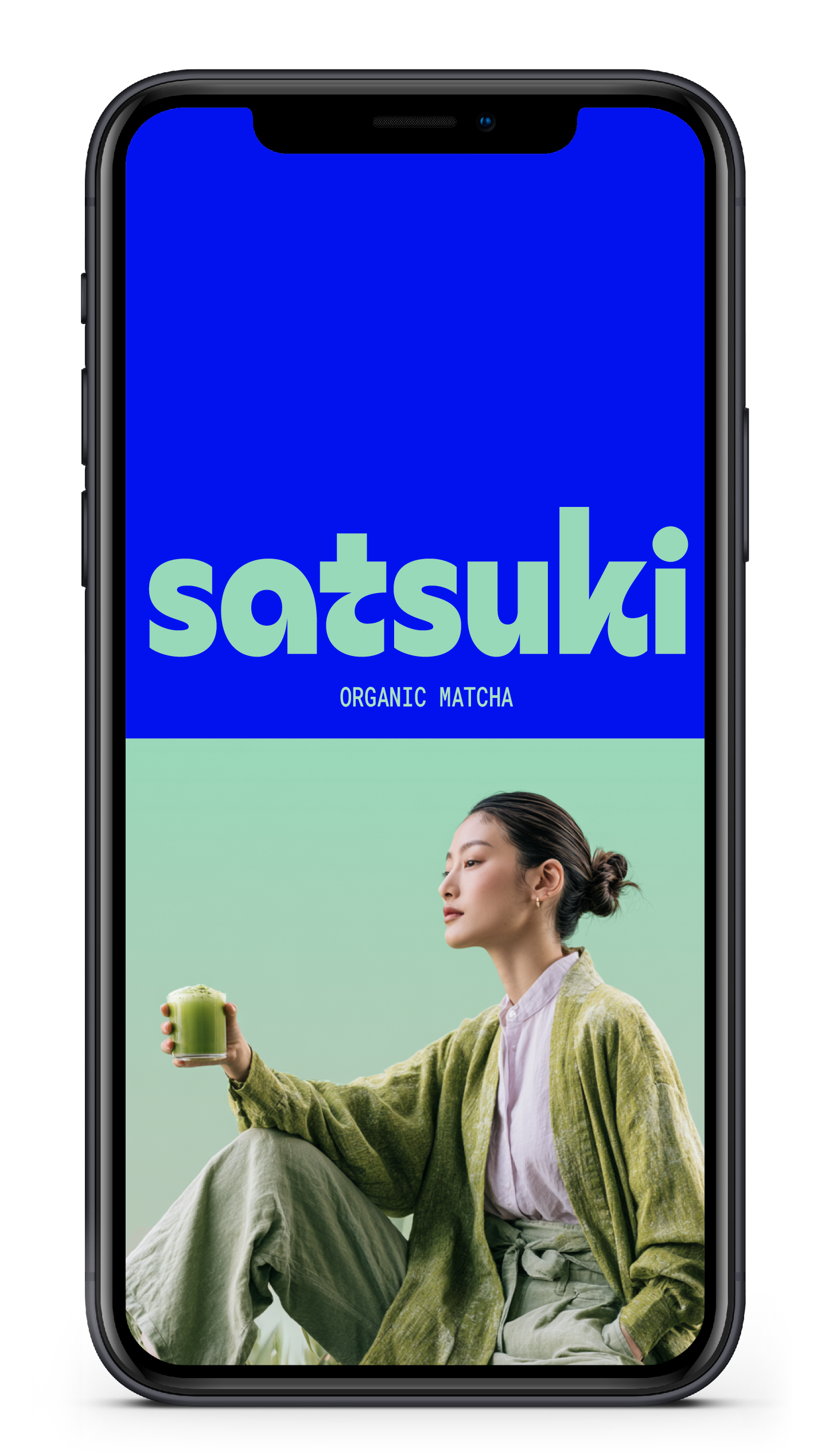
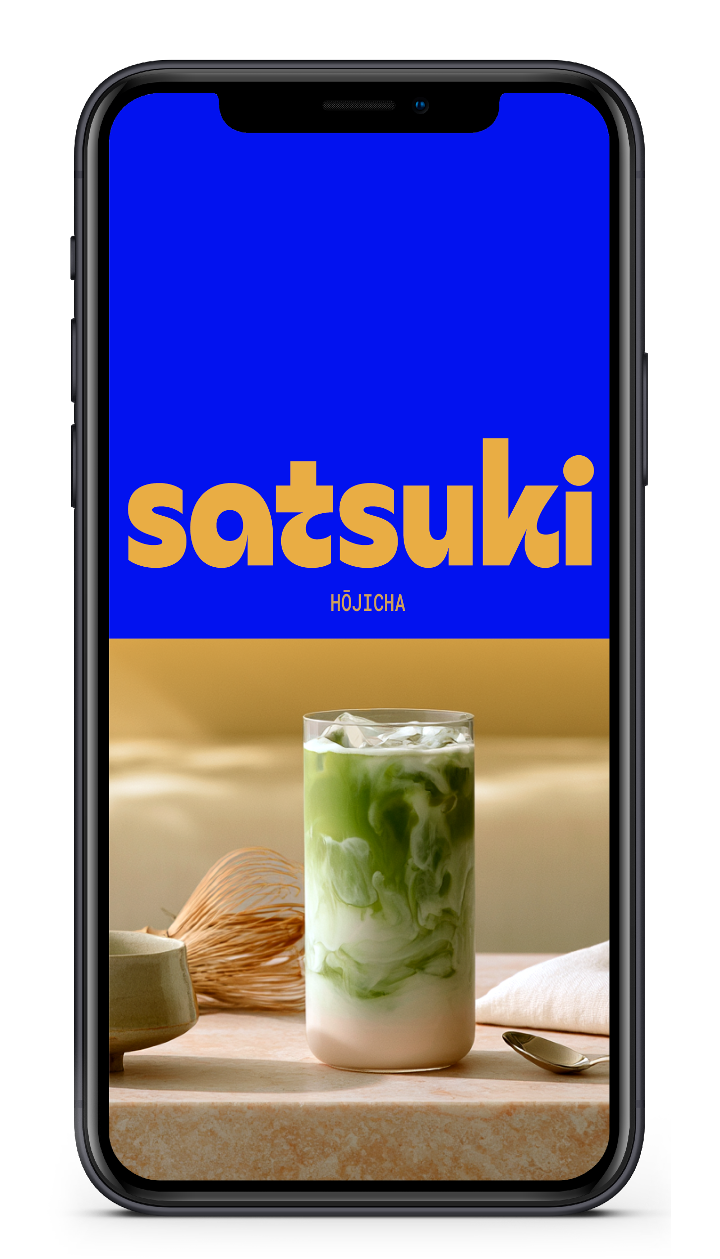
A bold wordmark, vibrant colour combinations and a deliberately reduced layout define the Satsuki identity. Set against the raw simplicity of the metal tins, the graphic design creates a striking balance between premium quality and everyday accessibility that is contemporary, distinctive and full of character.


Bright greens, soft mint and warm yellow create a fresh and expressive palette across the range. Paired with the simplicity of the metal tins, the colours give each variety its own identity by balancing Japanese tradition with a contemporary, approachable feel.





Satsuki means May in Japanese.
That is the time when some of the finest matcha leaves are harvested. The name reflects a simple idea at the heart of the brand: quality follows nature’s rhythm, and the best things are worth waiting for.



Hungry for more?
See related cases.