¡Ritmo de la Vida!
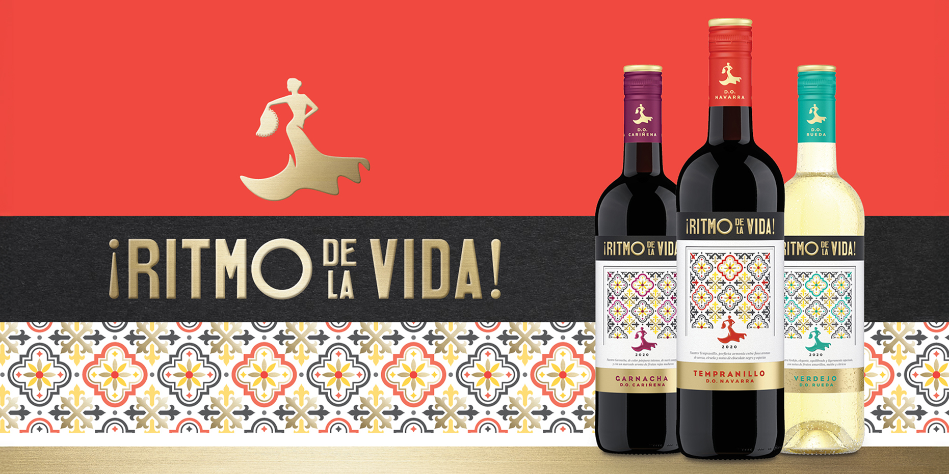
If a bottle is going to say Spain, it better mean it. ¡Ritmo de la Vida! is an invitation to a way of life. Three D.O. wines, three regions, three bold designs that don’t just catch the eye – they spark a feeling. Created for the retail shelf, but made for those who crave more than just grape variety: a moment, a memory, a mood.
Background
Rotkäppchen-Mumm, one of Germany’s largest wine and sparkling wine producers, set out to strengthen its portfolio. Spanish wines were booming – +25% growth during the pandemic – with premium segments above €5 at an all-time high. The opportunity arose to create a brand that combines Spanish authenticity with modern desirability.
Brief
The goal was to develop a premium wine line with clear Spanish origin, strong varietal recognition, and emotional impact. No label that needs explanation – just immediate shelf appeal. The design had to build trust, trigger desire, and translate quality into a visual language everyone understands.
Solution
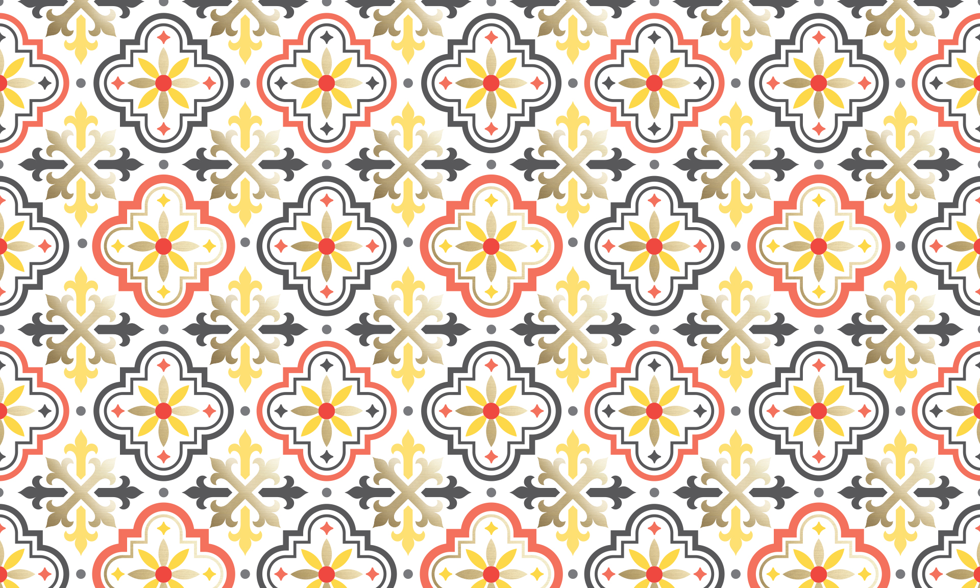
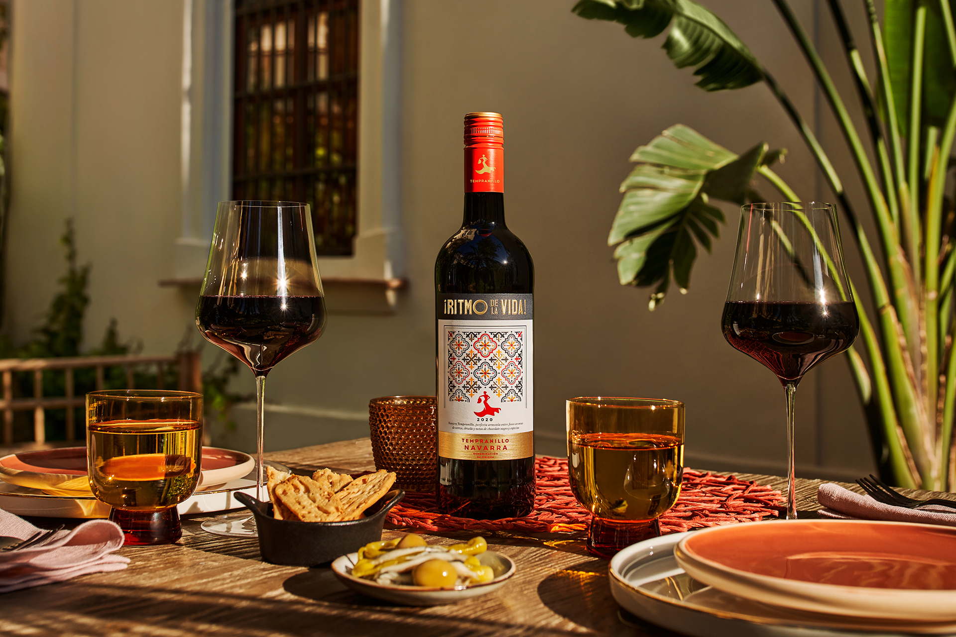
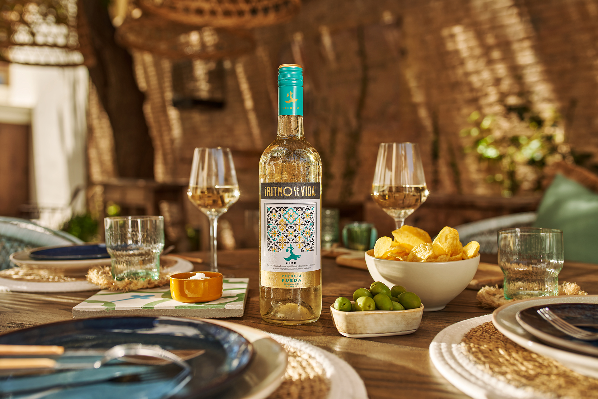
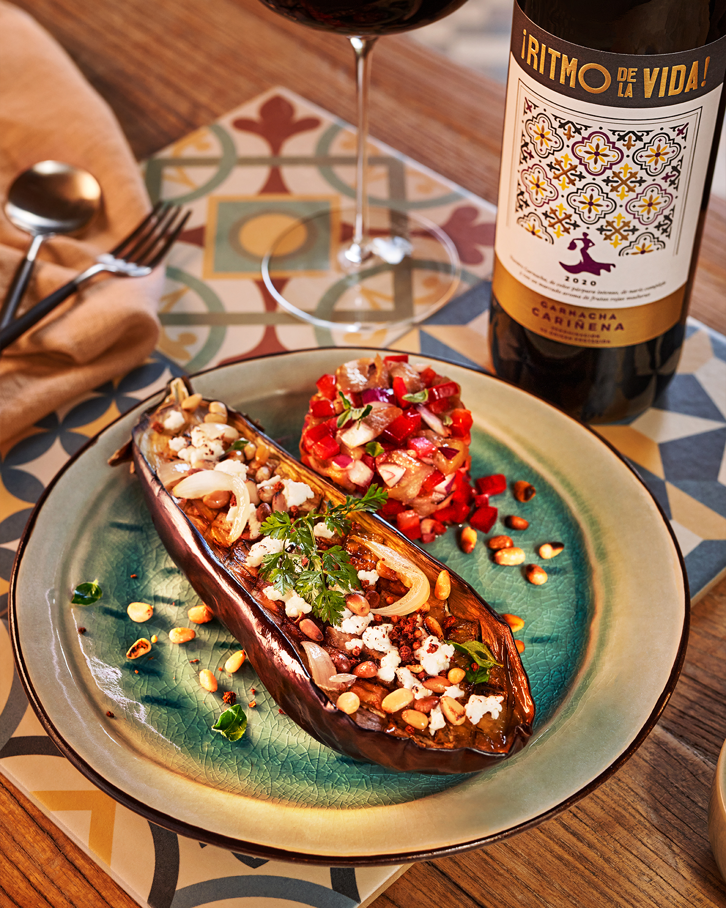
¡Ritmo de la Vida! brings Spain to the shelf with instant clarity with bold color coding, a distinctive wordmark and an iconic flamenco dancer logo. Azulejo tiles become the visual signature; colors guide the eye; and the brandmark ties it all together in one rhythmic, emotional gesture. The result: packaging that feels alive, looks premium, and delivers storytelling at first glance.
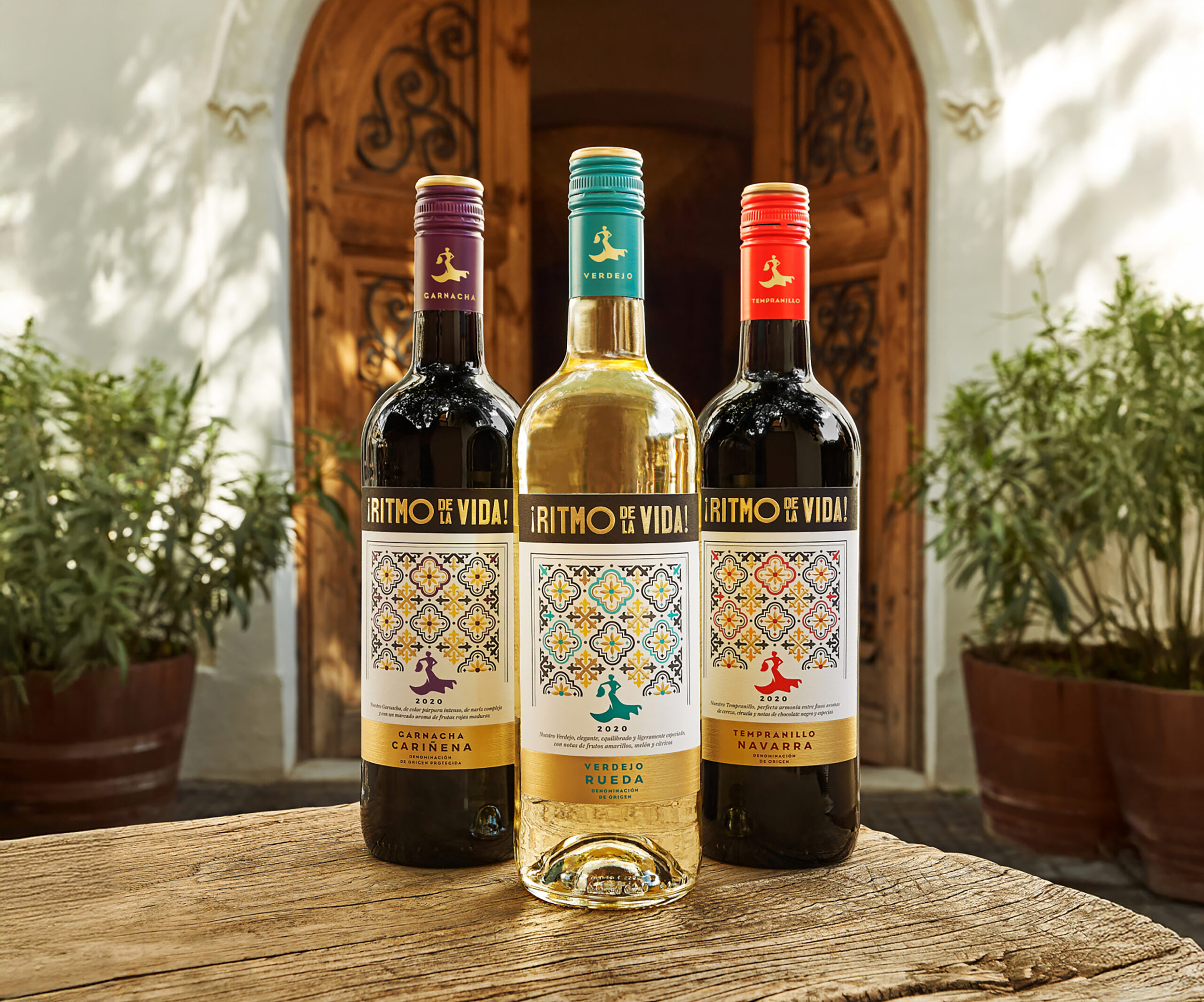

Photos: Anatol Gottfried
Some labels tell a story. These bottles pull you right in it. The tile patterns evoke culture, the color coding gives clarity, and the dancing silhouette brings a sense of motion and joy. It’s Spain made visible – not nostalgic, but modern. Designed to remind you how life should taste.
Building a brand presence you can feel
¡Ritmo de la Vida! shows its full strength in off-shelf placements. The brand’s visual assets – from tile motifs to bold color palettes, from logo to dancer icon – create stopping power even on 1–2 square meters.
Capturing a world,
not staging it
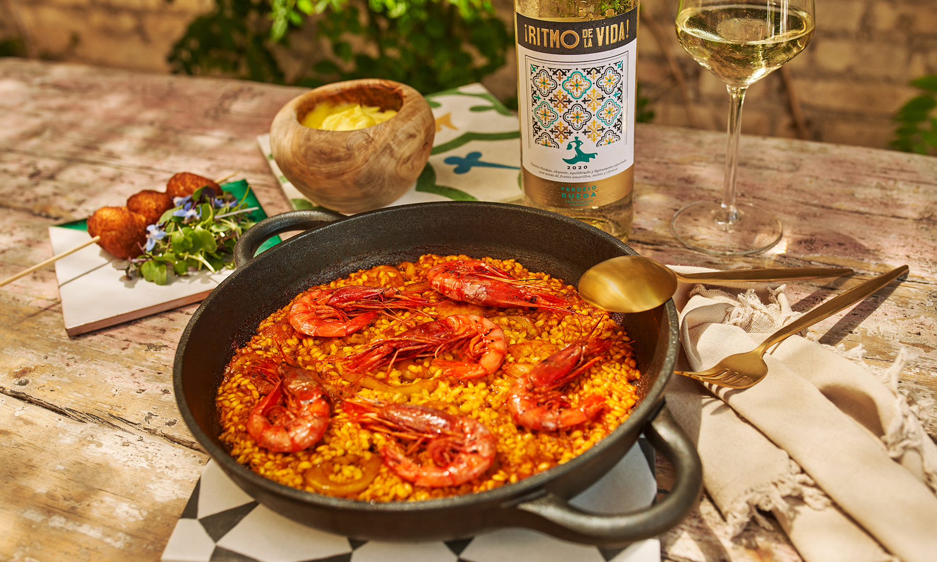
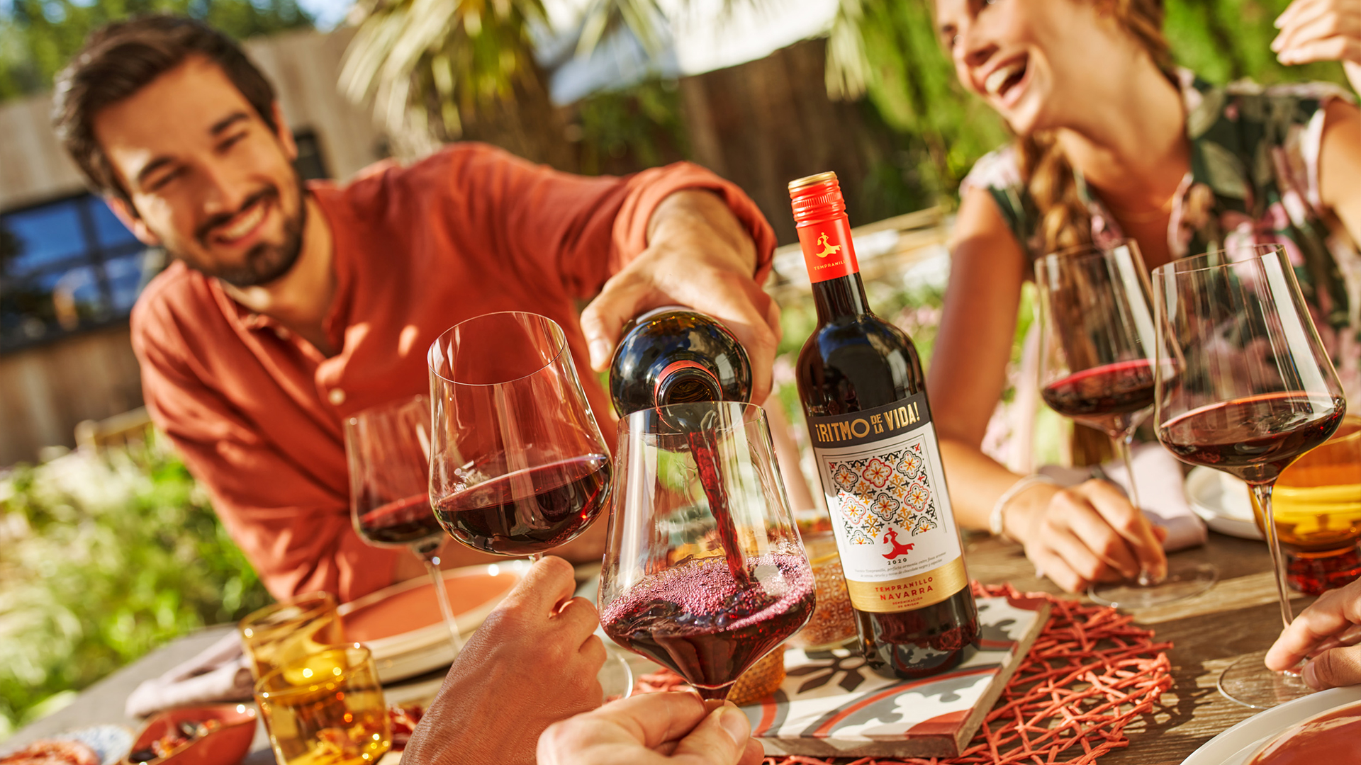
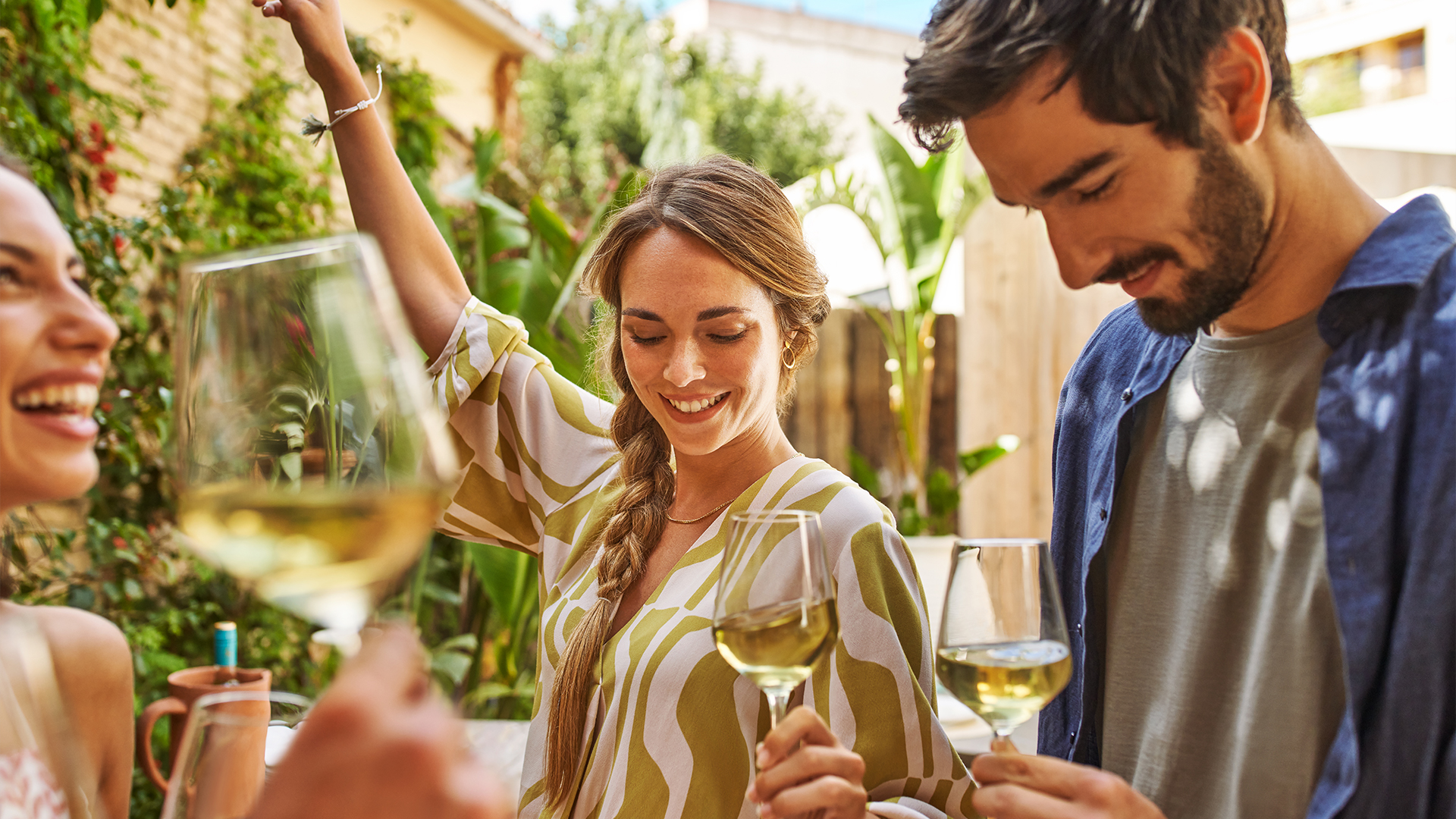
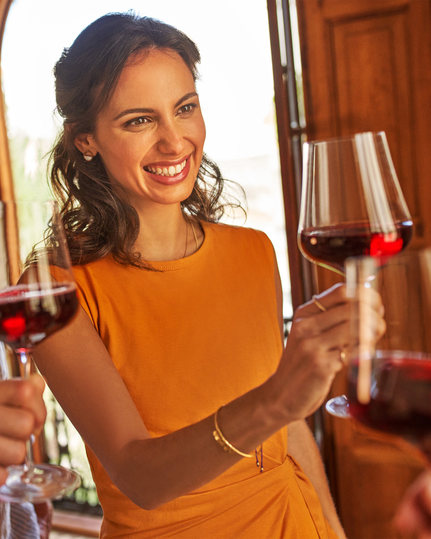
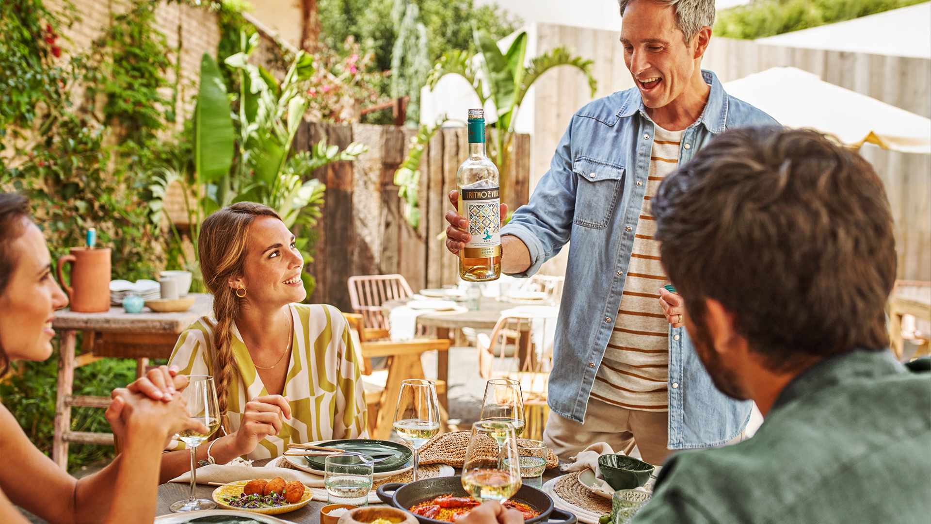
Brands resonate most when they’re rooted in something real. For ¡Ritmo de la Vida!, we didn’t build sets – we captured stories. The shoot took place in Valencia, at real locations with real people: outdoor dinners, shared moments, laughter without filters. Partnering with a local chef, we created Spanish dishes with a twist – photographed and later turned into cookable recipes for the brand’s platform.

“Ruska Martín has a keen sense for wine brands and the worlds associated with them, and translates this into great designs. I really enjoyed working with them on our design developments. They demonstrate a great deal of creativity, a good feel for premium products, and an understanding of the requirements of the wine world.”
Carmen George
Marketing Manager Premium & Lifestyle – Rotkäppchen-Mumm
Turns out…
… ¡Ritmo de la Vida! proves that cultural identity and retail-ready premium design can create a brand that moves people – without overexplaining. The design speaks. The content invites. The brand becomes part of the moment – on the shelf, online, at the table.